"This was never going to scale up"
Comments update: following the news that Google has scrapped its ambitious Project Ara, readers have been debating whether modular smartphones will ever be commercially viable.
Forget Ara: Google is scrapping its interchangeable smartphone, less than six months after promising consumer editions by 2017. Some readers were left disappointed, but others were completely unsurprised.
"Duh! This was a no-no from the start," wrote a user called R. "Name me one example of any consumer product where this kind of modularity works."
Kobi agreed, calling it "one of those idealistic, feel-good, utopian projects aimed at a world we don't live in."
"This was never going to scale up to make revenue, it was a designer's dream," said regular commenter Kay.
"I'm surprised it got as far as it did," added John. "It's a great concept, but nobody was actually going to be replacing parts."
How do you feel about Project Ara being scrapped? Tell us in the comments section »

Priceless: the growing trend for flat design was a hot topic this week after we featured seven of the best Minimalist rebrands. But are the new incarnations an improvement?
"I would never expect a behemoth like MasterCard to select anything but the most banal design and they have succeeded," wrote Nick, referencing the first project on the list.
"MasterCard simply went back to their roots," replied The Liberty Disciple, attaching an image of the brand's 1986 logo. "The logo is far more retro now."
"On many of these – MIT Media Lab, Airbnb, Whitney – great improvements were made," said a guest user called Agreed. "However, I don't care for this bullsh*t Modernist-washing of brands."
"We live in a post-Modernist world, and our general notion of aesthetics in graphic design has evolved," he continued. "We don't subscribe to the Mad Men, corporate-branding era of American design anymore." Read the comments on this story »

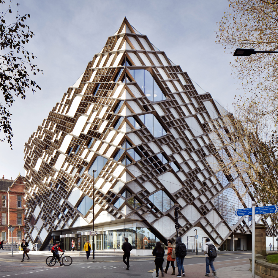
Diamonds are forever: the Carbuncle Cup shortlist for the UK's worst new building was revealed this week, and readers stepped in to defend one building in particular.
"I don't think 'the Diamond' really deserved the nomination," wrote Ale, referring to Twelve Architects' Sheffield University building, which is included on the shortlist along with five other projects.
Z-Dog agreed, defending the building's unusual facade: "At least they have pushed the development of complexity."
"The Diamond replaced a Grade-II listed Edwardian building, it was going to have to be brilliant to avoid criticism and it isn't," countered a user called MH28.
"Whilst externally the Diamond is unique, it is not offensive," said Hugo, before suggesting the award goes to another entry. "The church extension gets my vote for being feebly designed ad nauseam." Read the comments on this story »

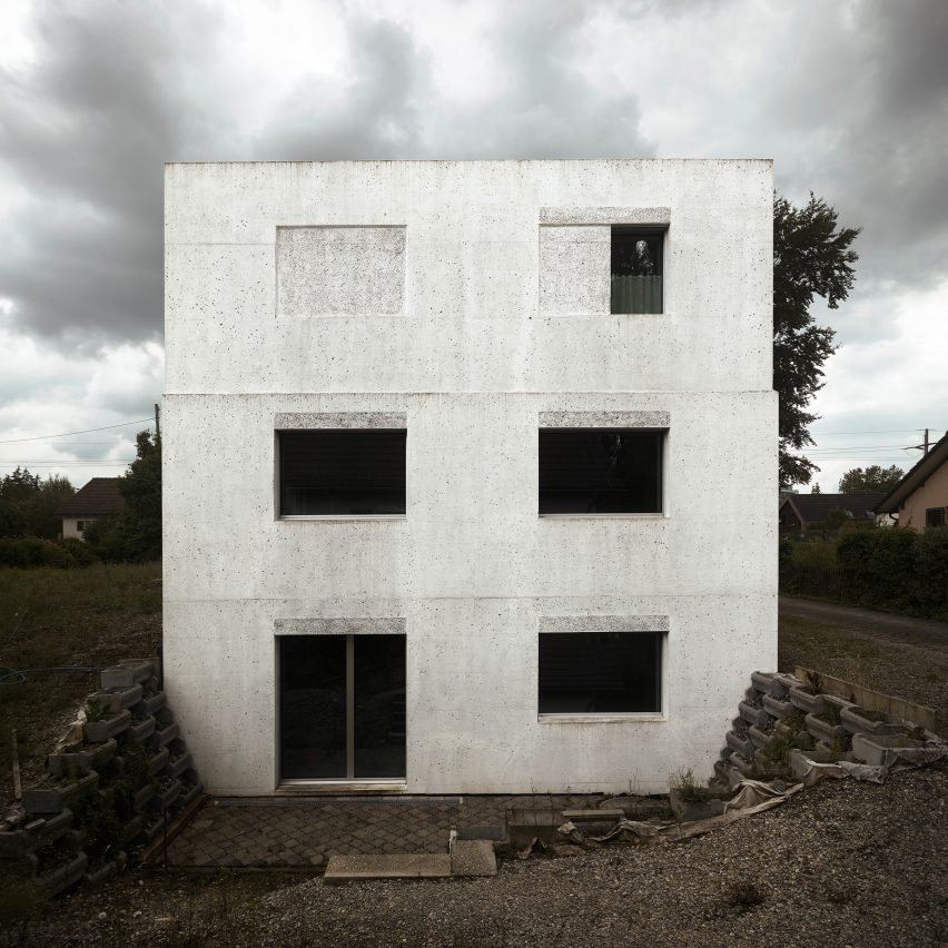
Austerity: this stark concrete house built by architects office HDPF near Zurich's airport has earned both admirers and critics.
"Echoes of Olgiati's Gelbe Haus, but this project is far more severe," said a user called N_1010, comparing it with the work of a more well-known Swiss architect.
"It's definitely lacking some of the subtlety of Olgiati, but I like it a lot," replied Dan. "It's bound to look stark and a bit soulless with so few possessions but I would be happy to have it as a blank canvas."
"It's horrendous," said Natalia, while Mike Lawless described the building as "inhuman" and "beyond redemption".
"Seems like team tried to go too intellectual on this one. Outcome is a bid sad and depressive," concluded Andrea-80051. Read the comments on this story »