Asdfg Architekten converts former miller's house into contemporary home
Hamburg studio Asdfg Architekten has converted a 19th-century miller's house in Berlin into a modern family home arranged around original brick walls (+ slideshow).
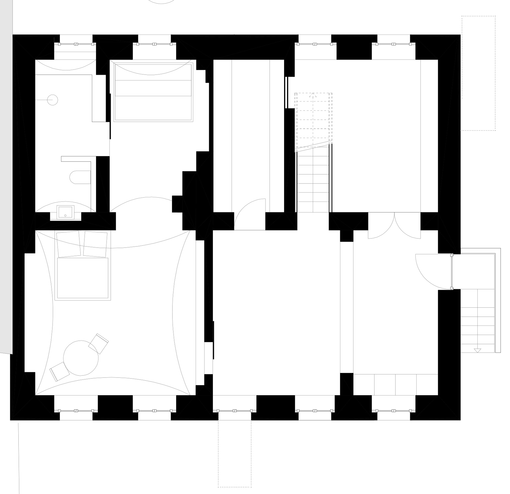
The building in the German capital's Prenzlauer Berg neighbourhood was built in the 1840s and had previously been used as a police station and workshop.
Its owner – a friend of Asdfg Architekten co-founder Philipp Loeper – asked the young Hamburg architects to oversee its refurbishment, presenting the studio with its first project. They named it Müllerhaus.
The main goal was to convert the former miller's house into a residence for a family with three children.
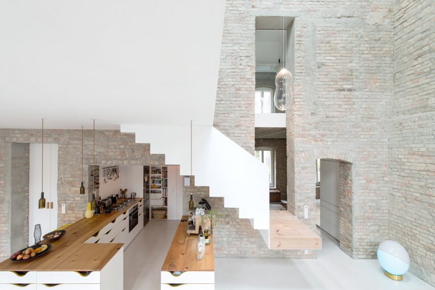
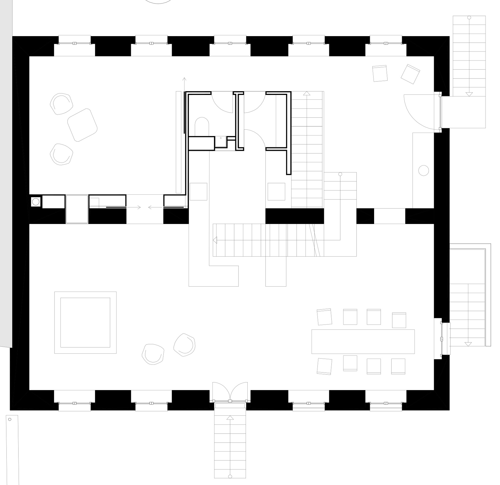
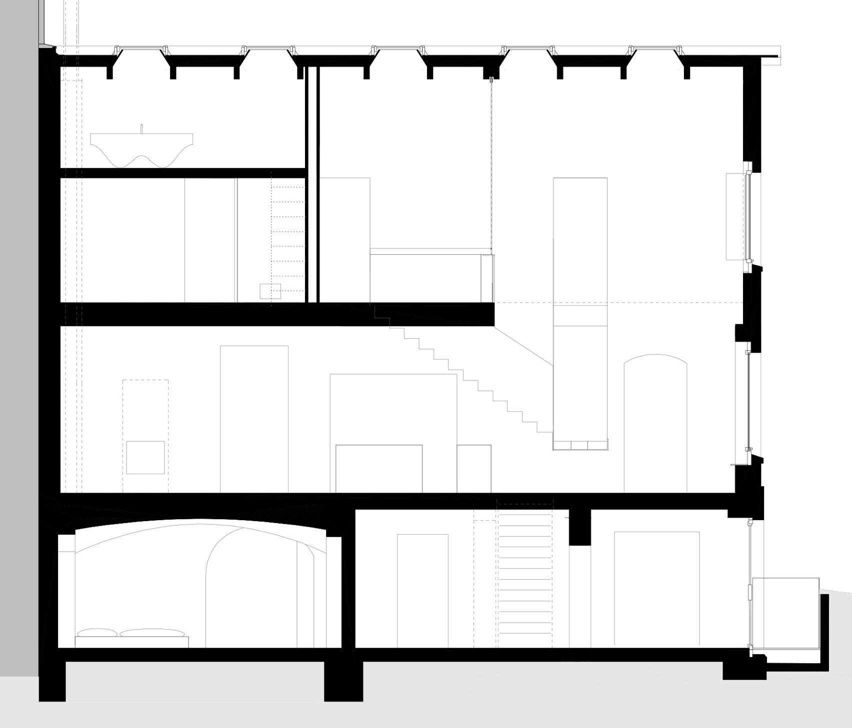
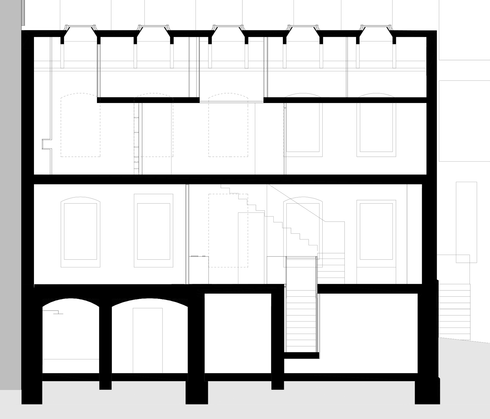
"In order to create a generous space, we only kept the outer walls and one massive wall in the middle," said Loeper.
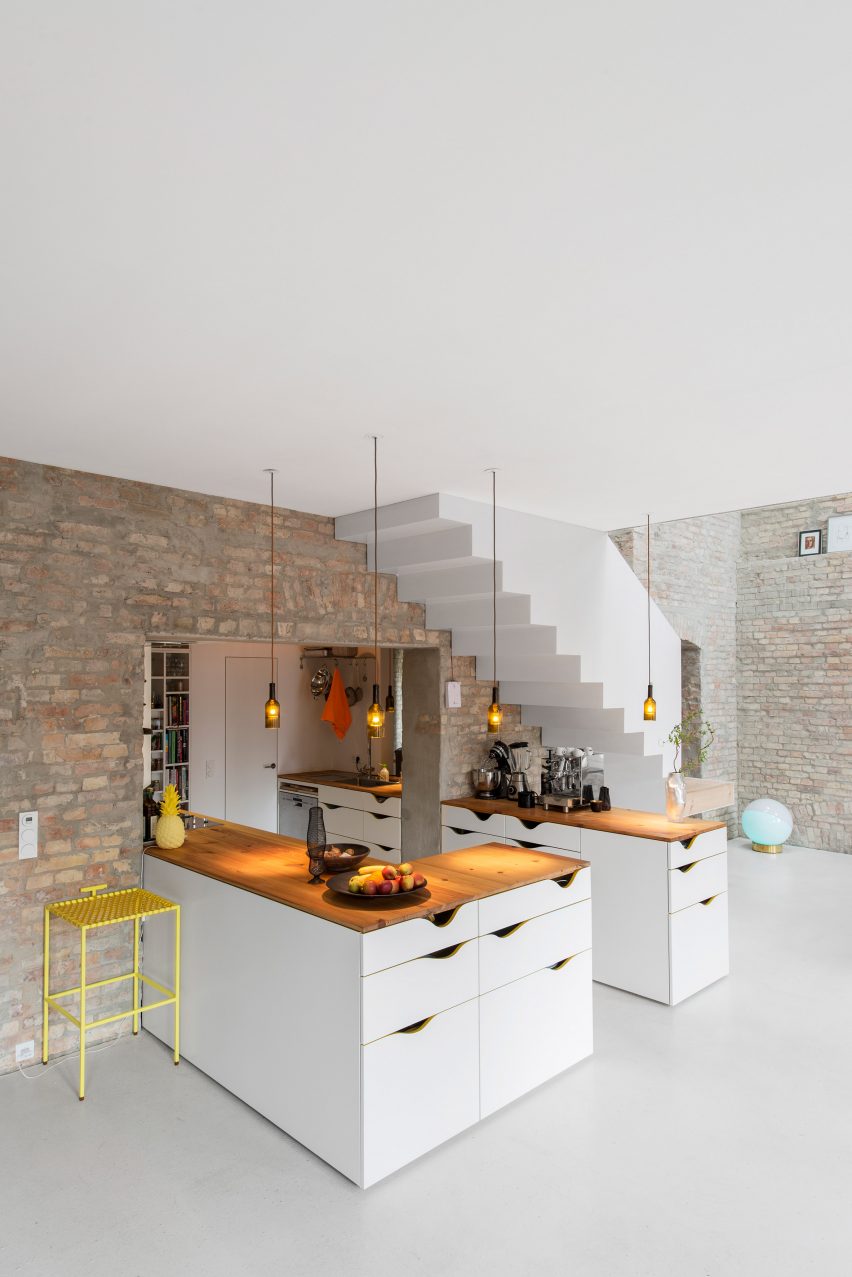
"The staircase, kitchen, as well as some sleeping galleries are somehow plugged into this wall."
The building had been neglected for many years and was in a dilapidated condition, with its interior subdivided into numerous small rooms that made it unsuitable for contemporary living.
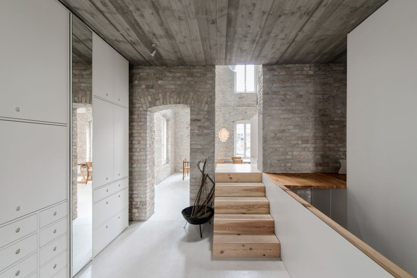
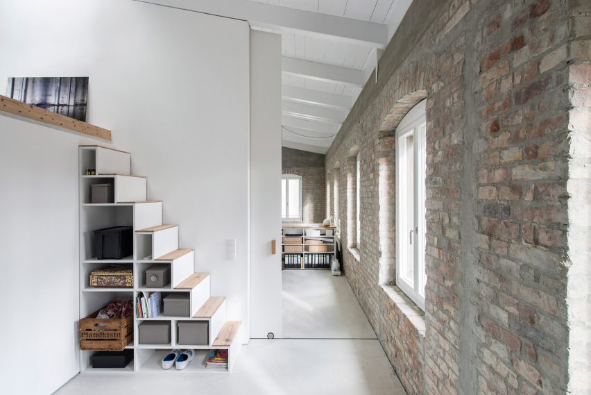
The internal renovations focused on removing most of these partition walls to provide interconnected rooms separated only by an original brick wall at the centre of the house.
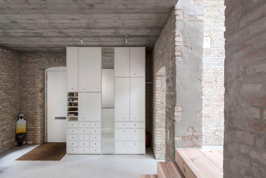
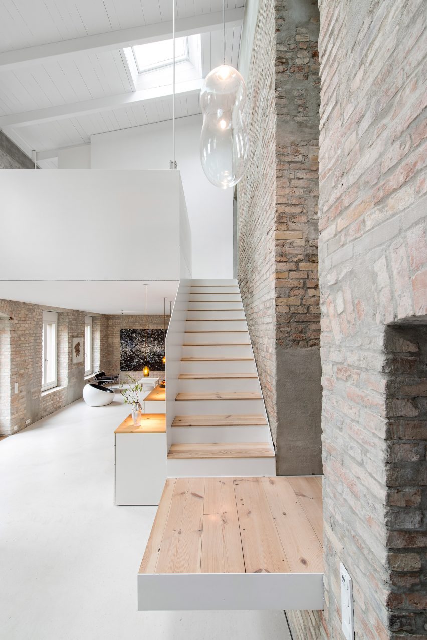
A staircase now ascends through a double-height atrium along one side of this wall. It is accessed via five steps in the entrance space that lead up to a platform, which projects through the central wall.
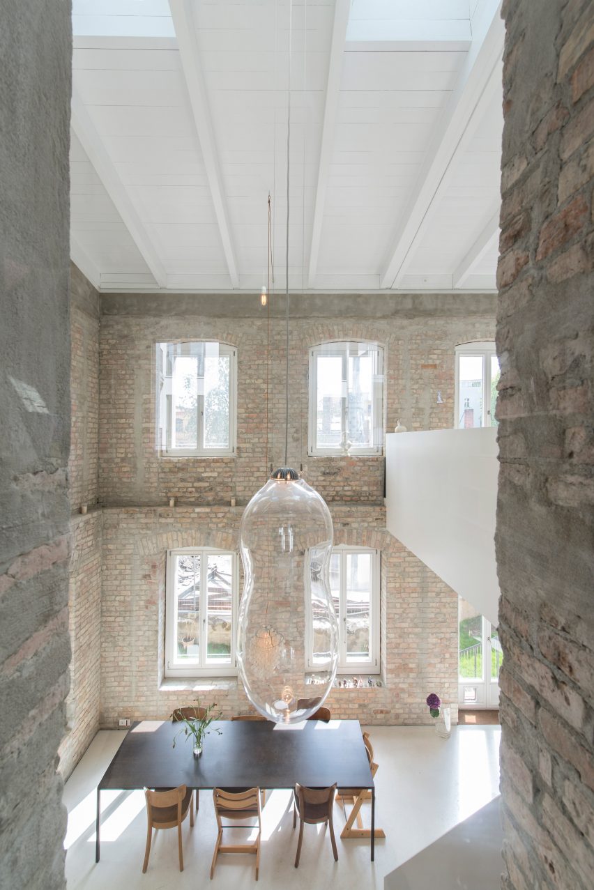
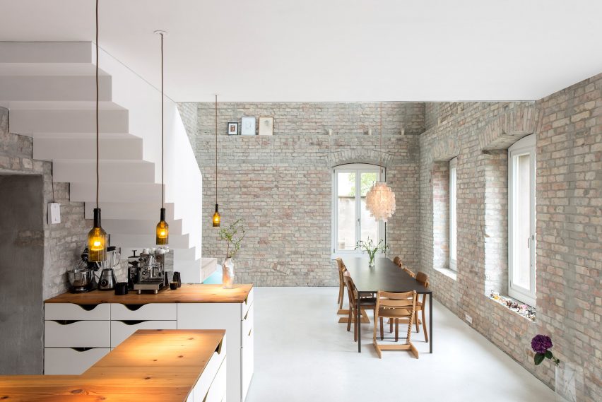
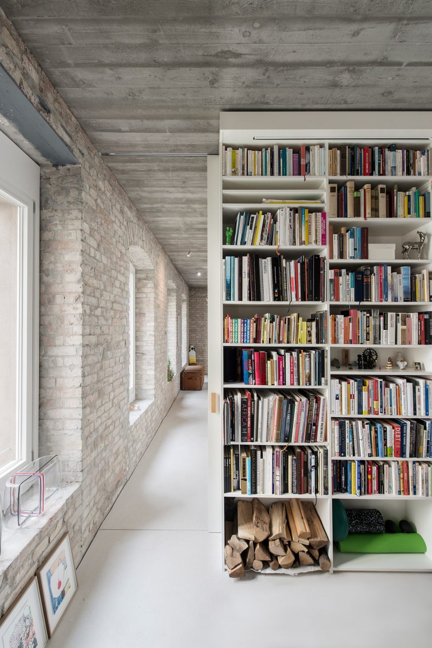
The brickwork of the original walls is left exposed, and openings in the central wall allow free circulation around the entirety of the ground floor. Wood from the original beams was reused for the staircase and kitchen joinery.
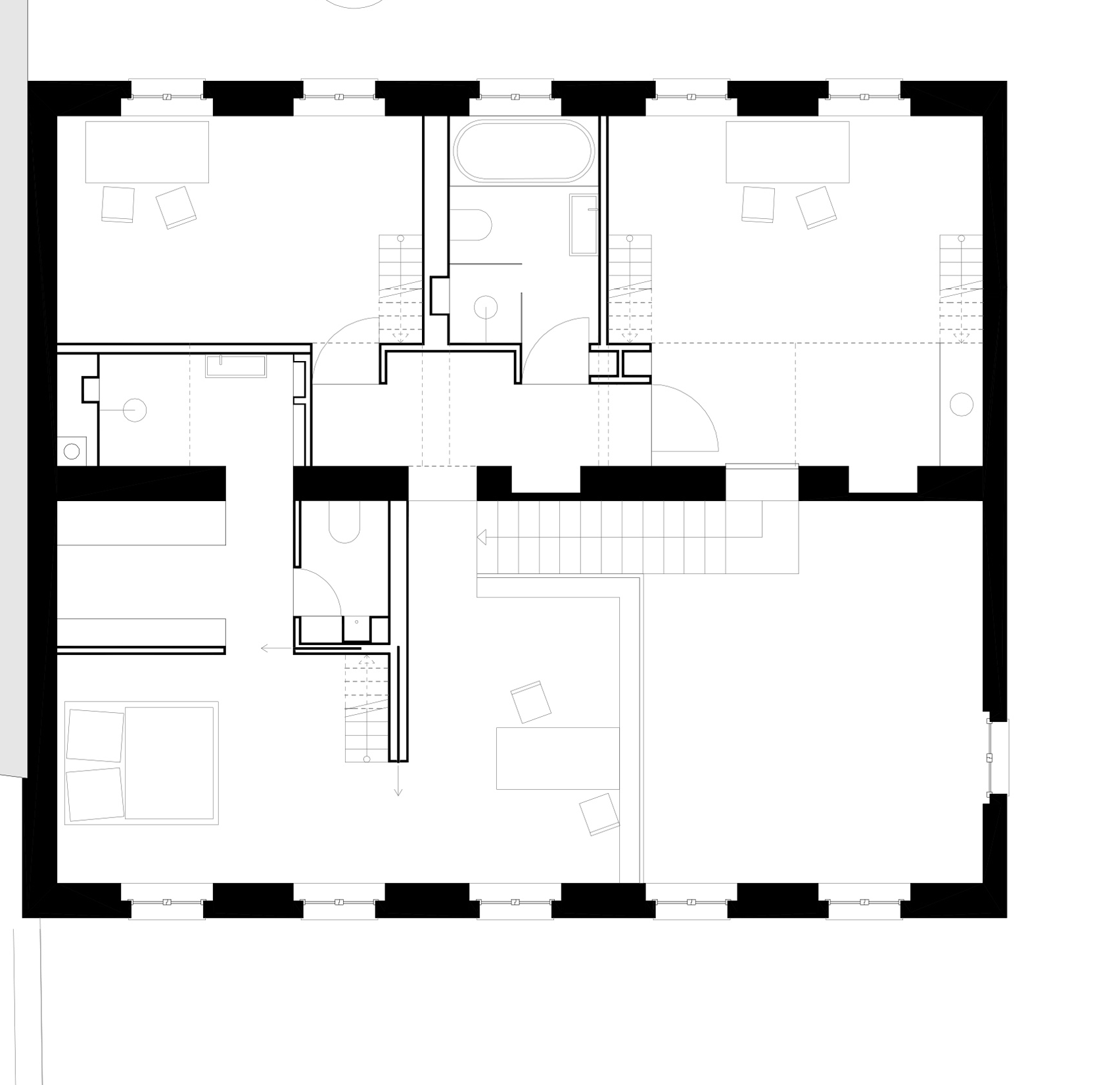
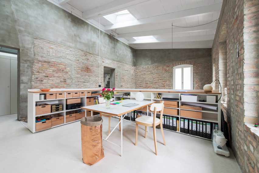
A studio area occupies a landing at the top of the stairs and connects to the adjacent master bedroom. The two spaces can be separated by pulling across a large sliding door.
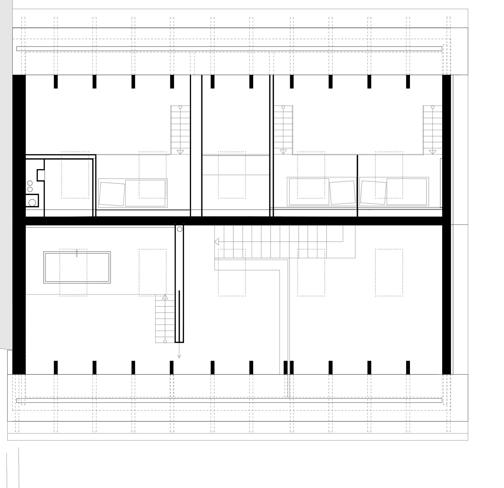
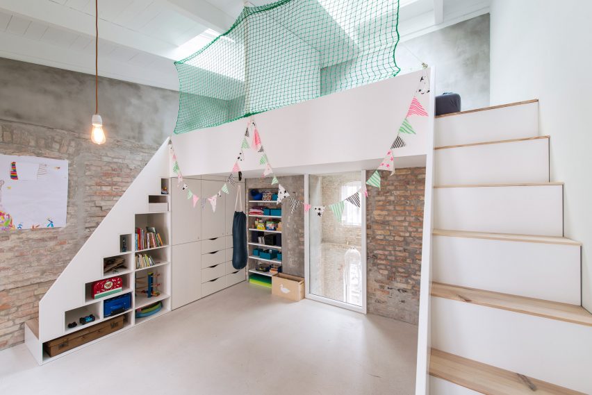
The children's bedrooms on this level feature platform beds accessed by stairs with built-in storage.
Netting creates a protective barrier around the sleeping areas and one of the rooms overlooks the dining space below through a window in the central wall.
Due to its historic significance as the area's oldest building, the local planning department stipulated that the house's facade should replicate an original design drawing from 1844.
However, the architects managed to argue for a more modern treatment, using raised relief forms to mimic the arrangement of lines depicted in the drawing.
"We wanted to show the history of the old building without pretending that the facade would be 170 years old," said Loeper.
"Our concept was to interpret the lines in the historical drawing as differences in the height of a stucco facade using ancient techniques and materials."
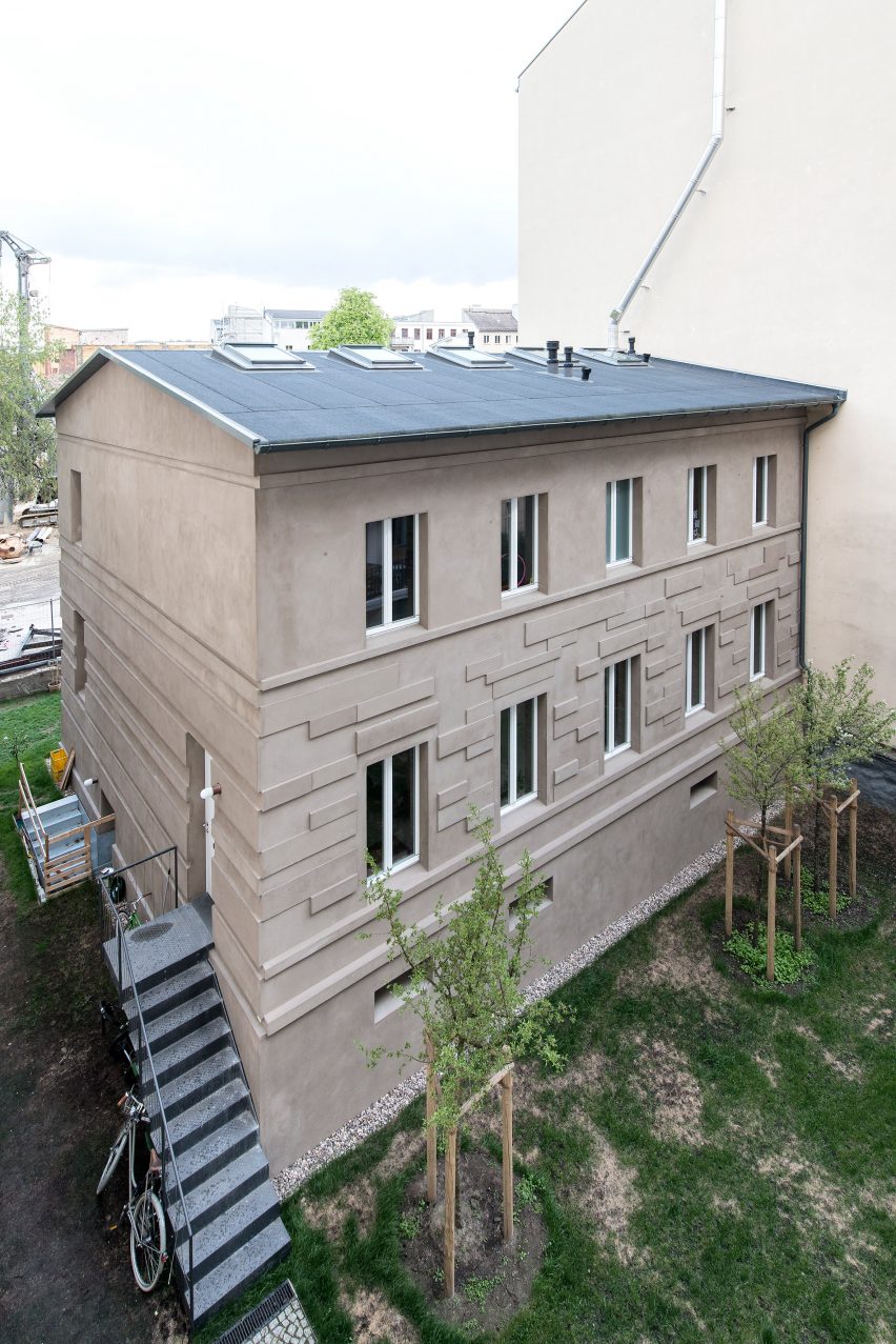
The outcome is a series of rectilinear elements with varying depths that produces a pattern of light and shadow, and evokes an abstract interpretation of the original stone facade.
Photography is by Michael Pfisterer.
