Viaduct's James Mair picks his five favourite minimalist furniture pieces
London Design Festival 2016: the best works of minimalist furniture have to make an impression with nothing more than a few lines. James Mair, founder and director of designer showroom Viaduct, shares five of his favourite examples with Dezeen (+ slideshow).
"There are so many aspects to minimalism, but I think a lot of the current commercial minimalism in furniture is just 'this is a box', and I wanted to take it a bit beyond that," Mair said when speaking about Viaduct's new exhibition of minimalist furniture, Bare Minimum.
"And this is where the relevance of material, construction and detailing really comes in, to give that extra something."
Mair's examples span 50 years of European design, and include the ultimate table, a chair that can be packed into a single cylinder and a sunlounger inspired by a slightly lifted mattress.
These pieces can be viewed among others at Bare Minimum, installed at Viaduct's London showroom for the duration of London Design Week. The exhibition runs alongside The 13 Square Metre House, a demonstration of another aspect of minimal living, the micro apartment. Both are on until 24 September 2016.
See Mair's picks and descriptions of the pieces below:
T88W Table by Maarten Van Severen for Lensvelt
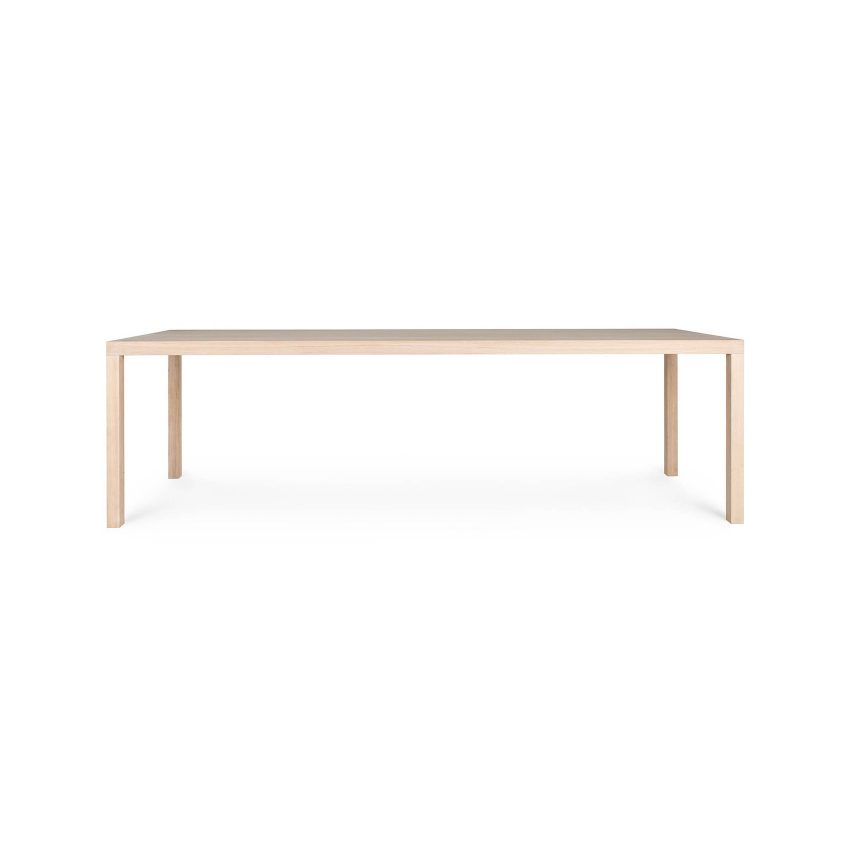
The proportions are 250 by 82. Maarten really loved that three-to-one proportion. Okay, it's a table with a leg at each corner, but each of the legs is mitred around a tube, the end pieces are mitred so that the flow of timber runs right the way through the table from end to end, so it's in the detailing, it has been beautifully thought-out.
Also it's a soaped oak table. You just scrub it, so it shows the history of happy evenings. There's an evolution to it. It shows red wine marks, they gradually disappear as you scrub it, and then more marks appear. A table with soul, that one.
Tube Chair by Joe Colombo
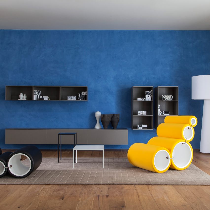
When it was introduced, this was pretty revolutionary. The idea of somebody in the early 60s thinking 'I'll get four cylinders and shove them inside each other and you take them apart and you can have a chair' – it's that playful effect that can be achieved out of something simple.
Superloon floor lamp by Jasper Morrison for Flos
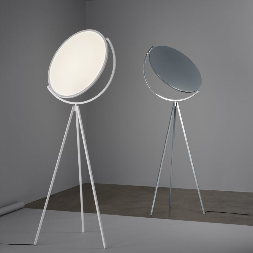
Although it was launched in Milan over a year ago, it's only just coming to the market now. Technologically, it's quite tricky. The reason I love it is it's looking at the Fortuny light from 1907 and reducing it using new technology. And I just think Jasper's done a beautiful take on that.
Wire S #1 and #3 by Muller Van Severen
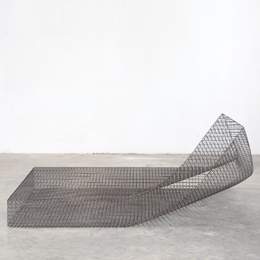
The idea of looking at a mattress where the corner's been lifted up and thinking 'oh, why don't we make that in metal?', it's a kind of sculptural joke in a way. It is another piece that makes me smile. And I feel that this in stainless steel, just sitting in a garden, it would look amazing.
Mobile chandelier 9 by Michael Anastassiades
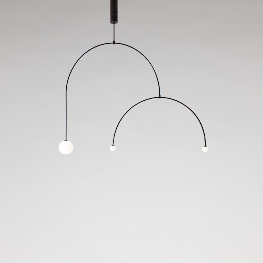
This is all about the mix of technology and economy of form. It is just a very pleasing shape.