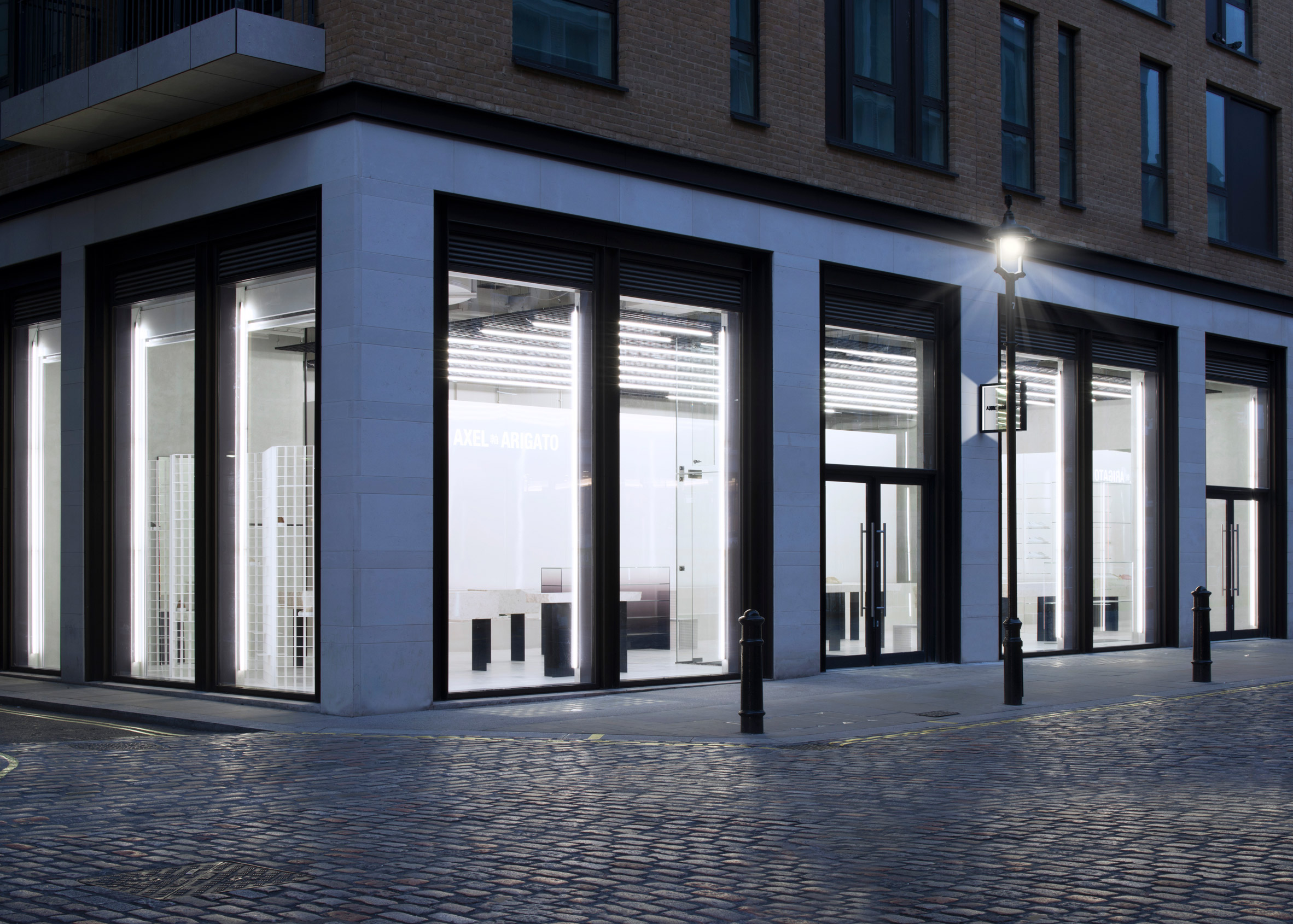
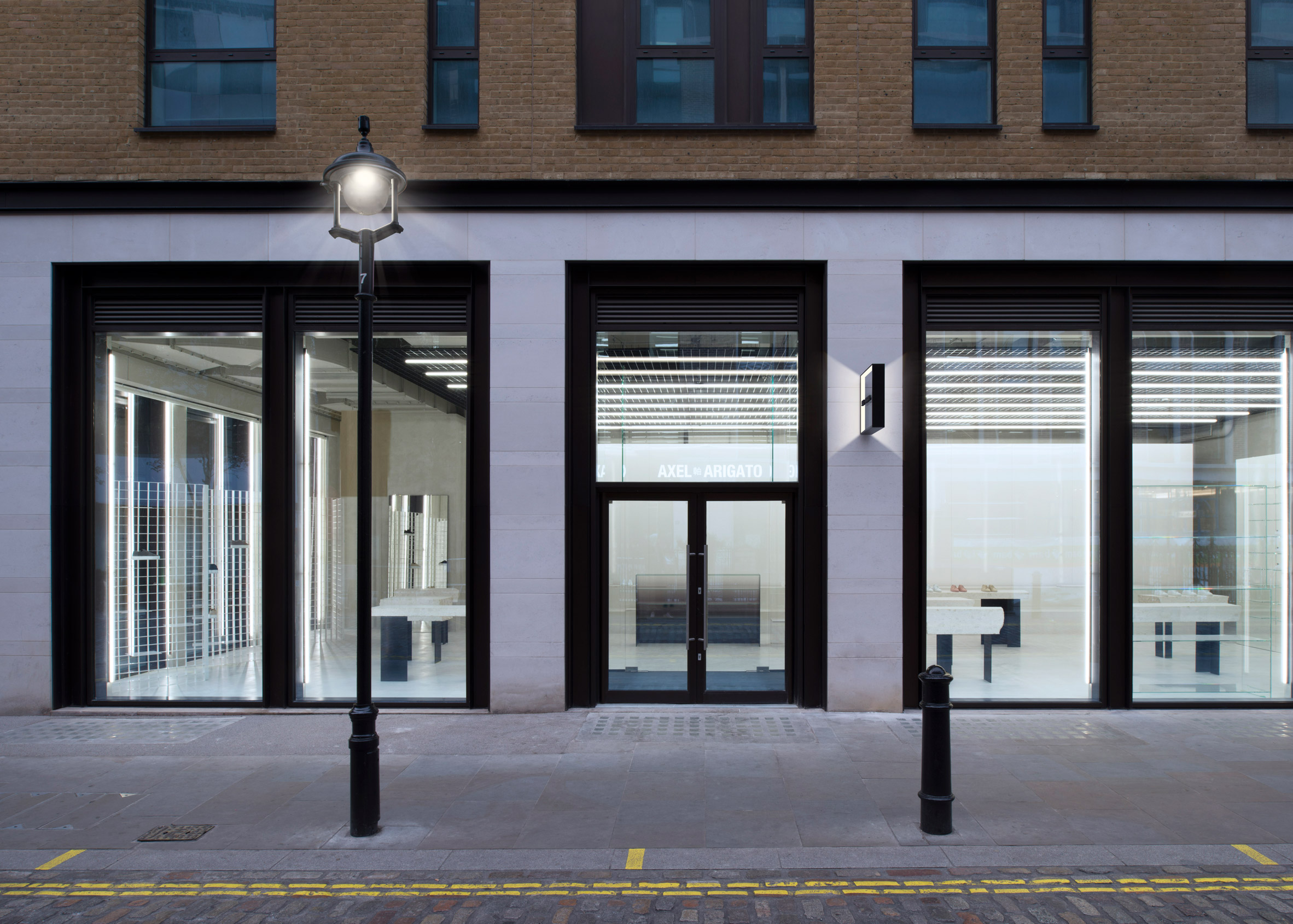
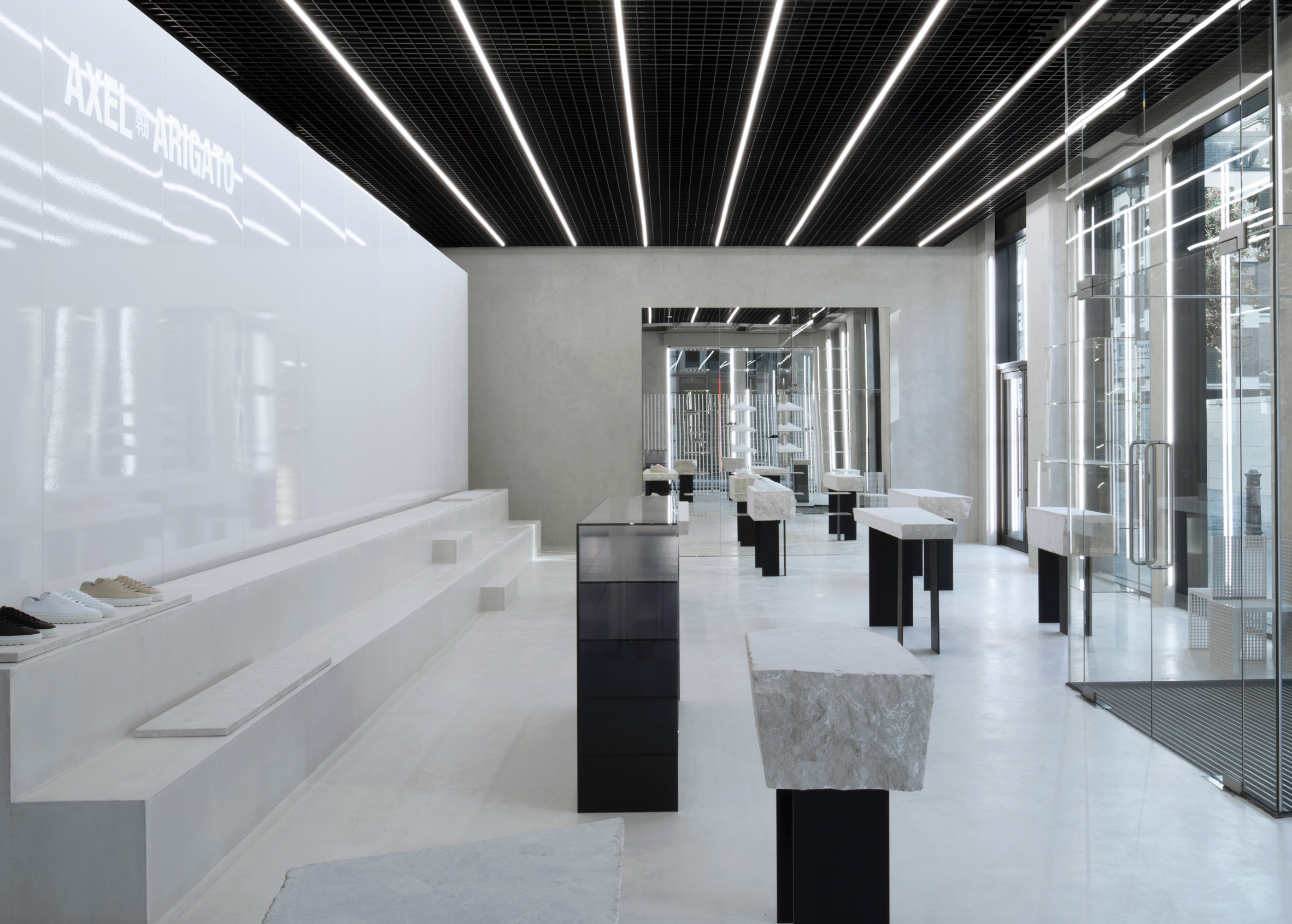
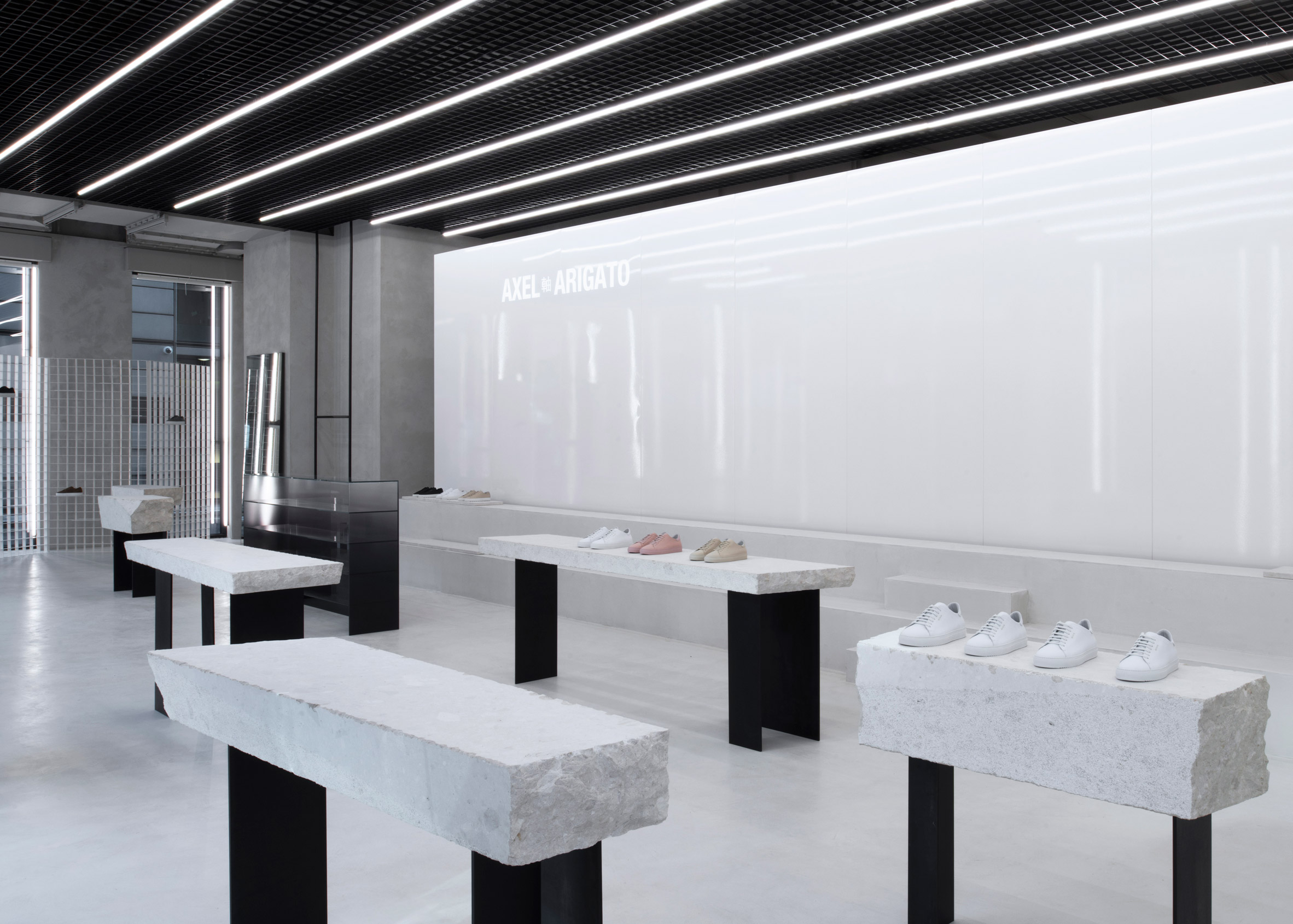
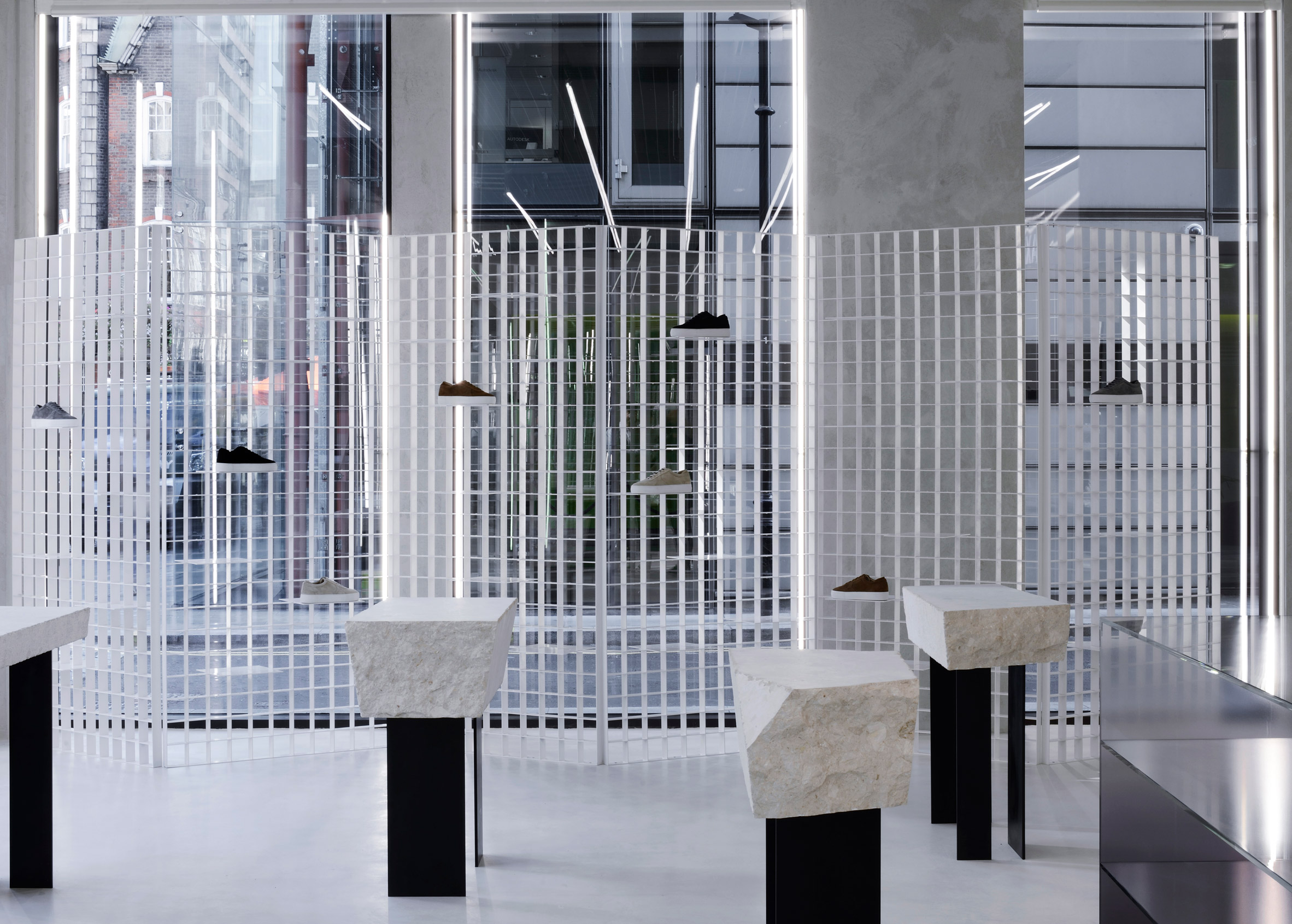
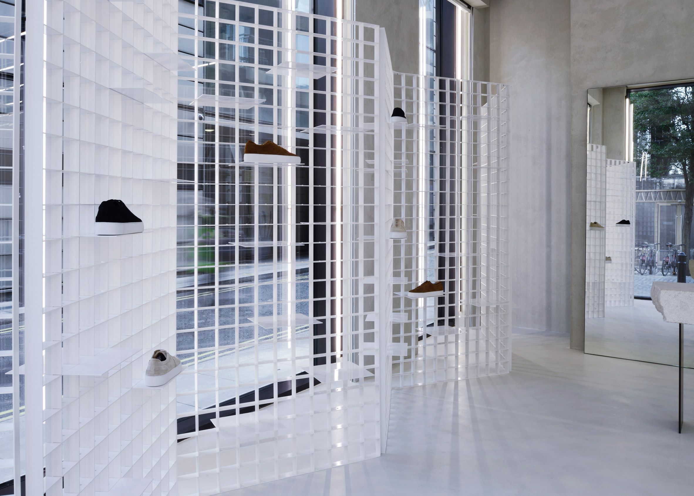
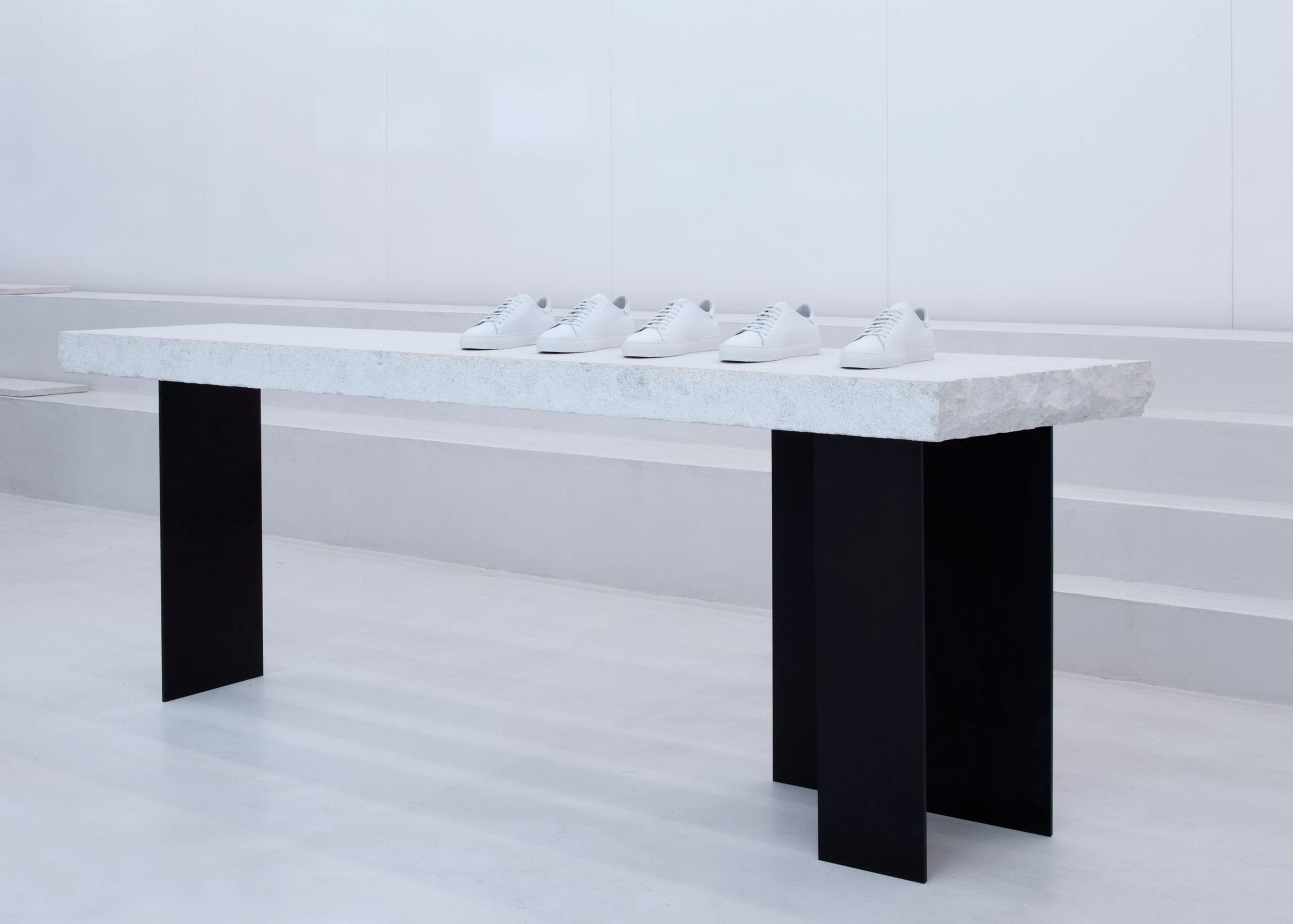
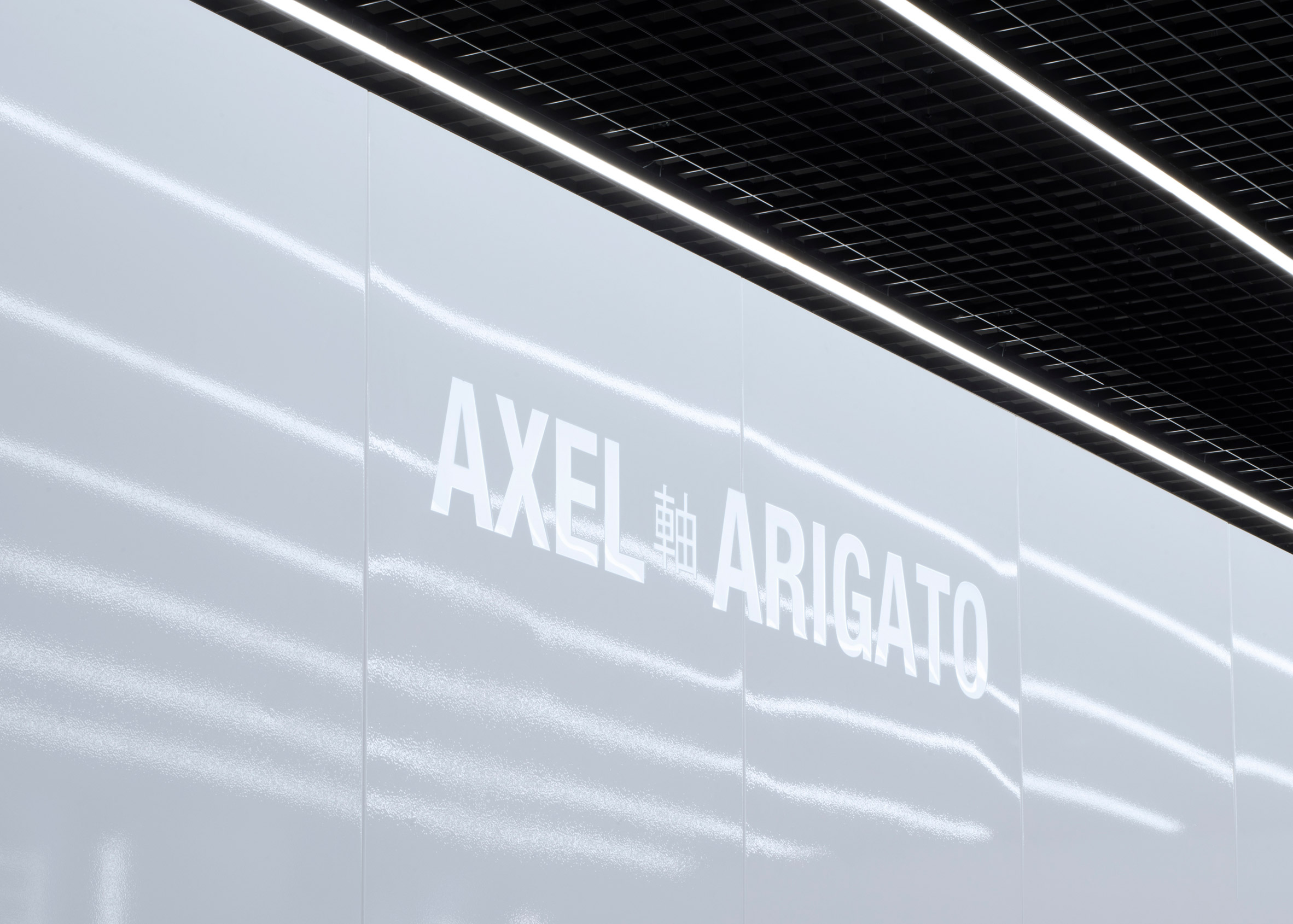
Shoes are displayed upon plinths made from giant pieces of terrazzo inside Swedish footwear brand Axel Arigato's minimal boutique in Soho.
Axel Arigato's first store in London was designed by Christian Halleröd, who co-founded Stockholm studio Halleroed. He based the interiors on the brand's minimalist aesthetic.
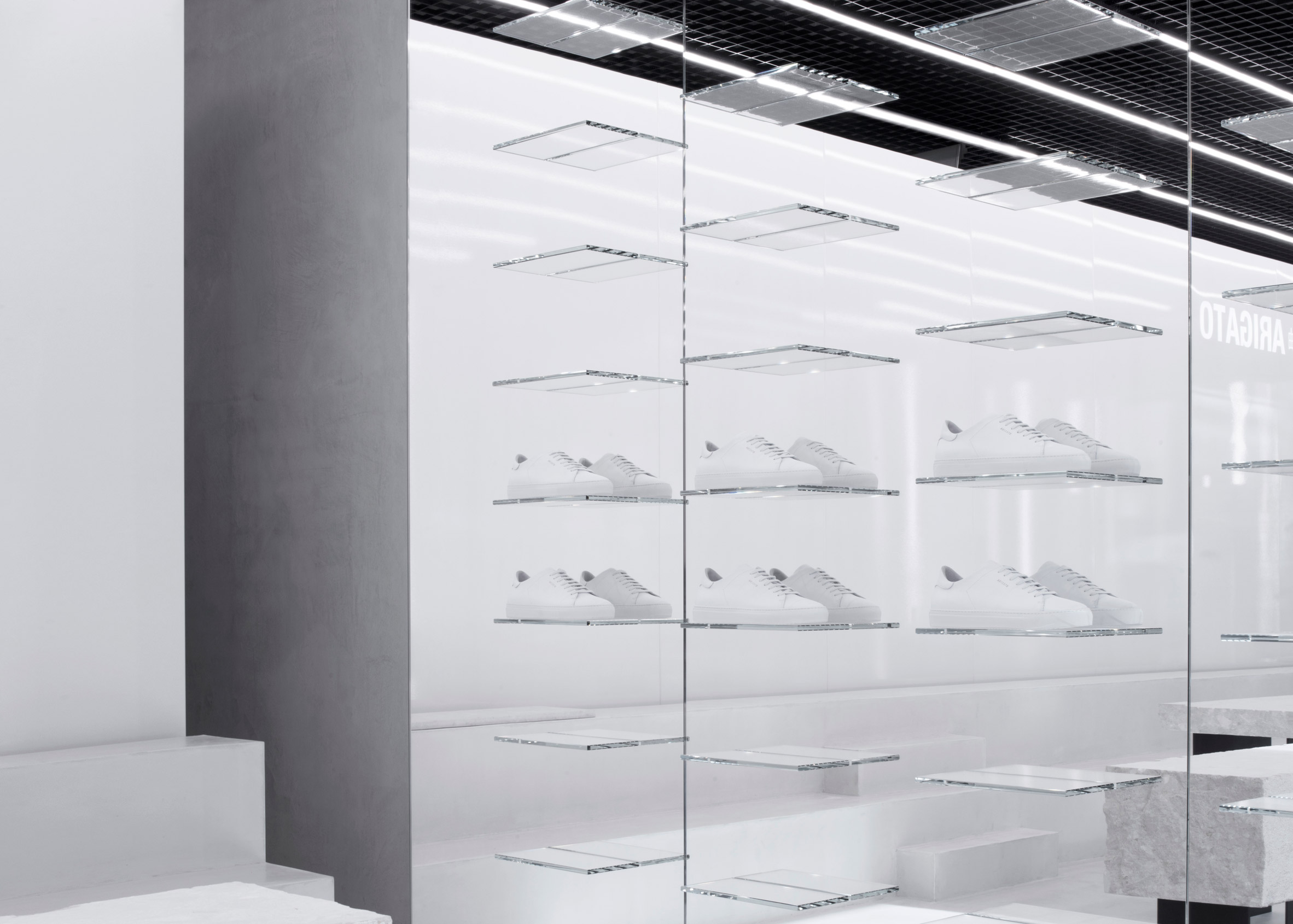
Set behind a giant glass facade, the Soho store features a palette of concrete, metal and mirrored surfaces paired against a white colour scheme.
The brand's trainers are displayed on a number of high tables made from 450 kilogram slabs of terrazzo, and upon bleacher-style marble seating towards the back of the store.
"We needed a minimalist palette because the products we offer are so diverse and individualised. Instead we started looking for different surfaces that could add depth to that tonality," said the brand's creative director, Max Svardh.
"I wanted to create a space that is inviting and open, the same feeling you get when you walk in to a gallery."
As well as displaying the brand's women's and men's collections, the store will stock rare Japanese books, magazines and objects.
Chairs used to furnish the interior, designed by Halleröd, are also available for customers to purchase.
Fashion brands are increasingly favouring minimalist store designs in order to keep the focus on the clothes.
Design office Thisispaper Studio used clean white surfaces and simple birch plywood furniture to transform a Soviet-era dental clinic into a space for its first shop, while designer Reiichi Ikeda inserted boxy partitions that follow the pattern of existing ceiling trusses into a clothing boutique in Japan.

