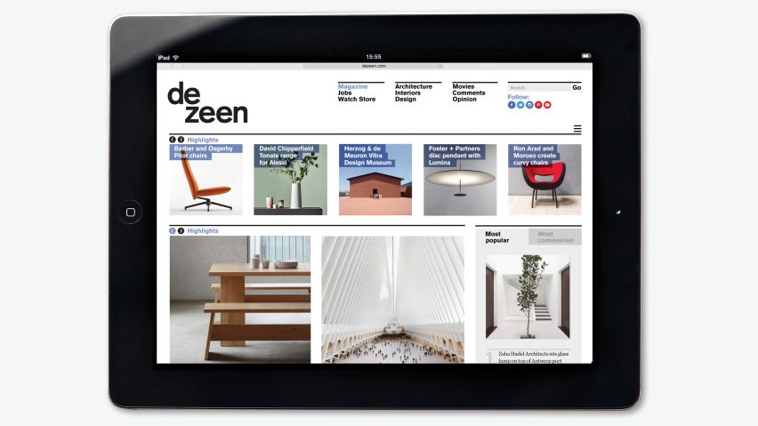
Welcome to the new-look Dezeen
Dezeen has changed. We've revamped our site to make it as beautiful as the architecture and design projects we write about.
We're not really calling this a redesign – it's more an iteration of the look we first introduced in 2007 and which, save for a few minor tweaks and upgrades, remained largely unchanged for nine years.
We know – it's long overdue. People have been forever asking us when we're going to move on from our cluttered, narrow grid and teeny images.
The truth is, we've tried several times over the years with various design firms – including some famous ones – but we never liked what they produced for us. We twice spent a lot of time and money on radical redesigns that we ended up throwing away.
Meanwhile our audience has been growing strongly year on year, so we don't appear to have suffered too much from our tardiness.
Third time lucky
This time, we think we've got it right. For our third try, instead of going to yet another fancy web studio, we returned to the brilliant Swiss designer and typographer Micha Weidmann, who created our logo and original layout in 2007, when we first moved away from the generic WordPress template we launched with the previous year.
For the development side we worked with Bill Kingston and his team at Den Creative, who have painstakingly built the new site from the ground up and tolerated our many changes of direction with good humour and patience.
Keep it simple
Micha's original design was famously simple and clean; our brief to him this time was to make it even simpler and cleaner. We wanted the site to look more grown up and to better express the quality and care we put into our content. We wanted the site to help people find what they want but then fade into the background so the content could speak for itself. We wanted to make a statement about our brand that was both strong and discreet.
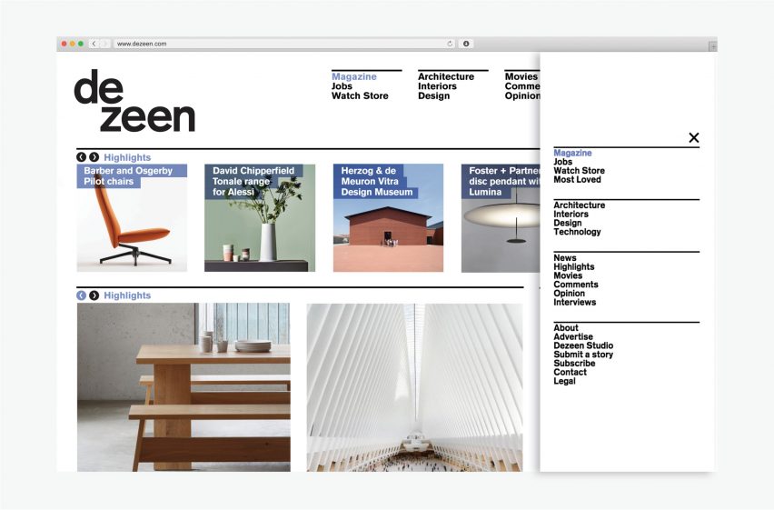
But we also wanted to remain faithful to our blog origins. Content is still ordered in reverse time order on the home page, with the page structure intact so readers can click back through our archive. "Keep it simple but make it simpler" was our guiding principle.
Micha (and co-designer Dean Pauley) immediately got what we were trying to do and we loved their ideas from their very first presentation, which took place 15 months ago. It's taken that long to nail every detail. We hope we've pulled off what we set out to achieve.
Lopsided logo
We've left Micha's wonderfully lopsided logo untouched but moved away from the idiosyncratic irregular grid that gave Dezeen so much character in the early days, as it became limiting as we grew.
We've kept the quirky "Scrabble" approach to our brand identity, which allows us to reconfigure our logo at will by rearranging the letters to create different shapes for different uses.
We've lost the narrow left-hand column, which was merely a hangover from the basic WordPress template we selected when we launched anyway. We never liked it, nobody ever clicked on it and we're not sure why it took us so long to get rid of it.
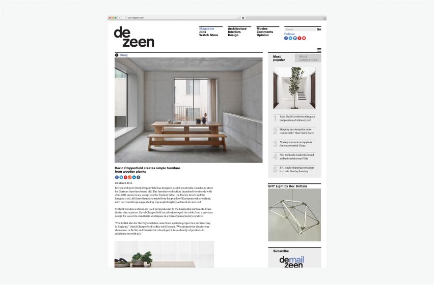
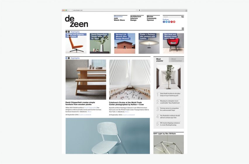
Instead homepage content is now arranged in two vertical rows, with individual posts much wider, enabling us to show bigger pictures.
The right-hand-side column remains largely unchanged as a universal navigation panel, but is less noisy.
However we've tried hard not to become too generic, retaining the quirky vertical navigation lists in the masthead rather than the horizontal menus everyone else uses, and sticking with our signature use of square images on the homepage (we were using square images long before Instagram even existed).
Now with fewer colours
The revamp is deliberately non-revolutionary – we've seen other sites jump on the latest tech fad and struggle. In many ways it's rather austere and un-technical – we have replaced our slightly garish orange-and-purple palette with a single shade of blue for text and navigation, and a single shade of grey for background elements. Everything else is black and white.
All directional navigation is reduced to a single pictogram of a chevron in a circle pointing either forwards or backwards – a nod to the out-of-the-box WordPress double chevron we used before.
The same rules are being rolled out to our other sites. Dezeen Jobs has already had a makeover in black, white and orange. Our branded microsites such as Most Loved will each have their own colour (red in the case of Most Loved). Dezeen Watch Store will soon be brought into the fold with a shade of sage green.
New features
Other new features – again, nothing revolutionary – include a "highlights" slider at the top of the homepage, which will display stories we think are the most interesting.
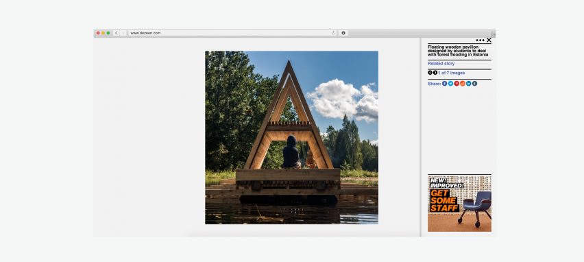
There is also a lightbox for images – click on any image in a post and you'll get larger images that you can scroll through without the distraction of text, widgets and ads. Lots of other sites have these, and we've happily borrowed and combined what we think are the best features. No point in reinventing the wheel.
This is just the start of a fairly major project to overhaul the way we serve content. We'll be introducing many new features and functionalities over the coming months, aimed at keeping readers coming back and spending more time with our content. The way people use the internet has changed dramatically since we launched and sites like Dezeen need to adapt or die.
However our aim is to make these future changes so seamless and beneficial that you won't notice them at all.
Meanwhile, we hope you like the new-look Dezeen. We hope you agree that it's very much like the old Dezeen, only more so.