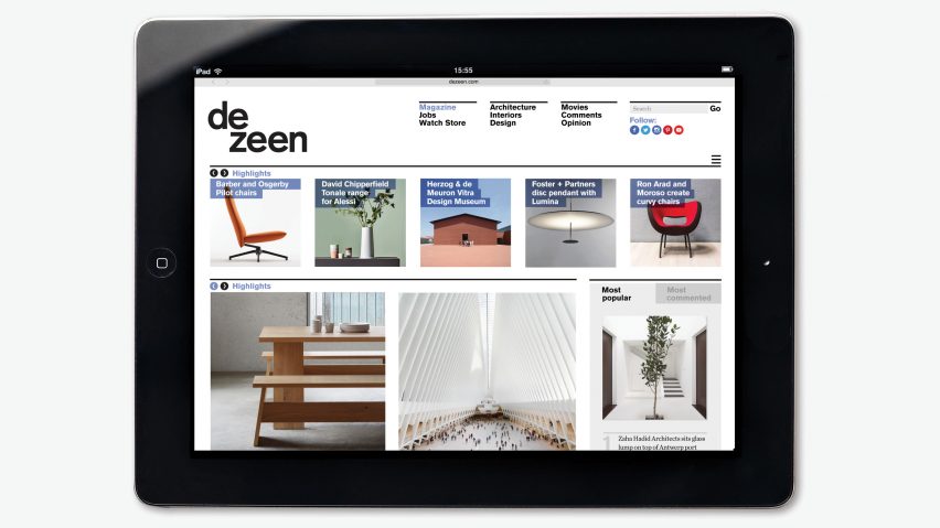
This week Dezeen had a big refresh, leaving some readers thrilled, and others disheartened. Find out what they had to say in this special edition of our comments update.
In the most significant revamp since Dezeen launched nearly 10 years ago, we moved away from the cluttered, narrow grid and teeny images, in favour of a more grown-up layout that better expressed the quality and care we put into our content.
Some readers were full of praise: "Dezeen, you have grown so much!" wrote The Liberty Disciple.
"Very nice and clean and finally updated," added Martino Pietropoli. "I understand many will miss the previous one but it was really outdated and somehow clunky."
"Fantastic – and the Swiss shows through," wrote Howard Stein, crediting our site designer, the typographer Micha Weidmann, who also created our logo and original layout back in 2007.
"Perhaps there is some truth to the contention (mine) that a fancy web shop still can't deliver the class of a top tier designer and typographer," he added.
Unsurprisingly, the new look also provoked strong reactions and some criticism from our long-term audience. "I hate it, my favourite site now seems a mess," wrote a user called Roveit.
"There are a few things the former design could have been done differently, but in this case I'm totally surprised and disappointed, and would like to have the other one back," said Désirée.
"The format definitely feels more Memphis than Bauhaus."
"You know what, it's not mind blowing but it's certainly an improvement on the previous site, which seemed to be so out-of-date it had actually become cool again," interjected Nigel.
We also received a lot of compliments on our mobile layout, which has been streamlined and adapted to include a highlights slider.
"I'm always on my phone and the transition was practically seamless on my end," wrote Paul Petit. "One must change the way the brain wants to explore Dezeen out of habit but that's no problem."
However some readers expressed concerns over page loading times, which is something we're looking into as a priority. One user even demonstrated his experience in a Youtube video.
After receiving a huge amount of honest feedback, we're collating all of the suggestions and will continue to iron out any glitches. Stay tuned!

