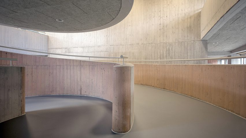
This extension to a day-care centre for disabled adults in the Swiss town of Stans has been kitted out with muted red awnings and spiralling pastel-tinged walkways.
Local studio Architekten CM was tasked with designing the building for the Weidli Stans Foundation, which provides accommodation and learning support for adults with multiple physical and mental impairments.
The day-care centre is located alongside an accommodation block on the edge of the town in the Swiss canton of Nidwalden. It allows the foundation to offer additional services focused on sensory experiences, creativity, play and music.
The multi-storey building optimises the space available on the designated plot, but presented a challenge for the design team as many users have disabilities that prohibit them from climbing stairs.
An entrance towards the centre of the building opens onto a foyer flanked on one side by a dedicated circulation area containing a series of sweeping ramps and landings.
"The commitment to barrier-free access to four floors led to the idea of ascending or descending connection routes," said the architects.
"In order to make use of the space required for this purpose, it was conceived both as a meeting place and an activity room."
The sides of the concrete ramps that curl up through the bright, window-lined circulation space are stained in different colours to help severely impaired users navigate more easily.
The colour scheme is continued throughout the rooms, with varying hues used on different surfaces. The colour is applied thinly so the grain and patina of the materials remains visible.
The paths ascend in gradual curves with a maximum gradient of just six percent towards the upper floors. Alternative circulation is provided by a stairwell, as well as passenger and bed elevators.
At the top of the space, the ramp intersects with a curved concrete room suspended above the pathways. A window in its rounded wall offers a view out through the nearby window.
A terrace supported by slender columns spans the void between the old and new buildings, providing an outdoor space at first-floor level and sheltering the access route to the entrance on the ground floor.
The ground floor accommodates offices and multipurpose rooms, with the three identical upper storeys containing two studios that incorporate their own kitchens and storage.
A basement level accessed from the adjacent building's garage houses archives and technical facilities.
Wrap-around glazing covering the facades is interspersed with bands of angled concrete panels featuring V-shaped notches removed from the bottom edges. The form and colour of the panels recalls the area's traditional tiled roofs.
"The differently coloured, earthy-red concrete elements on the facade are reminiscent of oversized roofing tiles and based on the neighbouring agricultural structures, but alienated therefrom in both dimension and materiality," said the architects.
Fabric awnings concealed beneath the concrete elements can be drawn downwards over the windows to provide more comprehensive shading," they added. "When the shades are down, the angled concrete surfaces cast shadows onto the facades that change as the sun moves across the sky.
The interior features a simple palette of industrial materials chosen to reflect the facility's function as a creative workshop.
Exposed board-marked concrete is used for load-bearing elements, with partitions and cabinetry made from plywood.
Photography is by Christian Hartmann.

