Kodak rebrands with retro-style logo
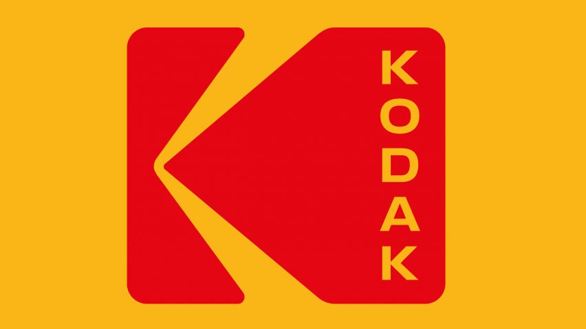
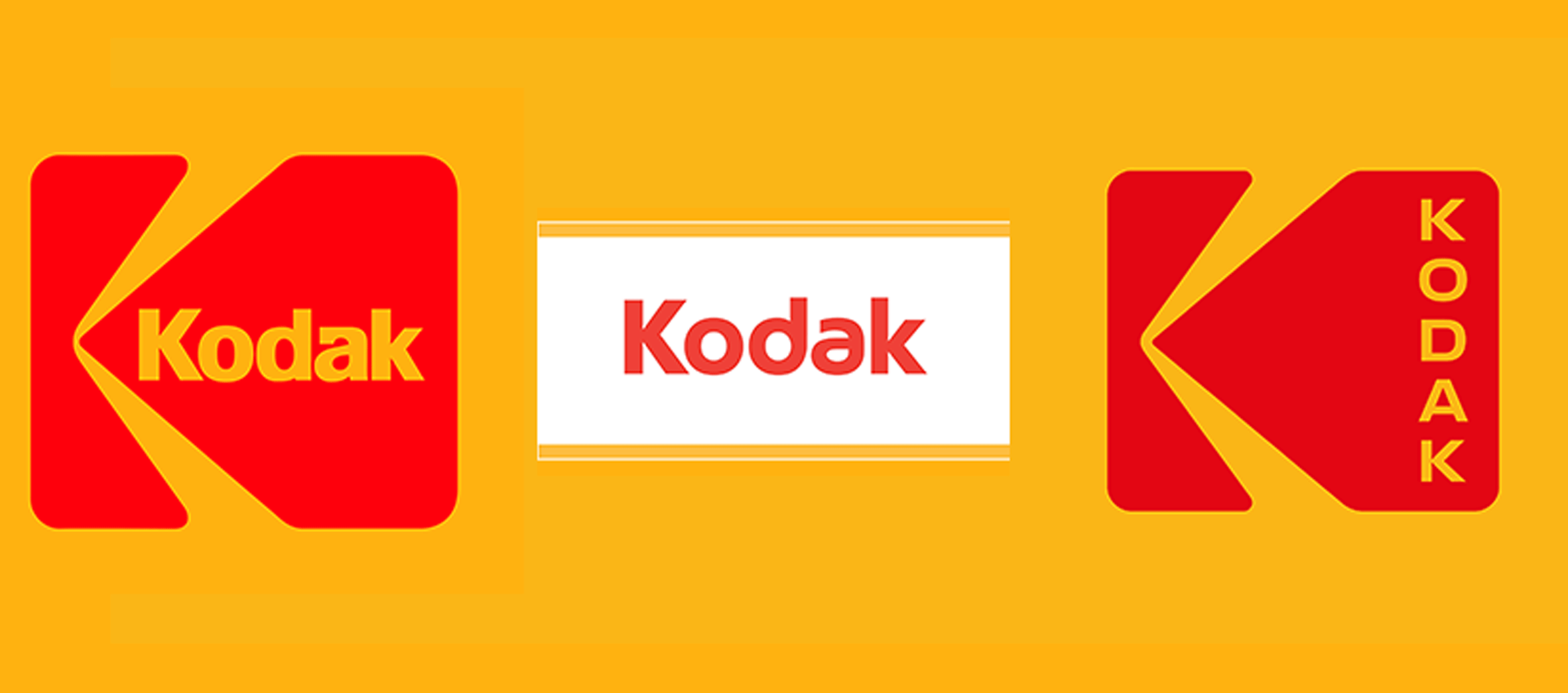
Kodak has rebranded for the first time in 10 years, ditching its typographic logo for a red and yellow version of the marque it used during the 1970s and 80s.
The logo is part of a wider identity refresh by New York-based studio Work-Order, which based its redesign on the Kodak brand.
"We wanted to let the logo be new again," said Work-Order co-founder Keira Alexandra. "We were extremely careful to be respectful to the legacy of the brand, honouring the science and creative vision of Kodak."
Some of the other companies taking up the trend for minimalist branding have also looked to earlier iterations of their logos for inspiration.

Recently, design agency Pentagram created a new logo and visual identity for Mastercard.
The updated version retained the two overlapping red and yellow circles, but swapped the stripes in the central portion for a block orange colour. The finished product looks significantly like the company's logo from 1979.
Although similar to the the K symbol first introduced in 1971, the new logo displays the word 'Kodak' positioned vertically instead of horizontally.

As with all the company's previous logos, it features Kodak's trademarked Dress Red and Dress Yellow colours.
It also differs dramatically from the camera brand's most recent logo, which is has been used since 2006.
The previous logo simply featured the company's name in a red, sans-serif typeface underlined in yellow.
The rebrand comes after the company revealed it was venturing into the smartphone market with a handset that puts photographic capabilities first.
Other major companies who have recently rebranded include food delivery company Deliveroo and taxi app Uber – whose new logo was likened to an "asshole".