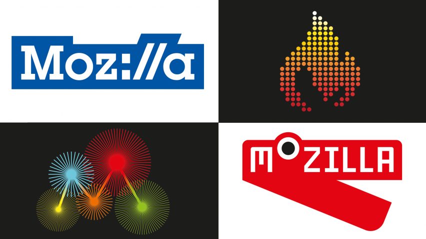
London studio Johnson Banks is almost finished with its rebrand for software community Mozilla, which has been carried out in public.
The Mozilla rebranding process began in June. The company had struggled to distance itself from its best-known Firefox web browser and undertook the refresh to raise awareness of its other projects.
They set up an "open design" blog as public platform for content to be posted, inviting discussion and feedback at each of the four stages of the rebrand.
"In their initial brief there was a small section airing the idea of doing the rebrand 'in the open'," designer Michael Johnson told Dezeen. "When we got down to the final two, most of their questions were about the idea of opening up the process."
"Mozilla's view was that – if they are a an open-source software company, why not do the same for their rebrand?"
In June, Mozilla posted a series of articles detailing seven possible concepts for its new direction.
Having gathered the public feedback from the blog and from a conference in London, they enlisted London studio Johnson Banks to narrow the themes down to five – The Good Fight, For the Internet of People, Choose Open, With You from the Start and Mavericks United.
These themes were then developed into seven possible design routes: The Eye, The Connector, The Open Button, The Protocol, Wireframe World, The Impossible M and Flik Flak.
The Eye design is based around a cat eye-like yellow shape, the colourful Connector identity was inspired by circuitry and tribal patterns, while the Open Button is intended to represent Mozilla's view on the internet being open to everyone.
The Protocol uses a colon and two forward slashes, Wireframe World was developed out of experiments with 3D grids, The Impossible M is inspired by computer graphics and optical illusions, and Flik Flak is made up of isometric characters.
Using public feedback, these designs were reworked and narrowed down again to four final selections.
Protocol remained in the final lineup, but three new additions named Dino, Flame and Burst were introduced through alterations of the existing concepts.
"While we've continued to work on all four designs, Dino 2.0 and Flame show the most dramatic progress in response to feedback from conference attendees and Mozillians," Mozilla's Tim Murray wrote on the company's open design blog. "We wanted to refine these designs prior to testing with broader audiences."
These designs were put to a test audience, who were asked to compare just one of the four designs to a series of brand attributes for Mozilla.
"This research phase will provide additional data to help us select our final recommendation," Murray said. "It will help us discern, for instance, which of these four pathways resonates best with which segment of our audience."
Blog comments, live crit sessions and Mozilla's strategic goals also factored into the decision – which will ultimately see the company combine the Burst and Protocol identities.
Mozilla and Johnson Banks are expected to publish the initial concepts for the final design imminently.

