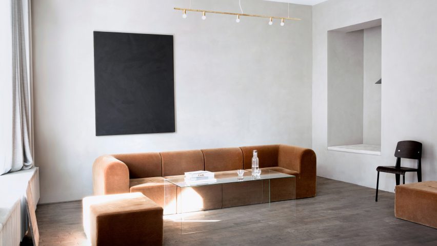
Danish studio Norm Architects has taken influences from both Scandinavian and Japanese design to create this pared-back gallery and workspace for Kinfolk magazine in central Copenhagen.
The local studio worked closely with Kinfolk's editor-in-chief Nathan Williams and communications director Jessica Gray to develop the design, which features a gallery as well as an office.
The aim was to create a collaborative workspace where the magazine's staff could meet together but also invite friends and partners to share ideas. A palette of wood and plaster in muted tones creates an informal, home-like environment that is more akin to a lounge than an office.
"Much like human wellbeing, the essence of our work is found in balance – between richness and restraint, between order and complexity," said Norm Architects. "Our vision is to look beyond sight. We want to create spaces that feel good in every way. "
The space is divided into three zones that increase in privacy as they recede back from the street.
A large shop window fronts the first space, which faces out onto Amagertorv and is used as a gallery space. The Kinfolk Gallery opened earlier this year with a first exhibition focusing on contemporary furniture.
The second space centres on a large round table and features wooden shelving, as well as plush orange sofas and a glass coffee table.
"While the gallery and office areas are spacious and connected into one open-space plan, the back rooms are more classic Copenhagen style with small rooms and wooden moulding and millwork," explained the architects.
"The space is designed to be bright, light and harmonised in the front area, while it's slowly getting darker and more intimate as you move through a series of narrow door openings that stretch from floor to ceiling, expanding the sense of height in the space," they added.
The final section is completely disconnected from the public areas – both physically and in terms of style.
This open-plan workspace is furnished with banks of bespoke oak tables, and has walls covered in sandy-toned plaster that give them a "special earthy wabi-sabi quality". The plasterwork is intended to echo the facades of Copenhagen's neoclassical buildings.
Rectangular niches in the walls are used to display design objects, to host light fittings and as casual seating areas.
"The interior architecture is minimalist but thoughtful, with attention to every little detail," said the architects. "Every single tone, nuance and material in the space has been carefully selected to create a harmonious, precise and natural feel with haptic qualities that we felt were well suited for the Kinfolk credo of slow living."
Spaces are furnished with off-the-peg pieces from design brands Menu, Vitra and Muuto, while a custom leather-upholstered bench below the front window provides a spot for impromptu meetings or people watching.
"The big sitting nook in the corner is created with an inspiration from the Japanese tokonoma," explained the architects. "In traditional Japanese architecture you don't break the rectangularity of the rhythm of tatami. Niches and storage are pushed out of the rectangular space, as is the case here."
"While the tokonoma is usually for displaying important scrolls, this nook is meant as a small space where you can curl up with a book or your laptop," they added.
Dezeen's US editor Dan Howarth spoke to Nathan William's earlier this year about how the Portland-based magazine became one of the most influential forces in the design world.
Project credits:
Architecture: Norm Architects
Collaborators: Apparatus, B&O Play, Dinesen, Fade Acoustic Ceilings, Lambert & Fils, Kabe, Kvadrat, Menu, Muuto, Paustian, Reform, Rich Brilliant Willing, Sørensen Leather, Vitra, Vola 6

