12 minimalist office interiors where there's plenty of space to think
If the old adage "tidy desk, tidy mind" holds true, then the workers at these 12 minimalist offices are at their mental peak.
From an advertising agency in Buenos Aires to a TV studio in Bangkok and the headquarters of Aesop in London, take a tour of some of the best calm and pared-back workspaces around the globe.
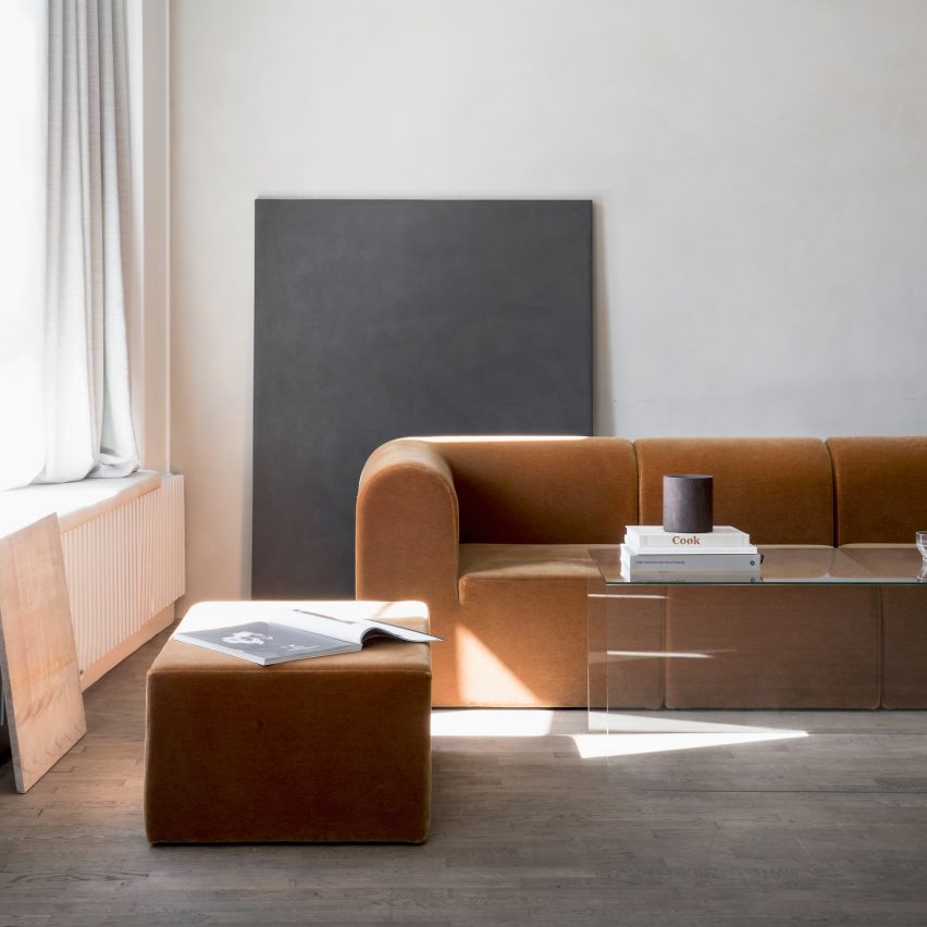
Kinfolk magazine office by Norm Architects
Danish studio Norm Architects took influences from both Scandinavian and Japanese design to create this pared-back gallery and workspace for Kinfolk magazine in central Copenhagen.
A palette of wood and plaster in muted tones creates an informal, home-like environment that is more akin to a lounge than an office.
Read more about Kinfolk magazine office ›

Dynamo office by Anne Sophie Goneau
Canadian designer Anne Sophie Goneau transformed part of an old building into this workspace for tech company Dynamo, located in a part of Montreal that has become a creative hub.
The designer used glass, drywall and the existing concrete structure. The floors are painted dark blue, and the kitchen is fitted with light-grey lacquered cabinetry.
Read more about Dynamo office ›
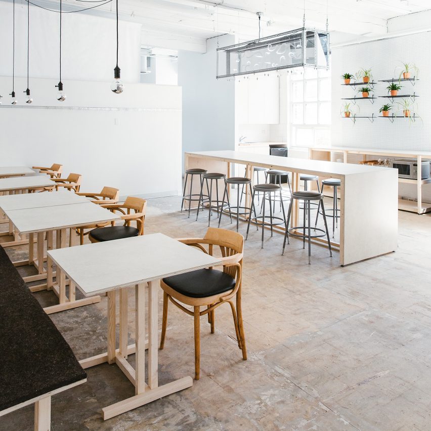
68 Claremont Free Space by Tom Chung Studio
Canadian firm Tom Chung Studio converted an industrial space in downtown Toronto into Free Space, an office and events facility with furniture that can be easily reconfigured.
The studio created a series of rooms, with a drapery track system that enables the space to be reconfigured for different uses. Materials are economical, hard-wearing and required little or no finishing.
Read more about 68 Claremont Free Space ›
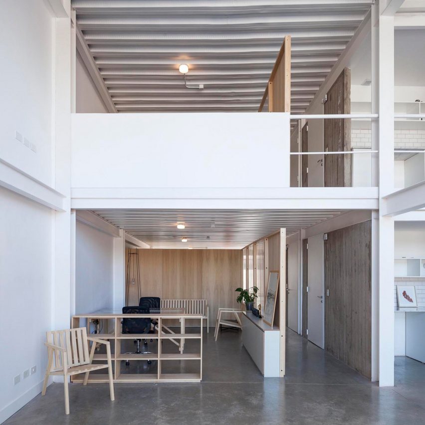
Argentinian studio It Met used corrugated plastic and sheets of wood to partition the workspaces of this advertising agency in Buenos Aires.
The It Met team wanted to adapt the building to better suit the nature of the company, and decided to create versatile spaces through the use of translucent, opaque and soundproof panels.
Read more about Circus office ›
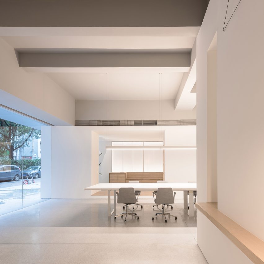
Atelier Peter Fong by Lukstudio
White boxes contain different spaces for socialising and working inside the cafe and co-working space Atelier Peter Fong in Guangzhou, which was recently fitted out by Lukstudio.
Lukstudio's concept involves containing different areas within a series of voids. The voids, which appear as white boxes on the building's facade, encompass a cafe, brainstorming area, meeting room and a breakout lounge.
Read more about Atelier Peter Fong ›
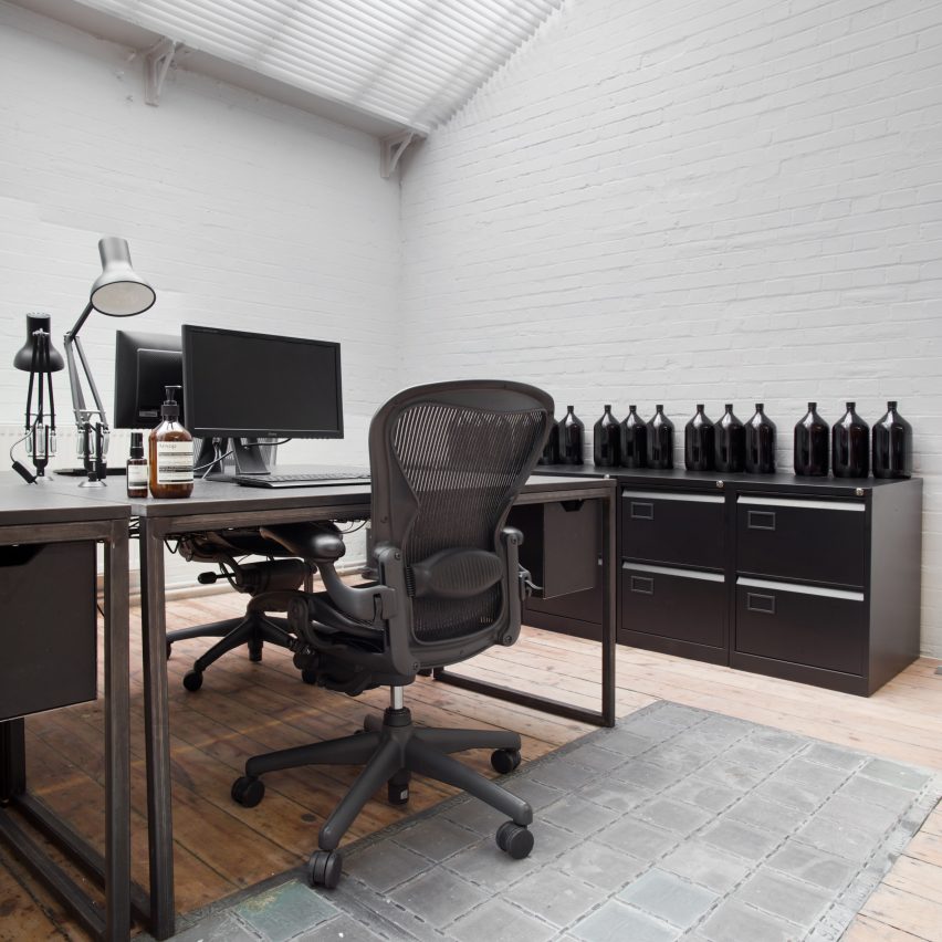
Aesop head office by Post-Office
Philippe Malouin's design studio Post-Office used a minimal colour palette and custom-designed furniture to turn a London warehouse into the UK head office of skincare brand Aesop.
Located within a former manufacturing warehouse in Bloomsbury, the 232-square-metre space is split into two rooms – both with a pared-back look designed to respect the original building.
Read more about Aesop head office ›
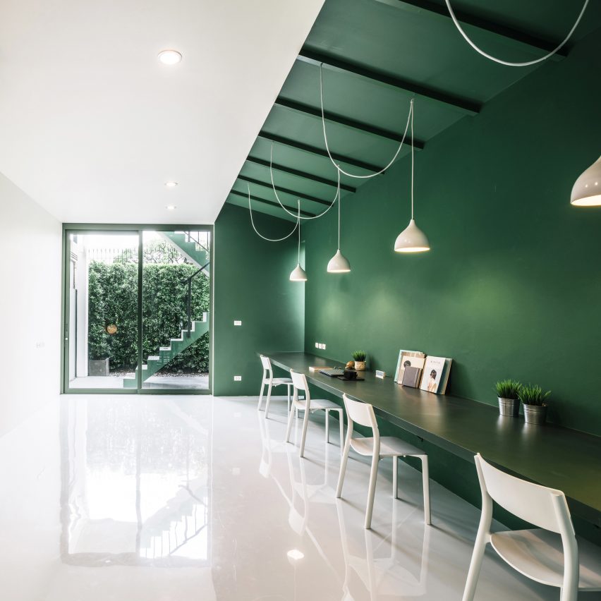
Green 26 production office by Anonymstudio
Splashes of green are used throughout this Thai TV production office in Bangkok, revamped by Thai firm Anonymstudio.
Contrasting green and white ceilings and walls feature throughout the 60-square-metre office. The working space is simple and spacious, furnished by a long desk in dark green and contrasting white chairs.
Read more about Green 26 production office ›
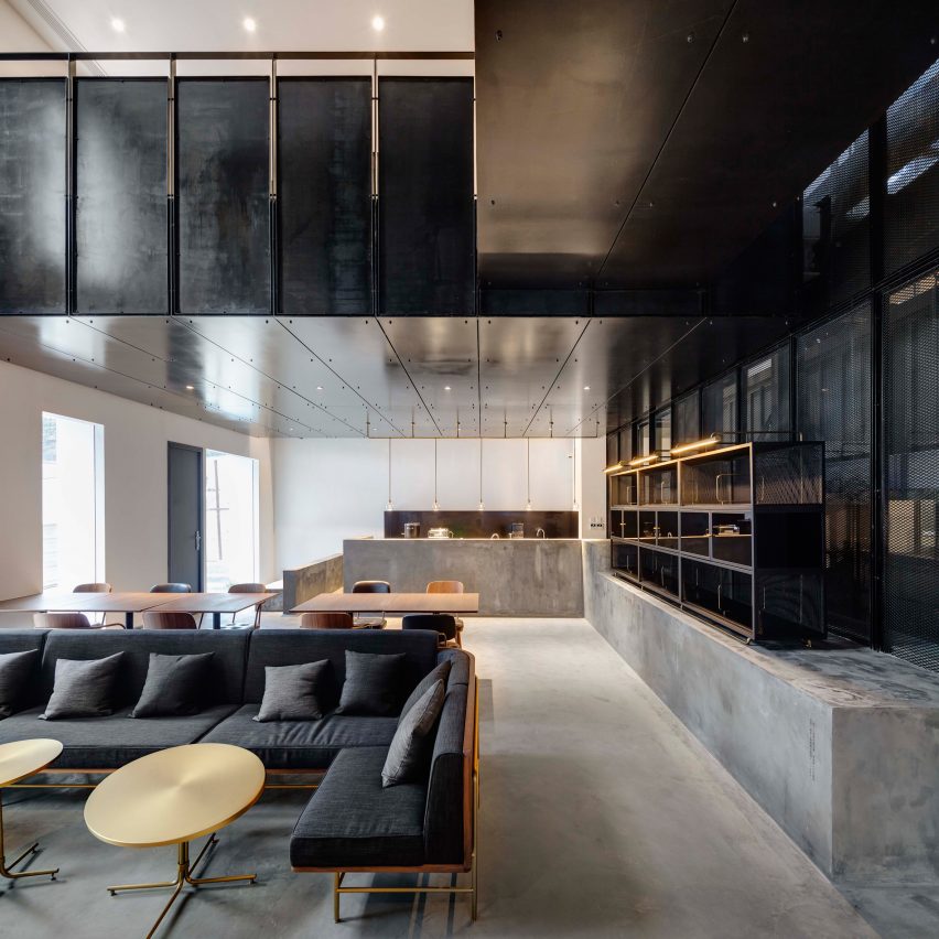
Shanghai studio Neri&Hu has converted a former missile factory in Beijing into this car repair garage and offices with an industrial-style metal staircase.
Preserving as much of the original building as possible, Neri&Hu juxtaposed metalwork and grey paintwork with refined walnut timber and brushed bronze elements that recall the craftsmanship of antique cars.
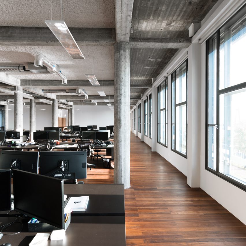
KAAN Architecten office by KAAN Architecten
Dutch studio KAAN Architecten works in offices of its own design in Rotterdam, featuring coarse concrete columns, smooth white walls and rich walnut floorboards.
KAAN Architecten converted the 1950s De Nederlandsche Bank building to create its 1,400-square-metre headquarters. It describes the office's utilitarian layout with refined details as "functionalism with added value".
Read more about KAAN Architecten office ›
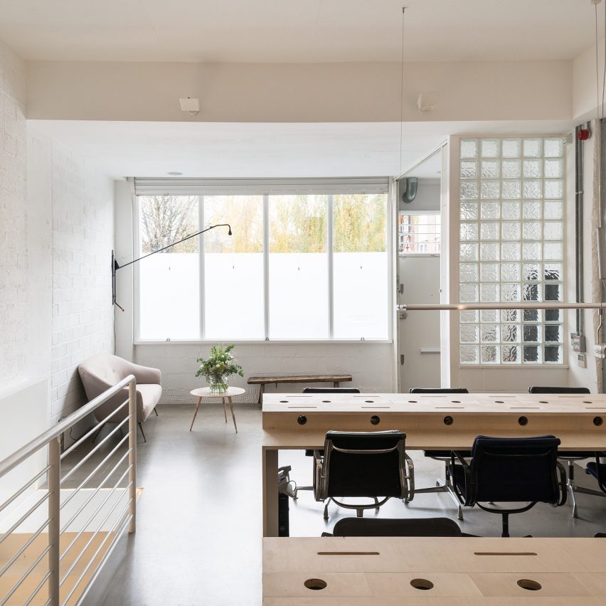
The Modern House by The Modern House and Assemble's Louis Schulz
Tables and desks by Louis Schulz from Turner Prize-winning studio Assemble are paired with vintage furniture and contemporary artworks in the office of architecture-led estate agent The Modern House.
The aim was to create a space the reflects the ethos of the brand, which specialises in the sale and letting of Modernist houses.
Read more about The Modern House ›
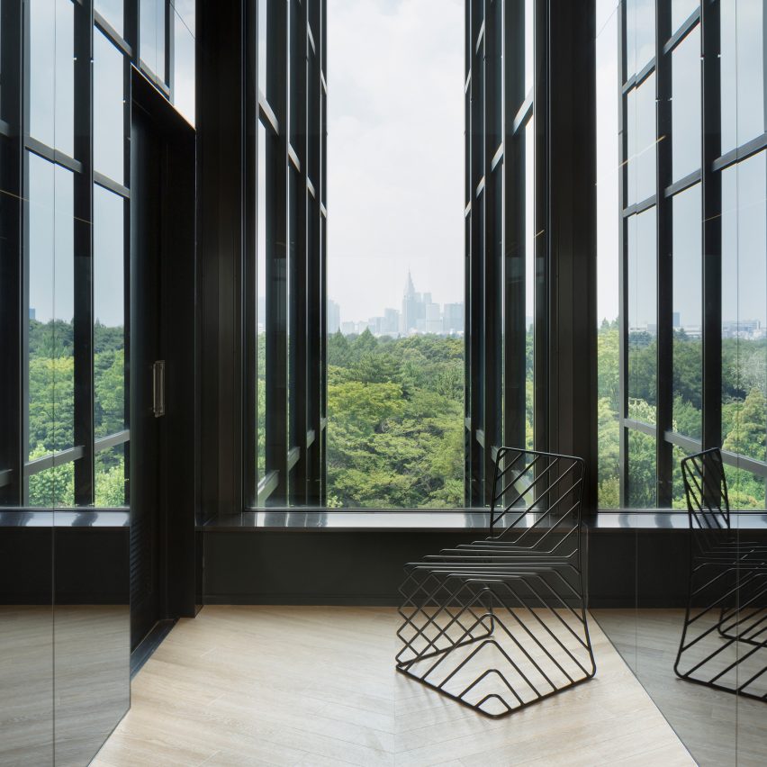
Sogetsu Kaikan office by Nendo
Japanese design studio Nendo designed a set of mirrored interiors for a cafe and office in Tokyo's Kenzo Tange-designed Sogetsu Kaikan building.
The building's L-shaped corridors are flanked by mirrored sections framed in black, which echo the building's aluminium window frames. Pale wooden floors change grain to indicate the relative position of the centre's exterior reflective wall.
Read more about Sogetsu Kaikan office ›
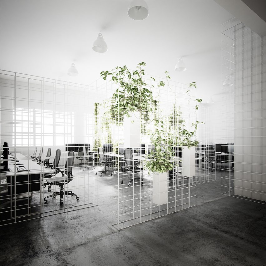
Squint/Opera animation studio by Sibling
Australian design studio Sibling installed a grid system based on 3D rendering programmes to define the working areas within the Melbourne headquarters of digital animation studio Squint/Opera.
As well as defining work spaces, the white-coated steel mesh grid is also designed to create a level of privacy while allowing views through the office.
Read more about Squint/Opera animation studio ›