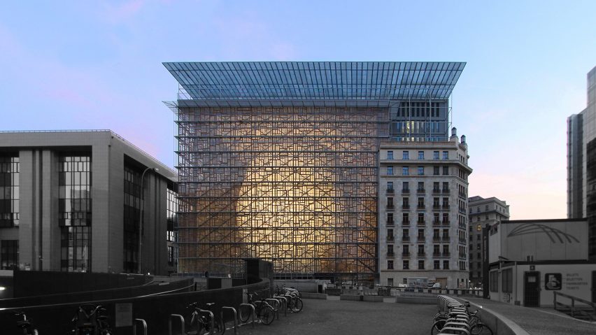
The European Union's new Brussels headquarters leads this week's comments update, after some readers claimed the building was a reason to rejoice in Brexit.
Red, white and blue elephant: the European Union's new €320 million headquarters has sparked a debate on the organisation's ethics – a topic which is still a hot potato following the result of the EU referendum.
"This monstrosity reaffirms that Brexit was the best decision Britain could make," said regular commenter Derek_V.
"Looking at this expensive building confirms to me why country wants to flee from the EU. Liberal hypocrisy at its finest," said Fern.
"This seems like a pure vanity project, which will undoubtedly add extra fuel to the pro-Brexit stance," wrote HughAdd.
One reader put aside the politics and focused on the building's architecture:
Read the comments on this story ›
My studio: commenters are reacting to Tracey Emin's announcement that she will relocate from London to the Kent coast, after planning permission for her David Chipperfield-designed studio extension was rejected.
"They just don't want a historic building to be demolished. It's not about her at all," wrote Jane.
"Planning is there for a reason. Just because you are a rich artist does not give you right to build what you want," said a user called Lord Alan.
But some felt approval should be granted in these situations, to prevent an exodus of creatives leaving the capital.
"There must be tonnes of 1920s buildings floating around the UK. Surely you would only keep the significant ones," wrote Joshua. "We can't treat every city like a museum piece."
One reader urged the British artist to look on the bright side:
Read the comments on this story ›
BIG rebrand: Bjarke Ingels' firm has been tapped to help build a new brand identity for the Nordic region – an appointment that readers felt was perfect for the Danish architect.
"Bjarke finally fulfills his destiny by entering into the marketing field," wrote user Dvxa.
"I don't know any architect better suitable for this kind of job," agreed Guest.
"Call me myopic, but what exactly does this branding entail?" asked Delbert. "A new flag? Coat of arms? Universal Nordic cigarette packs?"
A user called Ricky came up with a working title for the project:
Read the comments on this story ›
New tricks: Richard Murphy's "box of tricks" home has been named UK house of the year 2016, but its postmodernist-inspired design was met with scepticism in the comments section.
"UK house of the year 1995," wrote Cyrus. "I do not want to begrudge this home, but, for me, it seems a bit gimmicky," said Jjang.
But the building's unusual quirks, which include secret hatches, moving walls and a sliding ladder, won just as many admirers.
"I appreciate the strangeness here, and idiosyncratic detailing missing from many projects," said user WaxWing.
One commenter pointed out that you can't please them all:
Read the comments on this story ›

