From illustrated responses to the US election and Brexit, to posters for the Rio Olympics, Dezeen managing editor Olivia Mull picks the graphics and illustrations that tell the story of the last 12 months, as part of our review of 2016.
Illustrated tributes to David Bowie
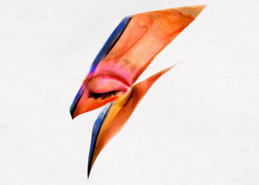
The loss of David Bowie at the beginning of 2016 came as a huge shock to the creative community. After hearing the news, illustrators and graphic designers were quick to post illustrated tributes on social media.
One of the most shared images is this gif by British illustrator Helen Green, which flicks through Bowie's style reinventions through the years. Other designers used the iconic lightning bolt from Bowie's Aladdin Sane album cover as the basis for their images.
See more illustrated tributes to David Bowie ›
Illustrators' peaceful responses to Brussels attacks
Illustrations shared on social media are increasingly becoming a focus for peaceful responses to terror attacks. In the wake of the Paris attacks in November 2015, it was Jean Julien's Peace for Paris illustration that became a symbol of unity.
This continued after the explosions in Brussels earlier this year, with cartoons cropping up all over social media – including drawings of iconic Belgian cartoon character Tintin and various versions of the Manneken Pis statue.
See more illustrated responses to the Brussels attacks ›
Illustrators and creatives react to Brexit vote
Illustrators were also quick to post their reactions to UK's vote in favour of leaving the European Union on Instagram and Twitter.
Many of the images posted by the creative community – the majority of which was vocal in its support to remain in the EU ahead of the referendum – show one of the 12 yellow stars of the EU flag fallen out of the circular arrangement, or replaced with a teardrop.
In Andrea Angeli's picture of a bunch of balloons, each displaying the EU member countries' flags, the UK's string has been snipped.
See more illustrated responses to UK's Brexit vote ›
LondonIsOpen poster campaign for the Tube
In August, London mayor Sadiq Khan launched the LondonIsOpen initiative with the aim to show that London is both united and open to the world, despite the Brexit vote.
David Shrigley was among the artists who designed posters for the London Underground as part of the campaign. Shrigley's poster features London written in black, while coloured sketches of the world replace the letter O.
See more LondonIsOpen posters ›
Official Rio 2016 Olympics posters
The official posters for this year's summer Olympics in Rio de Janeiro were designed by 13 artists from Brazil and Colombia.
The brightly coloured posters depict images that each of the artists felt were representative of the Brazilian city, including a muscular runner on Copacabana Beach, a child flying a kite over a favela, and a representation of the five rings and the torch.
See more of the official Rio Olympics posters ›
This year was the first time that a team of refugees competed in the Olympic Games. During the opening ceremony, the 10 athletes from four different countries walked under the Olympic flag to the Olympic anthem.
As a response, Refugee Nation commissioned a flag in hopes it would be used by the team. Artist and Syrian refugee Yara Said created this design, which uses black and orange to represent the colour of life jackets worn by refugees when making dangerous sea crossings.
Read more about the alternative flag design ›
MoMA's acquisition of original emojis
Last year, the Oxford Dictionaries made history when it named an emoji as its word of 2015. This year, the emoji gained more recognition when New York's Museum of Modern Art announced the addition of the original 176 emoji set to its collection of "humble masterpieces".
This small set of characters was created by designer Shigetaka Kurita for the Nippon Telegraph and Telephone 's i-mode mobile internet platform in 1999.
Read more about the MoMA acquisition ›
Peter Saville's graphic identity for London's Tate Modern
The opening of Tate Modern's new Herzog and de Meuron-designed extension was one of the architectural highlights of the year.
To coincide with the event, British graphic design legend Peter Saville updated Tate Modern's graphic identity to a colourful model of the complex, which features the main exhibition space and the new twisting brick extension in an orange-yellow tone.
Read more about the Tate's new identity ›
Illustrators reactions to Donald Trump's US election win
In the aftermath of Donald Trump's shock election win, many ominous graphics and caricatures depicting the former real estate mogul and reality TV star – mainly unfavourably – trickled onto social media sites.
An illustration by David Rowe shows a scene where a stunned Lady Liberty wakes up to find Trump next to her in bed, while this simple drawing by Matt Blease shows one of the slogan-emblazoned baseball caps seen at many Trump rallies, but replaces the text with "Make America vote again?"
See more illustrated responses to Trump's victory ›
David Shrigley's "thumbs up" teaser for his Fourth Plinth sculpture
On a lighter note, 2016 also saw David Shrigley became the eighth artist to create a large-scale sculpture for the empty plinth in London's Trafalgar Square as part of Fourth Plinth – one of the UK's most prestigious art commissions.
Shrigley unveiled a cartoon teaser gif just before the installation was unveiled, showing a huge hand with a bizarrely elongated thumb. His 10-metre-high sculpture, named Really Good, turned out to look exactly like it.
Read more about the commission in our interview with Shrigley ›

