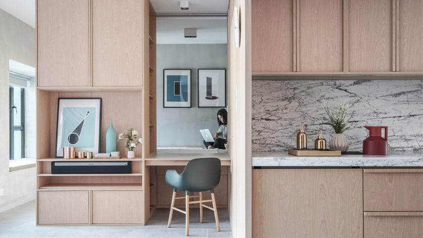
JAAK reconfigures Hong Kong apartment with space-saving cabinetry
Interiors studio JAAK has used custom cabinetry to convert a two-bedroom apartment in Hong Kong into a more open-plan home.
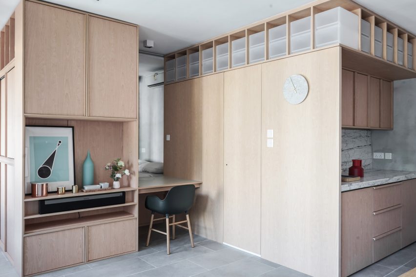
The Hong Kong studio looked to Japanese homes for ideas when renovating the 33-square-metre apartment named Kevin, to cater to the couple's requirement of a bright and flexible living space.
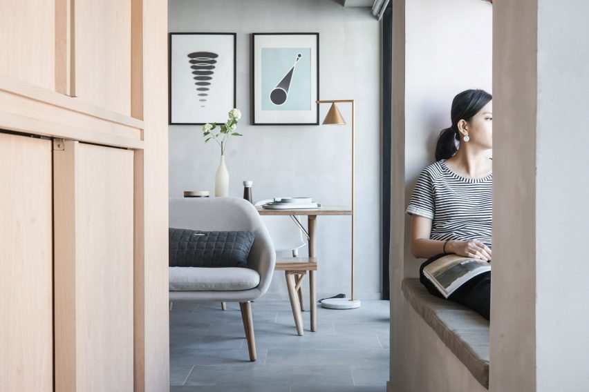
The clients, a single- rather than multi-generational family, had no need for the property's existing second bedroom so this was done away with in the new layout.
"Although Hong Kong has been a predominantly Chinese society, one cannot help noticing traditional Chinese family values have been diminishing," design director Calvin Cheng told Dezeen.

"Soaring real estate prices and stagnant wages have resulted in a class of 'DINC' – Double Income, No Children – couples not conforming to the traditional family mantra," he added.
"However, local real estate moguls have been slow to adapt, developing apartments with partitions and tradition in mind."
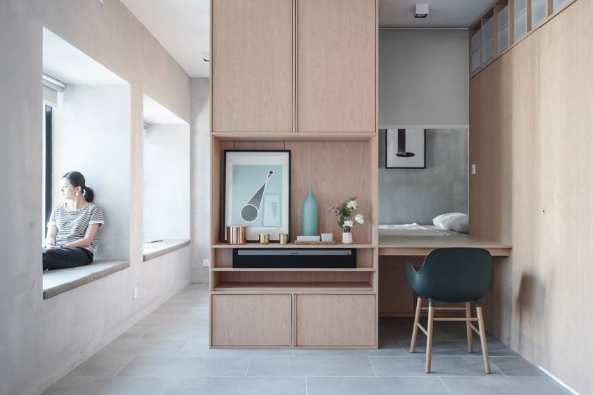
The studio first removed the apartment's existing partitions, typical of Chinese homes, to create a flexible open-plan living space.
Repartitioning the compact home made room for generously sized windows with seats and an engawa – a corridor-like space along one side of the home that helps maximise natural light from the windows.
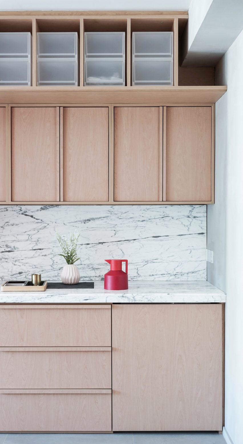
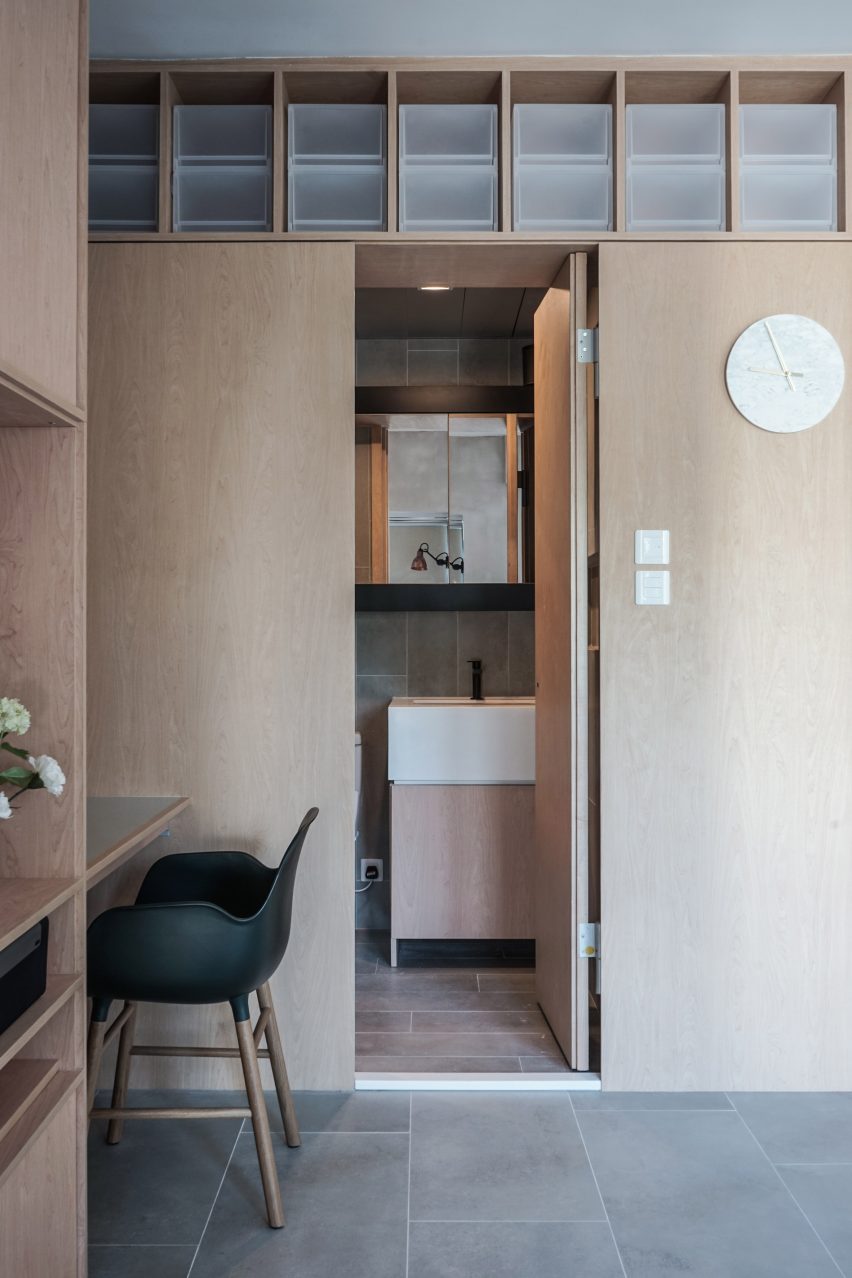
Custom-made wooden cabinetry was then introduced to recreate divisions within the home, but the only fully enclosed space is the bathroom, which is hidden by a secret door.
The bedroom, visible behind a built-in desk, is also partially enclosed and accessed by two steps tucked behind the fitted units.
An opening between the bed and desk is fitted with a blind in order to provide privacy while working and sleeping.
Together with the existing concrete walls, the white oak units and marble countertops, the studio has created earthen-toned interiors, which are accentuated by the new abundance of natural light.
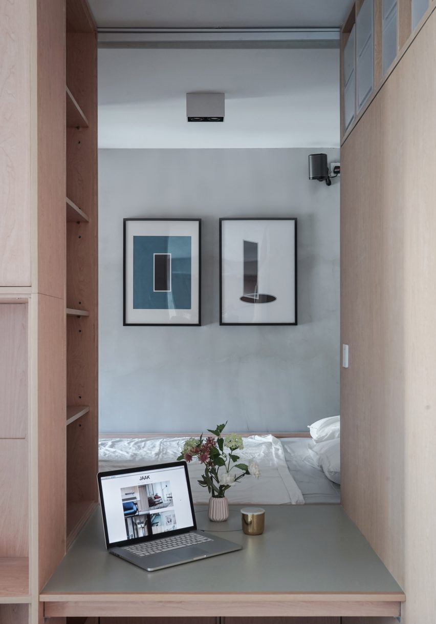
Storage is incorporated into the custom-designed units as a space-saving solution. Above the bathroom there is a row of cubbies, while the bed is raised on a platform to create storage below.
To avoid cluttering the small home, appliances are hidden behind the built-in cabinetry ensuring that the home remains uncluttered and "space is maximised on a mental level".
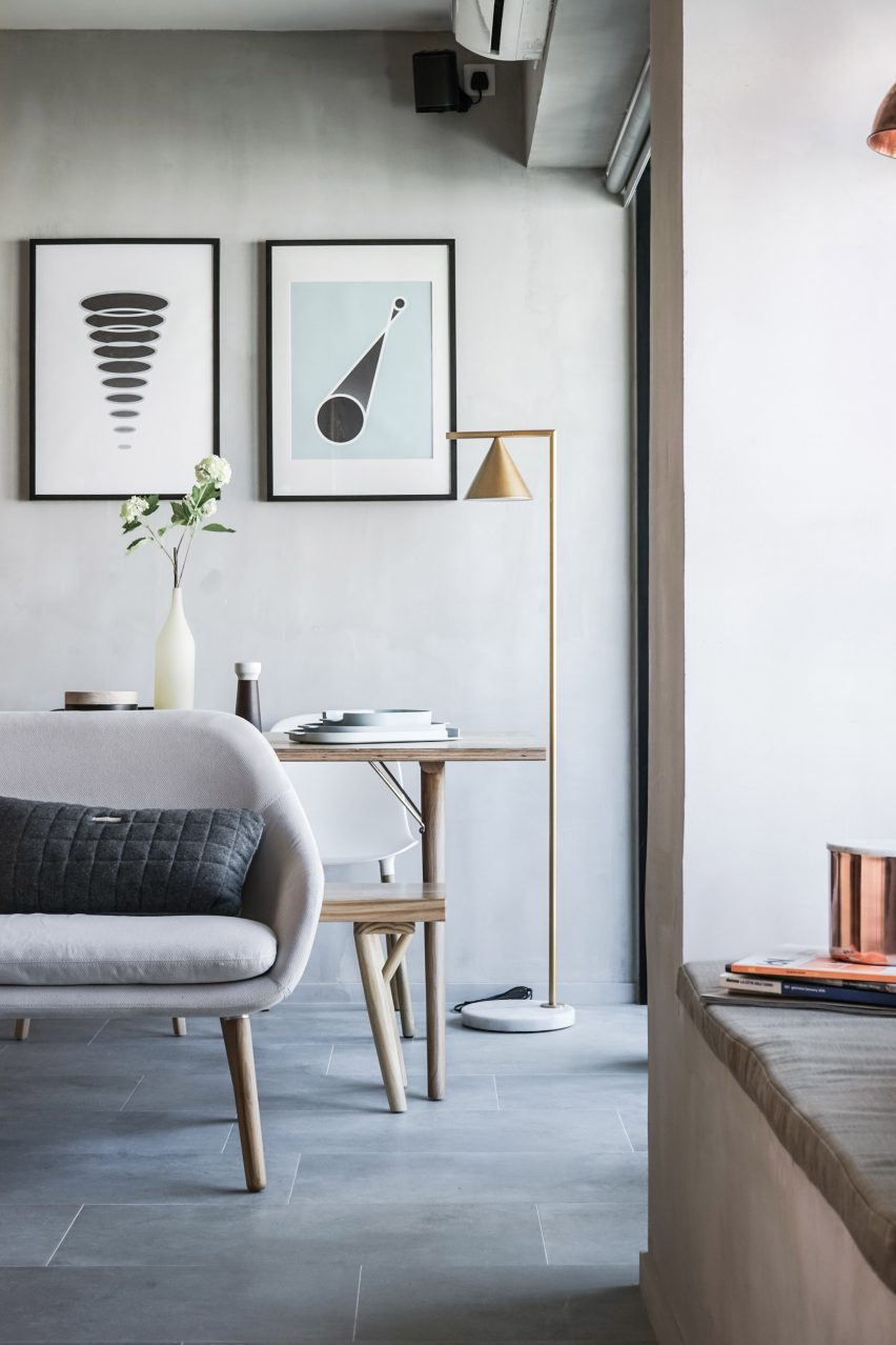
The apartment's clean aesthetic is reflected in the choice of abstract graphics designed by the firm's graphic design partners, based on four movies about the universe, including Apollo 13.
JAAK's design continues an emerging trend in Chinese cities for the removal of traditional partitions to create brighter open-planned apartments like An Apartment Without Centre.
Designers Lim + Lu also removed a number of internal walls in their apartment renovation, creating a colourful light-filled home that doubles as a showroom.

