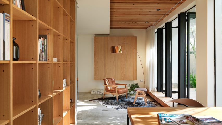
Taiwanese firm Soar Design Studio and architect Chen-Tien Chu have refurbished a 1960s house in the city of Taichung, creating open and connected spaces that look out onto a series of garden terraces.
The existing brick structure of the residence had become outdated and required significant modernisation to suit the needs of a young family, who had originally considered demolishing it and rebuilding.
One of the key aims of the renovation by Soar Design Studio and Tien-Chu Chen Architect Associates was to improve the connection between the interior and external spaces including a compact garden and various balconies.
The project is titled Wabi-Sabi House, after the Japanese aesthetic principle of celebrating beauty that is imperfect, impermanent or incomplete.
An open-plan layout enables the kitchen, dining area and lounge to open directly onto decked platforms that extend these spaces into patios squeezed between the building's facades and the boundary wall.
"We decreased the interior space to increase the area of the patio or balconies floor by floor to bring in the outdoor landscape," architect Ray Chang told Dezeen.
On the west side of the building, a section of the wall was removed and replaced with a row of glazed doors that pivot outwards onto a garden planted with trees. A row of steel I-beams was incorporated into the new opening to reinforce the structure.
In the lounge area, a wooden deck extends from inside to outside, creating a consistent element that is complemented by a countertop which extends the full length of the interior and continues through the glazed wall to the garden.
The external decked area is sheltered beneath an overhanging section of the floor above, with a sliding glass door opening the space up to the elements.
In response to Taiwan's tropical climate, the building features a series of deep balconies that shade the windows and help to draw cool air into the interior. Trees were introduced around the perimeter to provide additional shade and privacy for the occupants, as well as offering a view of greenery from inside the living areas.
A staircase ascends to a first floor accommodating two bedrooms, a bathroom and a lounge that opens out onto a large balcony with a simple wooden bench and views of the surrounding neighbourhood.
A void above this living space allows natural light from the level above to filter down and creates a visual link between the two storeys.
"We wanted to improve the family interaction, whether in the horizontal or in the vertical dimension," said Chang. "So we minimised each room's size to increase the area of the public space of family."
"The double-height void is also for family interaction between the parent's rooms on the second floor and children's floor above. We hope they can always enjoy this family interaction in every corner in the house."
Windows on either side of the void on the second floor add a further dialogue between the internal spaces. This storey contains another bedroom, a box room and a landing lined on one side with sliding doors that open onto a balcony.
The architects attempted to retain the character of the original building by using natural materials such as stone, wood, metal and concrete to complement the materiality of the existing interior elements.
The staircase with its classical wooden handrail and turned balustrades, for example, was preserved as it represents one of the building's most distinctive original features.
Among Soar Design Studio's previous projects is a hair salon where customers sit face-to-face around one long table.

