"Granada is denied a modernist masterpiece"
Readers are decrying the decision to scrap Álvaro Siza's design for a new entrance and visitor centre at historic Granada palace the Alhambra in this week's comments update.
Nada for Grenada: Portuguese architect Álvaro Siza has been asked to completely revise his proposal for the UNESCO world heritage site, after a report from the International Council on Monuments and Sites described the designs as "invasive".
"Siza's plan burrowed into the hillside and had a long series of ramps across low lying roofs to step people up to the Alhambra," wrote Stoney, one of many readers angered by the decision.
"It was completely small-scale and so unfussy there's no way any controversy could be on it. There's some power struggle going on here that has nothing to do with the design."
"Build it underground. This 'invasive' rhetoric is garbage" agreed Spadestick.
One regular commenter also expressed disappointment over the news:
Read the comments on this story ›

E-fail: readers are arguing over a leaked email from Zaha Hadid Architects head Patrik Schumacher, which claimed the open letter sent out by the firm disowning his controversial comments was issued by head of press Roger Howie without permission.
"Poor guy was just doing his job and trying to salvage ZHA's ever declining reputation since the passing of its leader," said Fred.
"This reads like a very badly written break-up letter," added Johan.
But some commenters came to Patrik's defence. "Give me an honest update over lies with a personal agenda any day," wrote Jeffrey. "What's more upsetting is the fact that a staff member shared such a private email as this."
One commenter pointed out a small but amusing detail:
Read the comments on this story ›

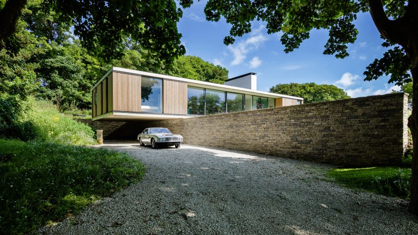
Retire in style: this contemporary bungalow in the English countryside by Ström Architects has challenged readers' views on what a retirement residence could look like.
"Now THAT is a retirement home!" said regular commenter Mr Walnut Grey.
"Just about my favourite house ever," said Gavin. "Gives me hope as an architect, that homes like this are both wanted and achievable."
A few readers praised the building's functional aesthetic:
Read the comments on this story ›

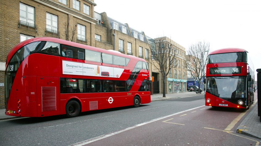
Thrown under a bus: the news that London mayor Sadiq Khan has discontinued the Thomas Heatherwick-designed double-decker buses has divided reader opinion, with some defending the retro design and others happy to see it go.
"This is a terrible loss to London driven by a man who has promised to underinvest in London transport," wrote Atlas. "Those buses are so beautiful and let us enjoy a bit of good design on our journey around the city," agreed ArchitecturalDesigner.
"They were too expensive and useless, trying to emulate the old Routemaster and undeniably failing at it," said a user called Clouds.
One commenter called for the replacement design to be more forward-thinking:
Read the comments on this story ›