AIA reveals winners of 2017 Honor Awards for the year's best American architecture
Shigeru Ban's Colorado art museum, a Senegalese cultural centre by Toshiko Mori and a Pinterest office in San Francisco are among this year's recipients of design awards from the American Institute of Architects.
The AIA has announced 23 winners of its 2017 Honor Awards, described as "the profession's highest recognition of works that exemplify excellence in architecture, interior architecture and urban design". The awards are bestowed upon architects licensed in the United States, although the projects can be located around the world.
The Aspen Art Museum in Colorado – designed by Shigeru Ban Architects with associate firm CCY Architects – and Thread: Artists' Residency and Cultural Center in rural Senegal by Toshiko Mori Architect were among the honorees in the architecture category.
Other architecture winners include a micro-unit apartment tower in Manhattan, an energy facility at Standard University and the adaptive reuse of a tobacco warehouse in Brooklyn.
The Pinterest headquarters in San Francisco, by IwamotoScott with Brereton Architects, was recognised in the interiors category, while an SOM-designed masterplan for Philadelphia's 30th Street Station won in the regional and urban design category.
Chosen from roughly 700 submissions, the award recipients were selected by a jury of architects and academics.
In December, the institute announced it was awarding its 2017 Gold Medal to the late Paul Revere Williams – the first African American to receive the award. Williams, who died in 1980, became the first black architect to join the AIA in 1923.
Read on for an overview of each Honor Award winner from the AIA:
2017 Institute Honor Awards for Architecture
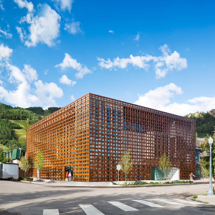
Aspen Art Museum; Aspen, Colorado, by Shigeru Ban Architects with CCY Architects
Founded in the late 1970s as a non-collecting institution, the Aspen Art Museum worked in tandem with the design team to determine programmematic needs and to ensure its new home completely supported the art it hangs. Adhering to a strict 18-month construction schedule, the new museum opened in 2014 and has seen a 400 per cent increase in visitorship and a 1,140 per cent increase in the number of students served by the museum's educational outreach initiatives. Three floors—two above ground, one below—are dedicated to gallery space, while the top floor includes an ample multi-use space, cafe, and public terrace with sweeping views of the Rockies.
Find out more about Aspen Art Museum ›
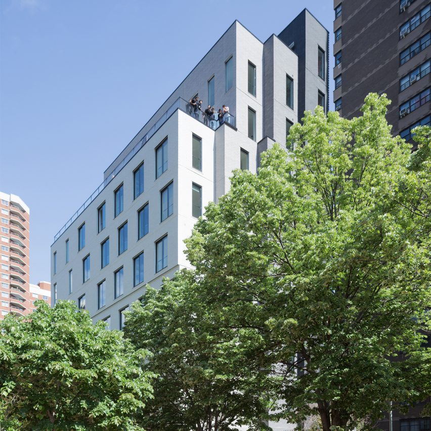
Carmel Place; New York City, by nArchitects
Winner of the 2012 adAPT NYC competition for New York City's first micro-unit apartment building, Carmel Place represents a new housing paradigm for the city's growing small household population. The design of the nine-storey building's 55 units aims for spaciousness and luminosity through the implementation of 9'-8" ceilings, 8' tall sliding windows and Juliet balconies. With a goal of conveying the residents' nested scales of community, afforded by varied interior and exterior shared spaces, the building's brick exterior massing resembles four slender "mini-towers" – a microcosm of the city's skyline.
Find out more about Carmel Place ›
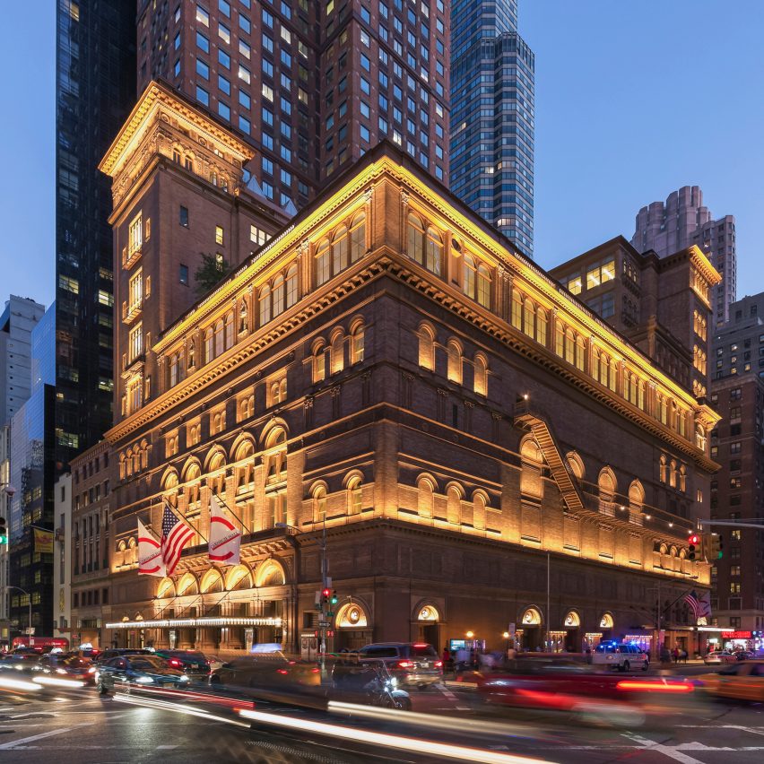
Carnegie Hall Studio Towers Renovation Project; New York City, by Iu + Bibliowicz Architects LLP
The Carnegie Hall Studio Towers Renovation Project centred on: renovation, reorganisation, and repurposing of 167,000 square feet of non-performance venues at the National Historic site. The seven-year project encompassed the creation of a Music Education Wing, new roof terrace, consolidation of administrative offices, expanded backstage space and functionality, and facade lighting to showcase the landmark. Substantial interior structural modifications and infrastructure upgrades aided in the success of the renovation. The project was awarded LEED Silver Certification, one of the oldest and most notable buildings in the country with such distinction.
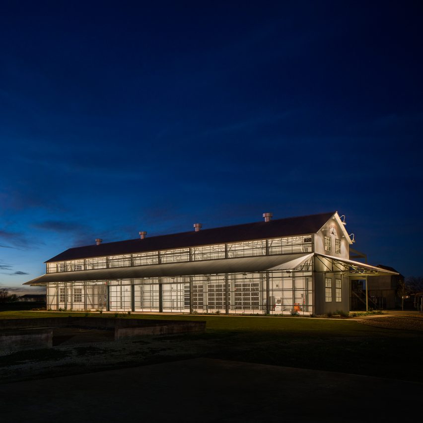
The Cotton Gin at the CO-OP District; Hutto, Texas, by Antenora Architects
The reuse of the two existing cotton gin structures is the first piece of a 2012 masterplan to revitalise the site, which was purchased by the City of Hutto. Both structures were selectively deconstructed and reused to create a single open-air 6,500-square-foot public events space. The new building is wrapped in perforated stainless steel that reflects the hot Texas sun during the day and provides intriguing transparency at night. The design team succeeded in creating a flexible space for public and private events that complements everything from programmematic functions of the local library and farmer's markets to artisan fairs and wedding receptions.
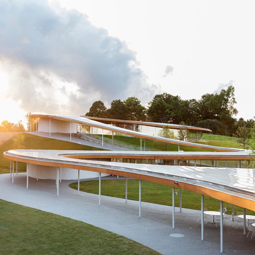
Grace Farms; New Canaan, Connecticut, by SANAA with Handel Architects
Grace Farms was established with the idea that "space communicates" and can inspire people to collaborate for good. To realise this vision, Grace Farms Foundation appointed SANAA to create a porous, multipurpose building nestled within an 80-acre landscape that would encourage people to engage with nature, the arts, justice, community, and faith. The River building emerged as a new kind of public space that embodies these aspirations. Its sinuous structure is comprised of 203 individually curved glass panels containing five volumes: a sanctuary; library; commons; pavilion; and partially submerged court.
Find out more about Grace Farms ›
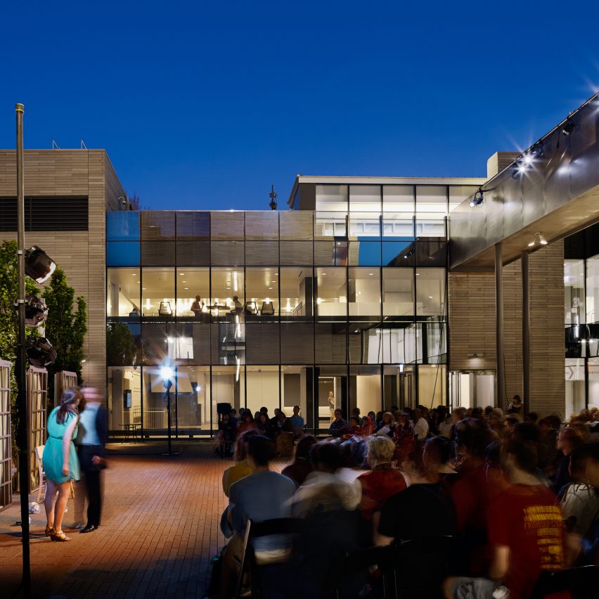
Reva and David Logan Center for the Arts; Chicago, by Tod Williams Billie Tsien Architects with Holabird & Root
Sitting on the southern edge of Chicago's Midway, the Center houses the University of Chicago's visual arts, film, music, and theatre programmes, finally uniting the programmes under one roof. The building comprises a 10-storey tower and an adjacent two-storey "podium." Both are clad in Missouri limestone cut into four-foot lengths and laid as bricks. The material echoes the limestone found on the University's neo-gothic structures as well as Frank Lloyd Wright's Robie House, also located on campus. Bathed in natural light, the smaller building is lit by north-facing skylights throughout its many creative spaces.
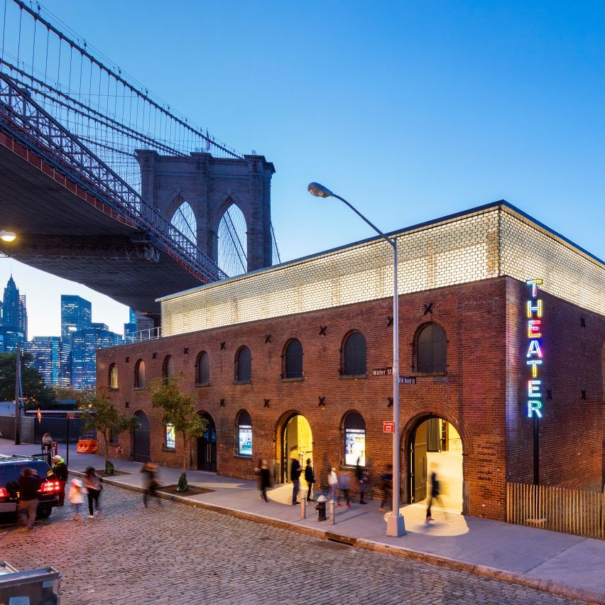
St Ann's Warehouse; Brooklyn, New York, by Marvel Architects
Beneath the Brooklyn Bridge, Marvel Architects has brought the brick and mortar ruins of the historic Tobacco Warehouse back to life, creating a new theatre space for renowned presenter St Ann's Warehouse. Leading a team of Silman, Buro Happold and Charcoalblue, Marvel created a controlled acoustical environment using natural state materials - concrete, blackened steel, Douglas-fir plywood. With a respectful sleight of hand, a new roof floats atop a ribbon of solid glass brick. Adjacent to the theatre is a trapezoidal garden designed with Michael Van Valkenberg Landscape.
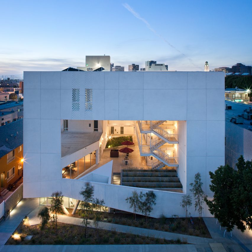
The Six Affordable Veteran Housing; Los Angeles, by Brooks + Scarpa
The SIX is a 52-unit LEED Platinum affordable housing and support services building for disabled veterans. Located in the MacArthur Park area of Los Angeles, which has one of the highest densities in the USA with a total population of 120,000 people in 2.72 square miles. The SIX breaks the prescriptive mould of the traditional shelter by creating public and private "zones" in which private space is de-emphasised, in favour of large public areas. The organisation is intended to transform the way people live away from a reclusive, isolating layout towards a community-oriented, interactive space.
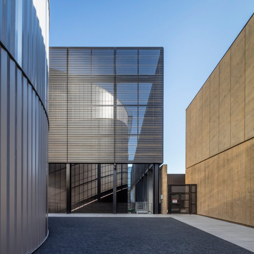
Stanford University Central Energy Facility; Stanford, California by ZGF Architects
The Central Energy Facility is the heart of Stanford University's transformational campus-wide energy system, projected to reduce greenhouse gas emissions by 68 per cent. The centrepiece of this composition of large, industrial components is a central courtyard pivoting around a 2.5-million-gallon hot water thermal storage tank, showcasing the energy plant's mission. The architecture takes its cues from Stanford's rich heritage: the Stanford arcade is reimagined as PV trellis; integrally coloured cast-in-place concrete nods to the prevalent limestone; and weathered Corten steel accents suggest terracotta tile roofs that give the campus much of its character.
Find out more about Stanford University Central Energy Facility ›
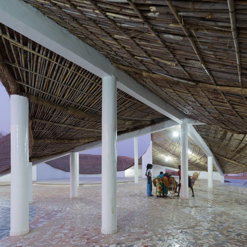
THREAD: Artists' Residency and Cultural Center; Sinthain, Senegal by Toshiko Mori Architect
Located in the remote village of Sinthian, Senegal, this project offers multiple programmes for the community, including a gathering space, performance centre, and residency for visiting artists. In the design, a parametric transformation of the traditional pitched roof inscribes a series of courtyards within the plan of the building while also creating shaded, multi-purpose areas around the perimeter of the courtyard. The inversion of the roof creates an effective strategy for the collection and storage of rainwater, capable of fulfilling substantial domestic and agricultural water needs for the community. Relying exclusively on local materials and construction techniques, the building's traditional structure is formed primarily of bamboo and spaced-brick walls that absorb heat and promote airflow through the building interior.
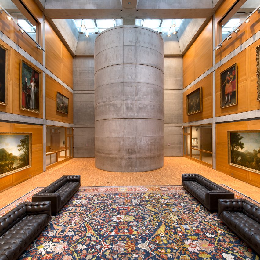
Following nearly forty years of continuous operation, the Yale Center for British Art, designed by Louis I. Kahn and recipient of AIA's Twenty-five Year Award, faced mounting programmematic, infrastructural, and operational pressures which threatened to degrade its extraordinary architectural character. The multi-year conservation project renewed interior finishes that had grown tired and worn; restored and expanded teaching spaces that were oversubscribed and underequipped; fortified spaces for exhibition, storage, and study of the growing collection; and replaced vital building systems which had reached the end of their practical life.
Find out more about Yale Center for British Art ›
2017 Institute Honor Awards for Interior Architecture
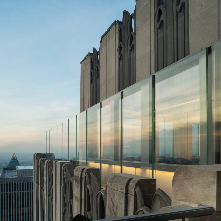
30 Rockefeller Plaza: 65th Floor, Rainbow Room, SixtyFive; New York City, by Gabellini Sheppard Associates with Montroy Andersen DeMarco
Gabellini Sheppard Associates opened a new chapter for the 13,160-square-foot Rainbow Room and 65th floor, blending contemporary needs with design that rekindled the room's original Art Deco-inspired spirit and radiant notoriety of 1934. In the Rainbow Room, the revitalisation of the rotating dance floor, addition of mesmerising crystal window veils, and restoration of the chandelier and central dome, reinforce the modern-day grandeur. In Bar SixtyFive, a faceted ceiling composed of glass-reinforced gypsum panels anchor the space, reinterpreting the open-air height the room once had as a sun parlour.
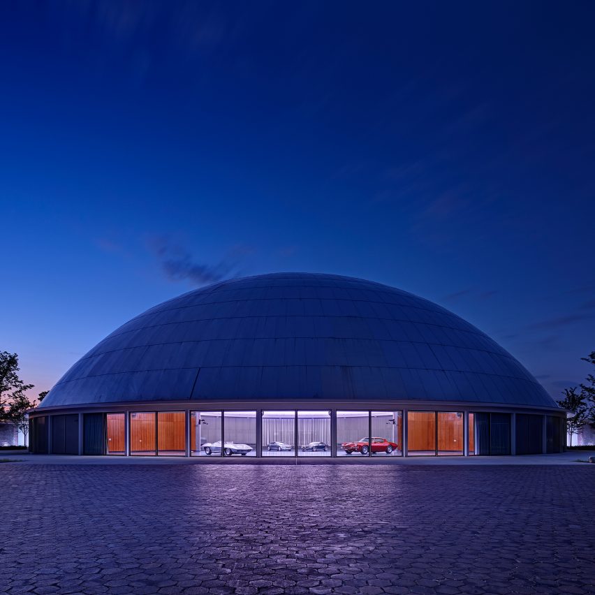
General Motors Design Auditorium; Detroit, by SmithGroupJJR
In 1956, the General Motors styling team moved from Detroit to a new design space. The complex, originally designed by Eero Saarinen, has become a legendary corporate master piece of planning and design. For SmithGroupJJR, the overall design intent was to modernise the facility but to do so in a manner consistent with the original Saarinen detailing. Technologies of materials, lighting and audio/visual have progressed dramatically and the revised Design Dome is now poised for General Motors to re-establish the relevance of this significant space for the design community.
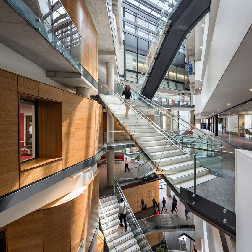
George Washington University, Milken Institute School of Public Health; Washington DC by Payette with Ayers Saint Gross
Located on iconic Washington Circle Park in the heart of the nation's capital, this School of Public Health is a rigorous, innovative response to site and programme. With its most sustainable solutions so deeply embedded as to be nearly indistinguishable, it keenly demonstrates the symbiotic relationship between sustainability and public health. The building's unusual skylit atrium, in which classrooms and study areas overlook the city through an open latticework of floor openings, invites exploration and discovery. The building supports a highly effective learning and interaction environment that is equally memorable for its intimacy and transparency.
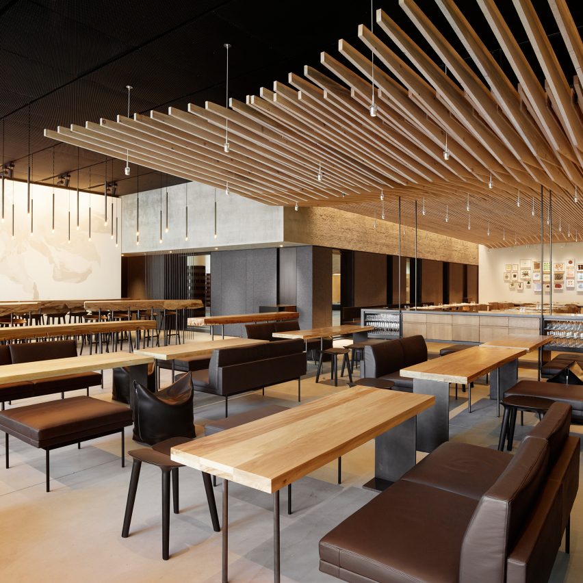
In Situ; San Francisco, by Aidlin Darling Design
Located in the recently reopened San Francisco Museum of Modern Art (SFMoMA), In Situ represents a unique intersection of art, design, food and community. The restaurant features a curated collection of culinary innovators from around the world to make their contributions accessible for greater public engagement. Its design operates at many scales from urban to the intimate, and is intended to engage all of the senses with an emphasis on tactility and acoustics. The exposed interior shell of the building provides a backdrop for discreetly placed "artifacts" which include commissioned art, custom designed lighting, custom furniture and a sculptural wood ceiling.
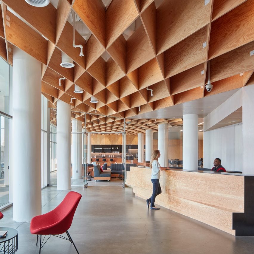
Pinterest HQ; San Francisco, by IwamotoScott Architecture with Brereton Architects
The new Pinterest headquarters is inspired by the redesign of the company's web platform — clean, simple, intuitive. It occupies a concrete structure in the SOMA district that previously housed a John Deer factory. A key aspect of the design extends the existing atrium through to the ground floor, spatially connecting all four floors. The Knitting Stair occupies this newly activated heart of the building. The workspace programme is organised as porous, concentric layers around the atrium and Knitting Stair, opening up to the city at the ground floor's lobby, cafe, all-hands space and maker lab.
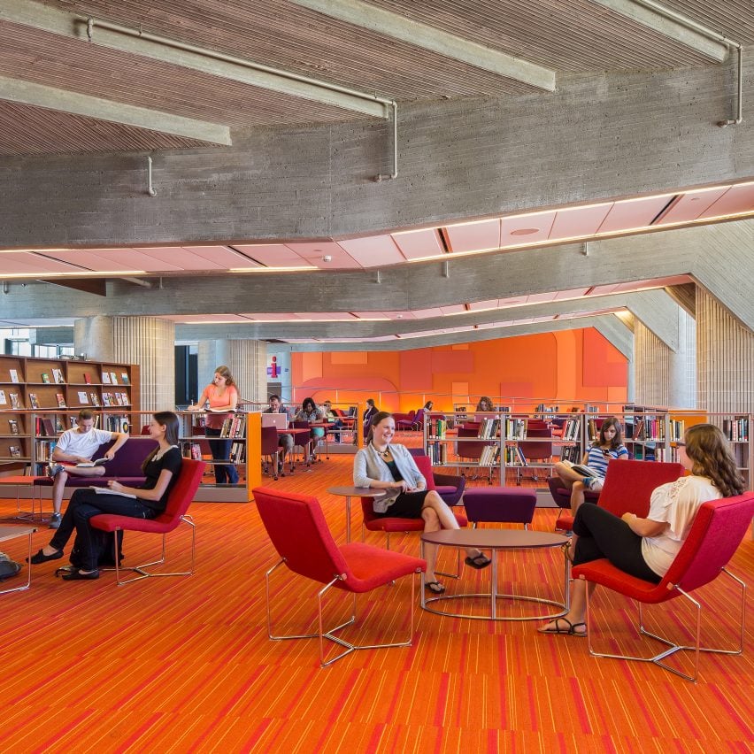
University of Massachusetts (UMass) Dartmouth, Claire T Carney Library; Dartmouth, Massachusetts, by DesignLAB with Austin Architects
Conceived in 1963 as a utopian community by architect Paul Rudolph, the UMass Dartmouth campus remains a tour de force of late 20th-century architectural exuberance and optimism. The Claire T Carney Library is the 160,000-square-foot centrepiece of the concentric campus plan. DesignLAB's transformation celebrates the historic architecture, while creating a state-of-the-art learning environment, improved group study spaces, a cafe, a lecture space, and a new campus living room. Inspired by Rudolph's original design intentions, the renovation included the re-introduction of a vibrant colour palette, bold supergraphics, and dynamic social spaces.
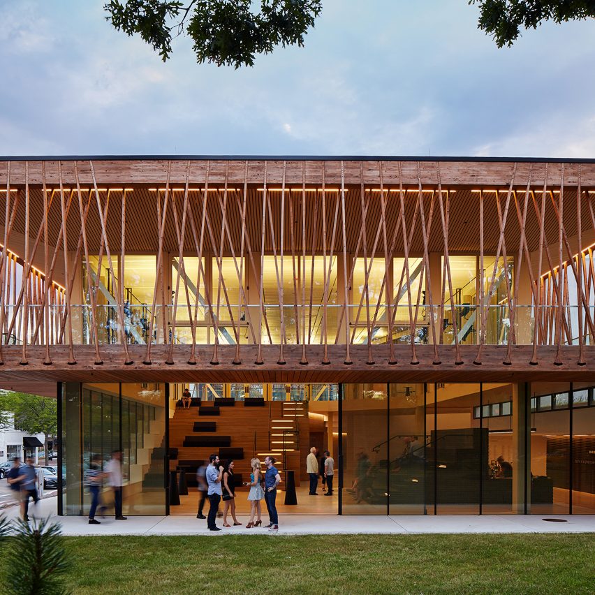
Writers Theatre; Glencoe, IL, by Studio Gang
While functional requirements of performance venues often dictate opaque volumes, the 36,000-square-foot Writers Theatre is instead a transparent cultural anchor that embraces its community. A double-height lobby provides a flexible space for outreach, gatherings, and performances, with glass doors that open to the adjacent park. Clad in wood hewn from the site, box office and concessions are treated as furniture, integrated into flexible lobby tribune seating. A canopy walk hung from timber trusses provides an open-air gathering place before, after, and between shows. The two stages are configured to enhance the intimacy for which Writers is known while creating new opportunities for innovative performance.
Find out more about Writers Theatre ›
2017 Institute Honor Awards for Regional & Urban Design
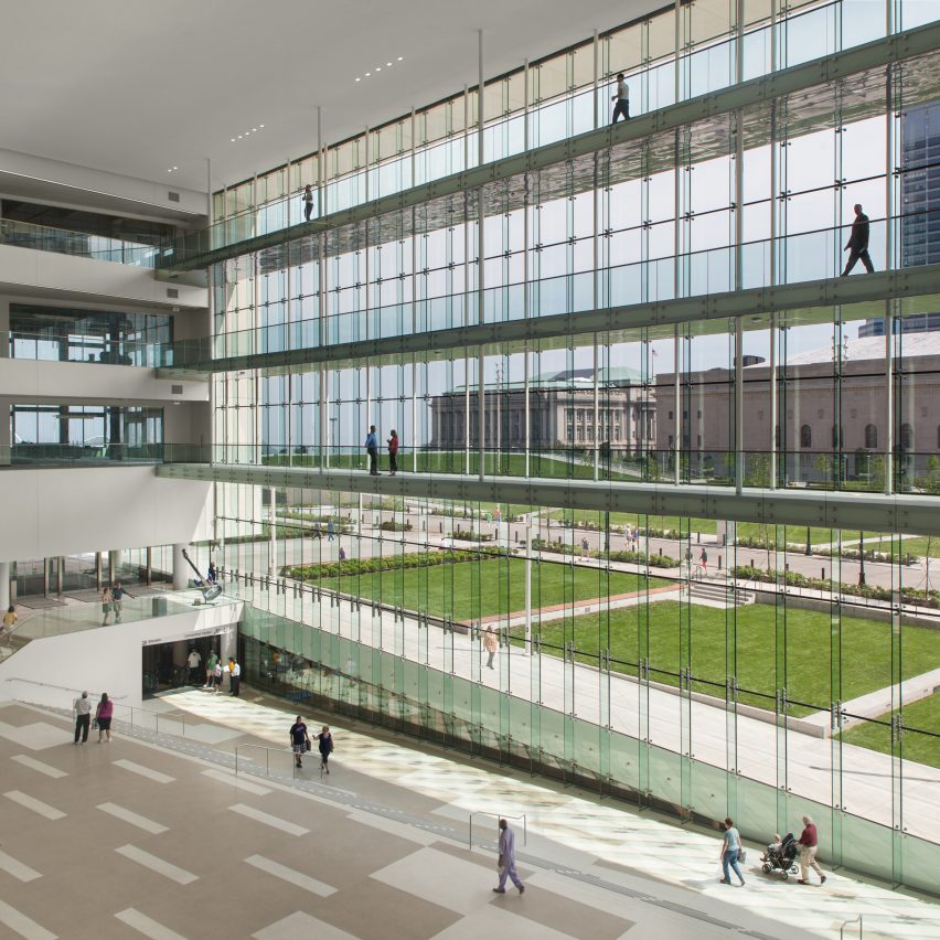
Cleveland Civic Core; Cleveland, by LMN Architects
Cleveland's civic centre is one of the most completely realised examples of the City Beautiful movement in US city planning that flourished during the late 1800s. In 1903, architect/planner Daniel Burnham designed the Mall – a large public park flanked by major civic and government buildings on a bluff above Lake Erie. One hundred years later, the Cleveland Civic Core project continues Burnham's vision while reimagining it for the 21st century, weaving together two public assembly facilities with civic green space to catalyse a dramatic revitalisation of the downtown core.
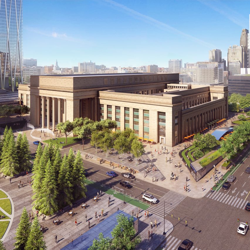
Philadelphia 30th Street Station District Plan; Philadelphia, by Skidmore, Owings & Merrill
The master plan for Philadelphia's 30th Street Station District, created through the partnership of Amtrak, Brandywine Realty Trust, Drexel University, PennDOT, and SEPTA, and developed by SOM in association with WSP | Parsons Brinckerhoff, OLIN, and HR&A Advisors, will realise the long-awaited vision of a mixed-use urban district centred on a vibrant transportation hub. The plan, determined through a broad and inclusive public process, creates a sweeping transformation of the historic station and the 88-acre rail yard it anchors to build a new neighbourhood above the district's complex transportation infrastructure.
Find out more about Philadelphia 30th Street Station District Plan ›
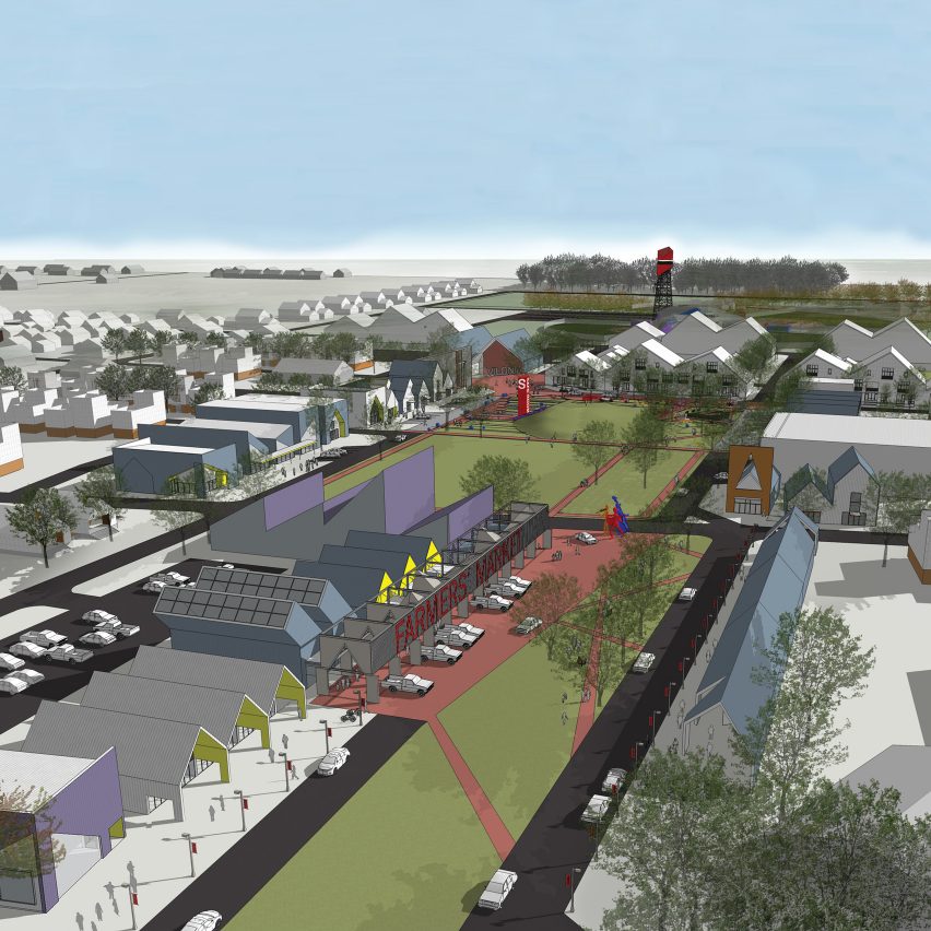
Reinventing Vilonia; Vilonia, Arkansas by, UA Community Design Center
The town of Vilonia was levelled by an EF-4 tornado that killed 11 people in 2014. The reinvention plan, unanimously adopted by the city council in 2015, is built upon a new strategy to employ underground safe rooms as a municipal planning format that can be transferred to other towns susceptible to tornados. To deal with these issues, the plan calls for the implementation of a "safescape" comprising a modulated system of shipping containers buried underground. By combining the network of safe rooms with a park system and new town loop, residents and visitors will be within a five-minute walk of safety during a tornado.
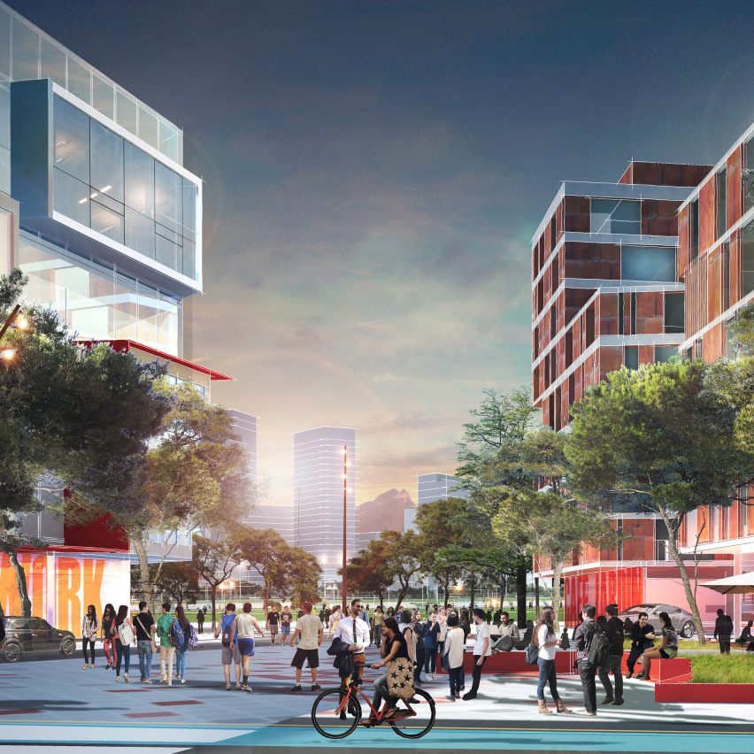
Regeneracion: A Vision for the Campus and District of the Tecnologico de Monterrey, Mexico; by Sasaki Associates
"Regeneración", the new Framework Plan for Monterrey Tec's flagship campus rethinks the institution's relationship to its complex urban setting to make a new kind of contribution to the city, the country, and the very nature of higher education in Mexico. Inter-disciplinary learning, mixed-use R&D clusters and cultural facilities are carefully connected to the district by a strong public realm, reinforcing synergies with surrounding neighbourhoods. The plan reflects a new pedagogical vision, and sets the stage for continued expansion of the Tec's influence as an engine of innovation and development in Mexico.
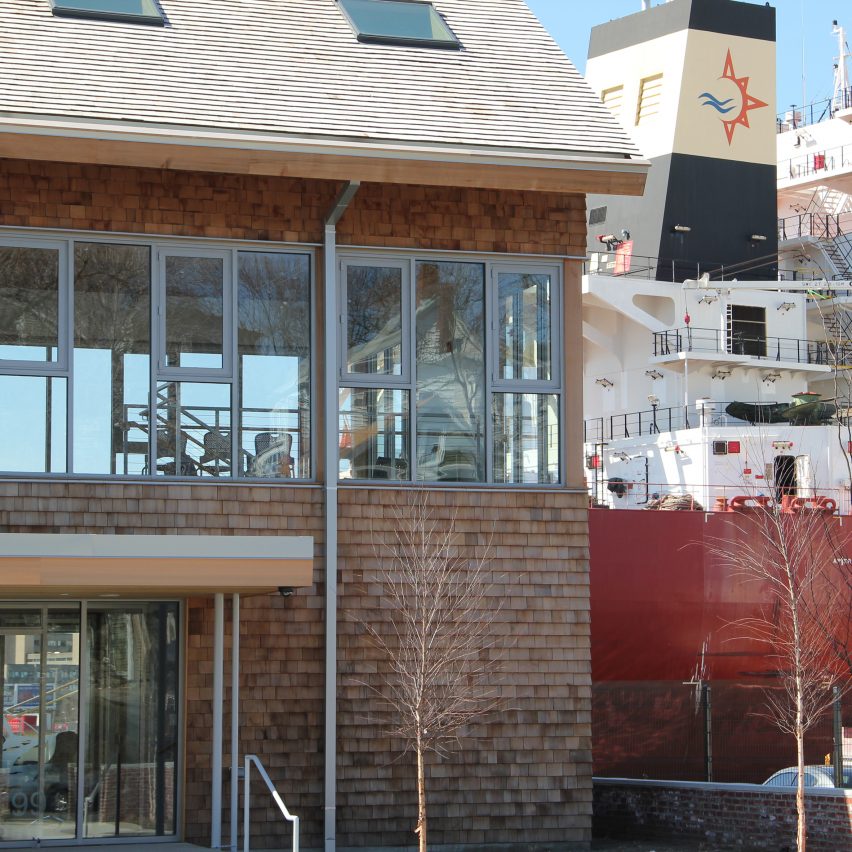
Rock Chapel Marine; Chelsea, Massachusetts, by Landing Studio
A shared-use road-salt transshipment facility and recreation and habitat landscape, Rock Chapel Marine is a new model for the integration of active industrial uses with public access on the working waterfront. Through design, the project interweaves industrial operations with everyday life, making use of the seasonal nature of the salt industry to expand public recreation during the summertime and then return to industrial use in the winter. Structures from the site's former use as an oil terminal are re-appropriated throughout, creating new forms of public engagement with the working waterfront.