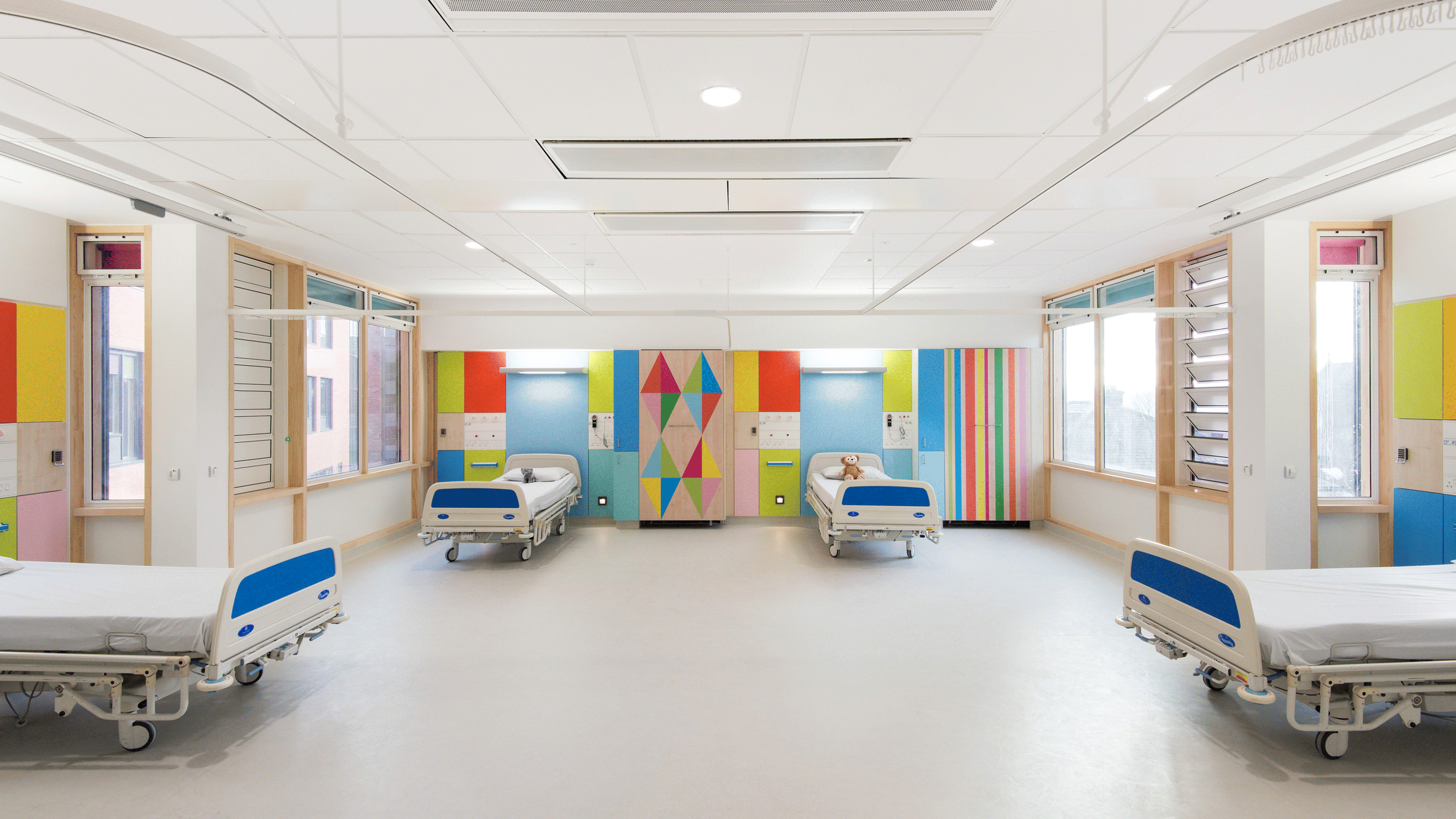
Morag Myerscough brightens the wards of Sheffield Children's Hospital
British designer Morag Myerscough had to meet strict clinical regulations to bring her bright colours and harlequin prints to the wards of this children's hospital in northern England.
Myerscough was invited by Artfelt, the Children's Hospital Charity's arts programme, to design the interiors for wards of the Sheffield Children's Hospital.
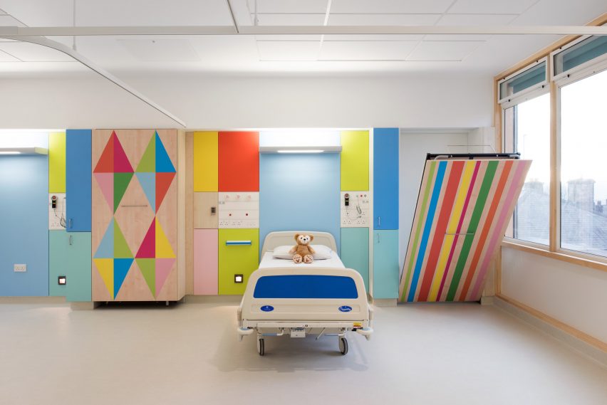
She designed 46 en-suite bedrooms and six multi-occupancy suites for a new wing of the hospital, added by Avanti Architects. The objective was to make the rooms feel more comfortable and domestic.
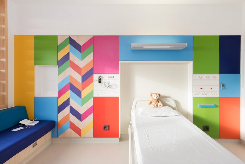
Although children's rooms might seem perfectly suited to Myerscough's colourful, graphic style, the design process was not straightforward.
Myerscough gave some of the rooms a paler colour scheme to suit children with autism or others who have an intolerance to bright patterns. She also wanted the rooms to feel appropriate to older children.
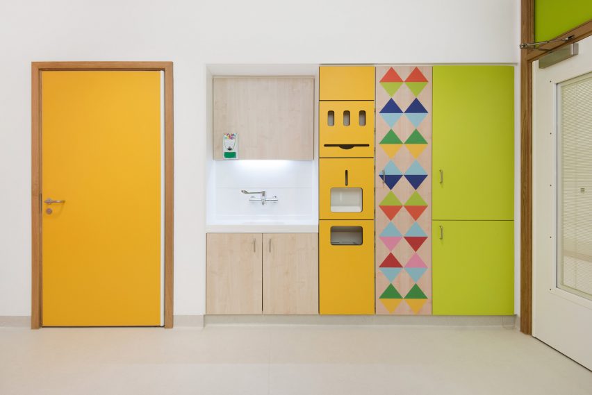
"Although the rooms are for children, I didn't want them to be childish because children of all different age groups will be staying in them," said Myerscough.
"I also wanted to create somewhere parents would be happy to spend time too. It was just about making a bedroom that you felt good to be in."
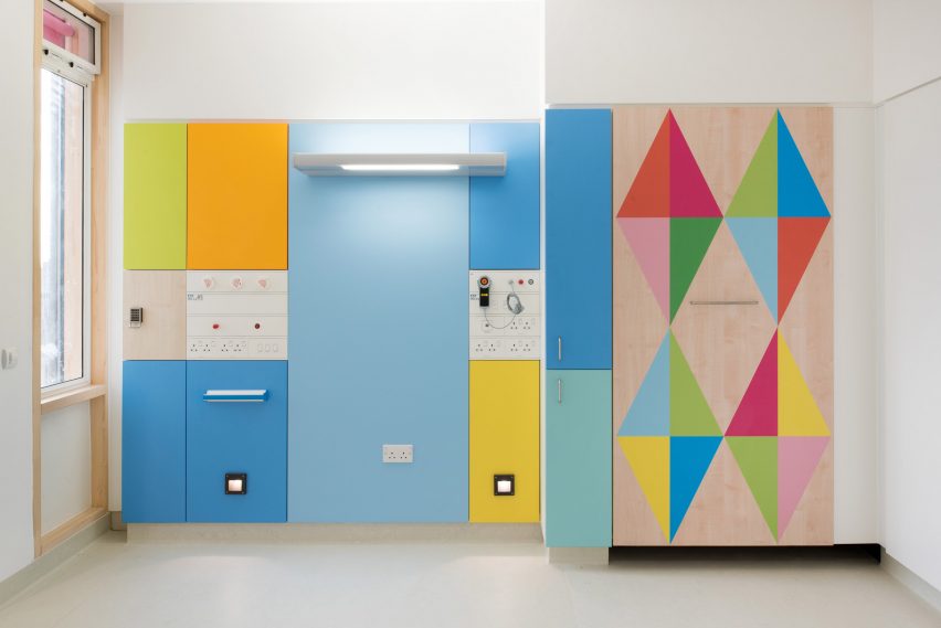
In addition, the hospital environment required that everything be sterile and easy to clean, so Myerscough had to work entirely with plastic laminate.
The wood-like panels in the wards is Formica, which has the woodgrain screen-printed onto paper and then laminated. Painting directly onto the Formica wasn't possible, and neither was screen-printing additional colours onto the paper.
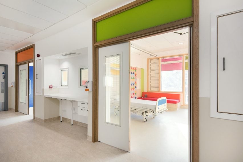
"To get the really pure colours that I wanted, I had hoped to screen print my own pattern onto the existing wood grain," Myerscough said. "Unfortunately we couldn't do that because you can only screen print one or two colours onto the paper before it disintegrates."
In the end she ended up scanning the wood grain and digitally adding patterns to it. That combined pattern was then printed onto paper and laminated like normal Formica.
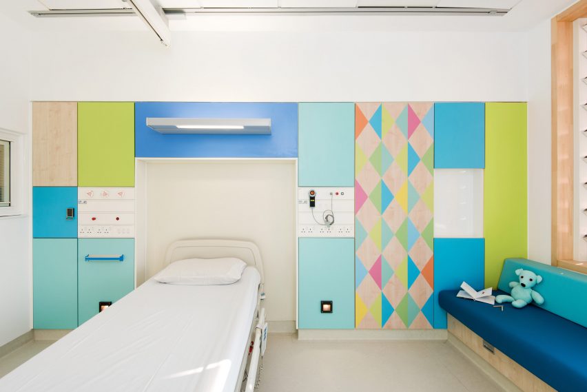
"We pushed the process to ensure we kept the warmth of the wood grain," she said. "We managed it – but it did take a year!"
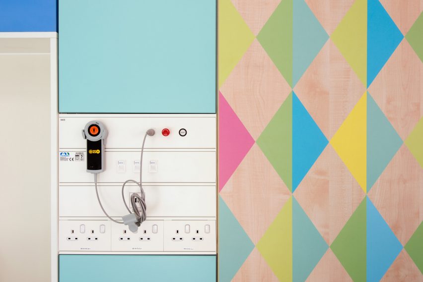
Besides the colours and patterns, a defining feature of the space is its relative lack of medical equipment. A lot of the cables and devices are stored behind the Formica panels, giving the space a more home-like feel.
A number of architects and designers have tried to make patients more comfortable through homely interior design. Gables and courtyards are intended to make the Glasgow Ronald McDonald House less hospital-like, while one Taiwain dental clinic is styled like a living room to ease patients fears of visiting.
Photography is by Jill Tate.