"Let's hope Trump doesn't use a nuclear launch key instead of the Allen key"
Readers are discussing satirical designs created in response to Donald Trump's presidency – including a flat-pack border wall and a logo based on the Nazi swastika – in this week's comments update.
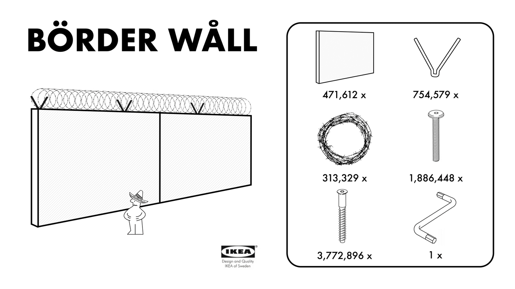
Büild a wåll: commenters are reacting to a spoof of an IKEA flat-pack furniture kit, which demonstrates how to cheaply build Donald Trump's proposed Mexican border wall.
"Let's hope Trump doesn't use a nuclear launch key instead of the Allen key," wrote Geoofbob.
But some didn't see the funny side. "The more people come up with solutions for this wall, the less likely it will be cancelled," wrote regular commenter H-J. "They're even trying to help him realise it on a shoe-string budget."
One reader raised concerns about whether the graphic was political correct:
Read the comments on this story ›

Logo no-go: Tucker Viemeister's alternative logo for Trump based on Nazi insignia led to readers sharing other facist-style logos in the comments, and drew criticisms for being too simplistic.
"This is a cheap shot that required little thought or effort," wrote Tom.
"The formula Trump = Hitler is too banal and not correct either," agreed Woodstein. "Trump himself does not shy away from dumb Nazi comparisons."
"What did the letter 'T' do to deserve this?" asked Axiomatic1.
But some felt the design packed a punch. "Politics aside, it works well as a power logo," said Mr J.
One commenter said the comparison hit too close to home:
Read the comments on this story ›

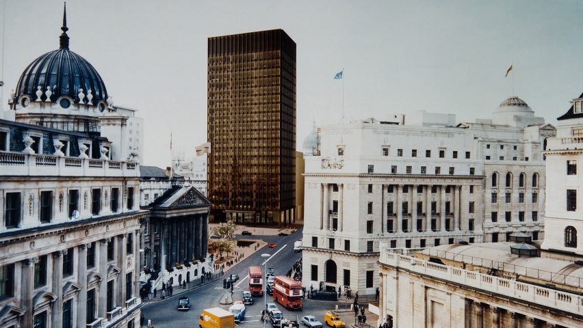
Stirling v Mies: the other talking point this week was Mies van der Rohe's unrealised tower for the City of London, which has been revealed in detail for the first time.
Readers who prefer its design to the building that was eventually built for the site – James Stirling's postmodern No 1 Poultry – expressed regret.
"Can't we just demolish that ugly Pomo building and build this beautiful Mies van der Rohe masterpiece?" one user wrote.
"A painful reminder of how it could have been," wrote Guest. "London's greatest missed opportunity? I think so."
But not everyone was disappointed with how things turned out:
Read the comments on this story ›

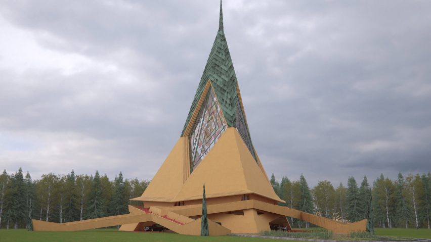
So wrong it's Wright: an unbuilt chapel by Frank Lloyd Wright has been realised in these colour visualisations by architect David Romero, but some readers are glad it never became a reality.
"Very unlike Mr Wright," wrote Joel. "I'm rather glad it wasn't built."
"The images don't do it justice – very flat plasticky feel to it," wrote Ngon. "However, the effort of showing unbuilt work should be appreciated!"
Not all responses were negative:
Read the comments on this story ›