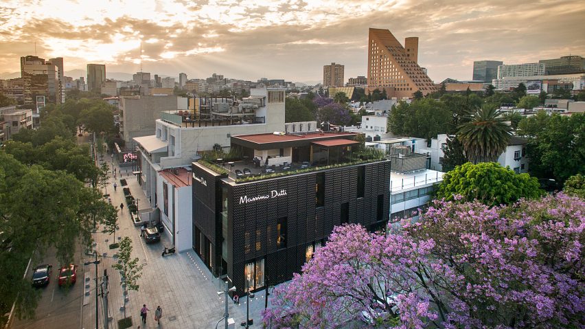
Dark metallic screen covers Massimo Dutti store in Mexico City by SMA
A patchwork of patterned, fibreglass panels wraps the exterior of this three-storey boutique for fashion brand Massimo Dutti, designed by Mexican firm Sordo Madaleno Architects.
Encompassing 15,608 square feet (1,450 square metres), the store is situated along Presidente Masaryk Avenue, one of the most prestigious streets in Mexico City. The thoroughfare has undergone a renovation in recent years "to improve its urban qualities".
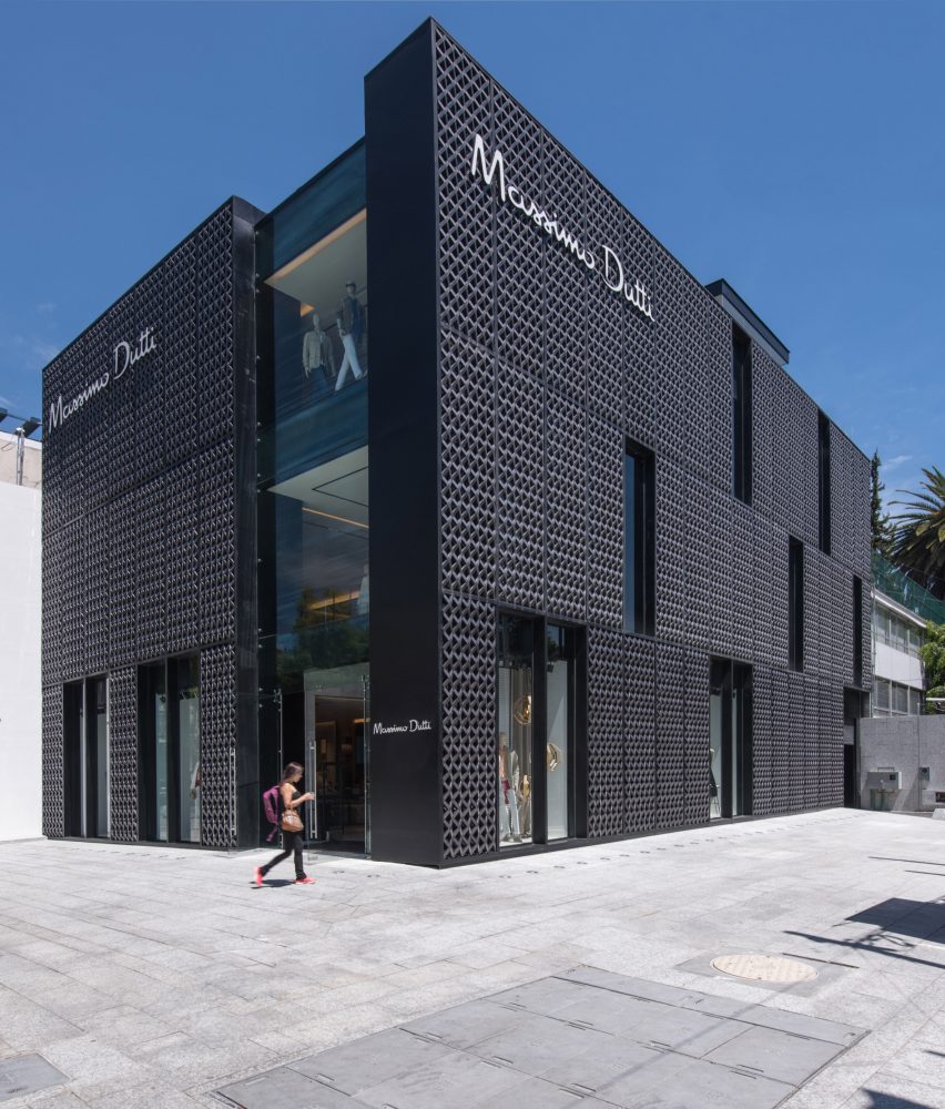
The local firm Sordo Madaleno Architects (SMA) was charged with transforming an existing concrete and steel building into a multi-level store for Massimo Dutti, a Spanish clothing retailer known for its classic pieces.
The goal was to create a "veritable work of architecture" that is well-integrated into the surrounding Polanco neighbourhood.
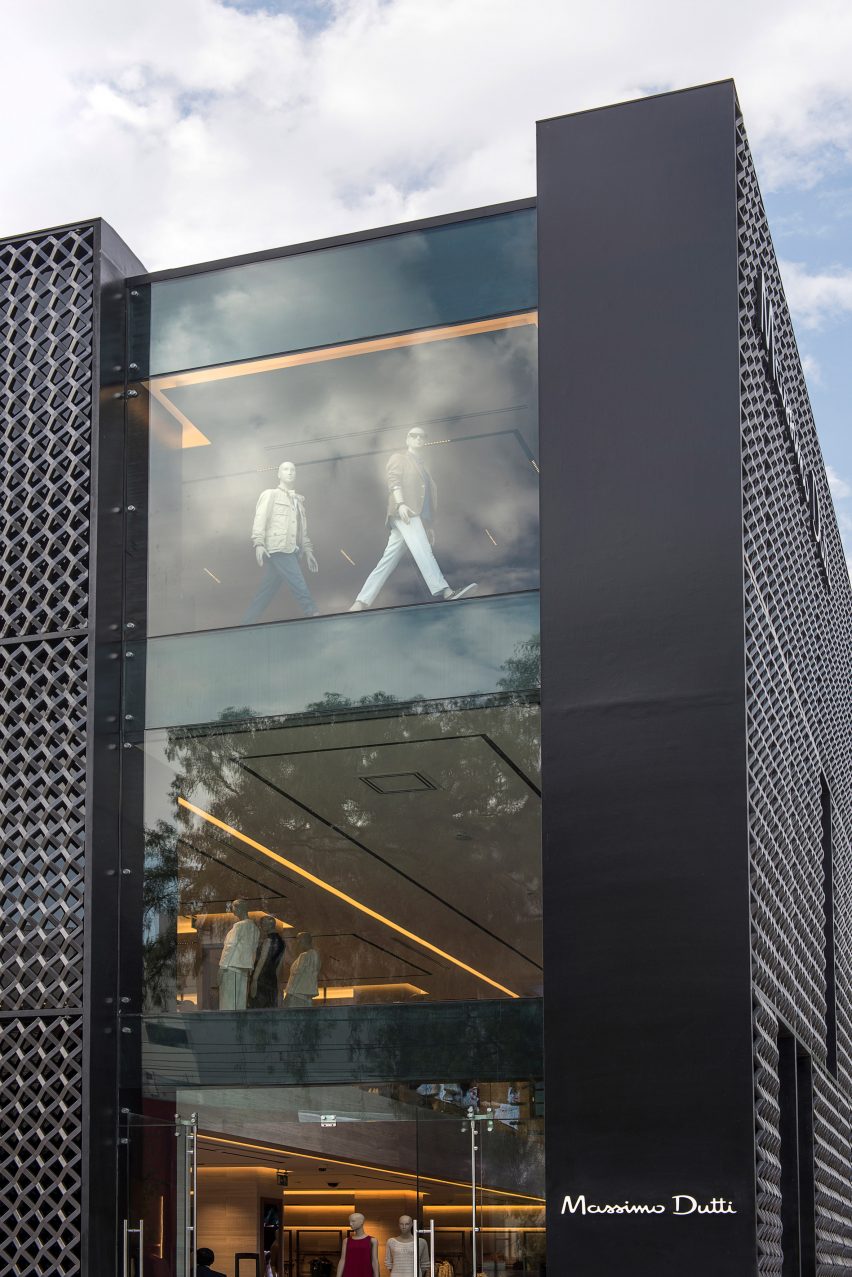
For the exterior, the architects aimed to create a facade that matches "the formal landscape of heights and voids found in the zone’s historical architecture".
The team wrapped the building with a screen composed of light-weight, fibreglass panels coated with a dark grey metallic paint. Their colour and patterning were inspired by the traditional wrought-iron railings found in the district.
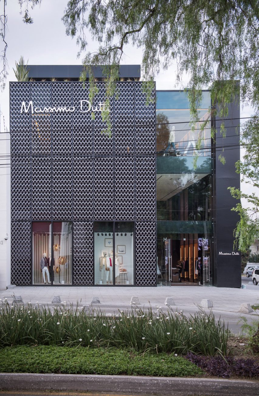
The brise-soleil has tall, linear openings that serve several functions. "The screen generates a series of rectangular niches that are randomly repeated within the orthogonal mesh," the team explained.
"Each of these niches becomes a window, a showcase, or a closed element, depending on the internal use."
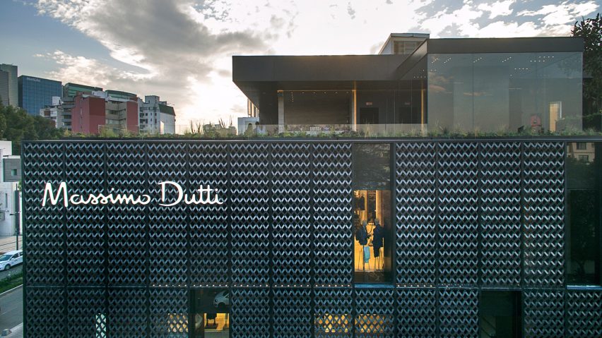
The screen was fabricated using moulds. "It represents a superb collaboration between traditional local skills and sophisticated technology," the studio said.
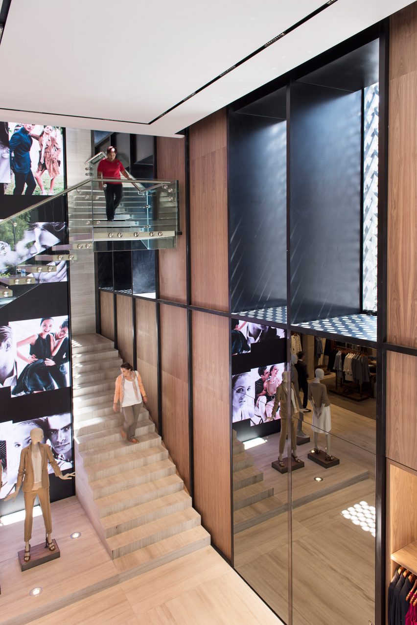
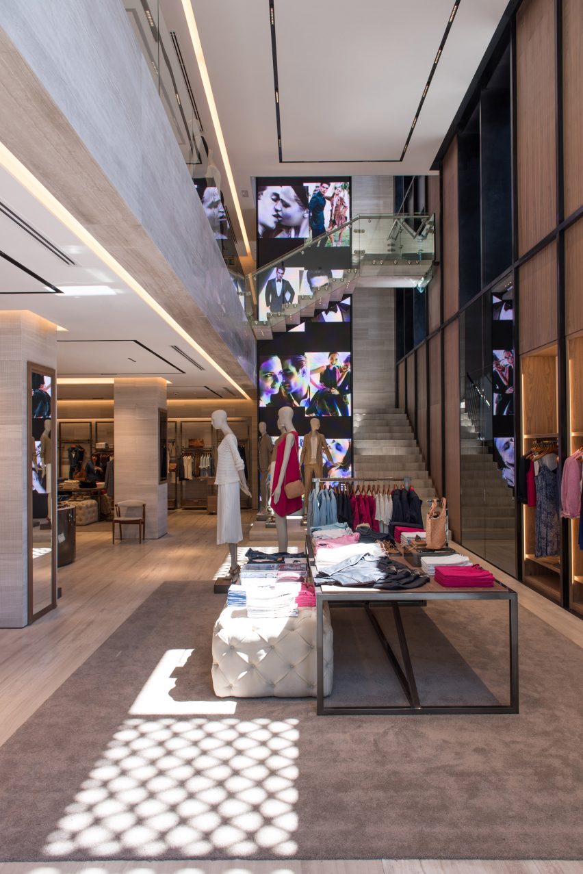
A tall strip of glazing forms the store's main entrance. Visitors step into a double-height space, with a central stair connecting all three levels.
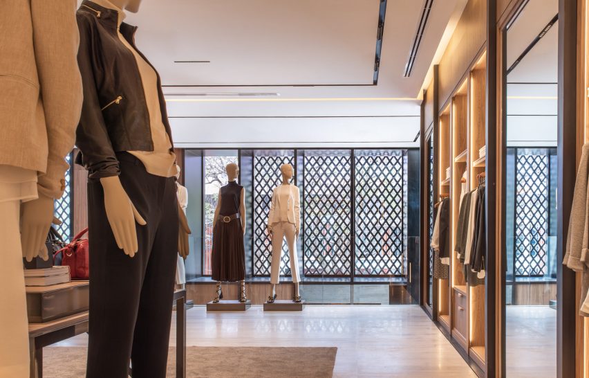
"With simple lines and purity of materials, a versatile and timeless space is created that does not interfere with the demands of fashion and ensures the product holds all the attention," the architects said.
The team chose neutral materials that embody a "classical but innovative essence". Pale stone is paired with wood and metal accents throughout the space.
The store is fitted with grey carpets and tufted display benches. A number of original pieces were specifically designed for the project, including tables and hanging racks made of walnut, stone and steel.
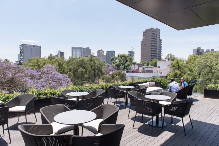
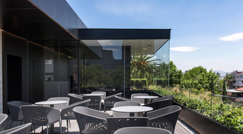
A rooftop terrace, where guests can enjoy a cup of coffee or refreshment, is meant to complement the interior space and enrich the shopping experience.
Offering sweeping city views, the elevated terrace also serves as a venue for hosting special events. A rooftop structure houses a kitchen and washroom.
Overall, the team aimed to create a retail space that embraces its vibrant urban context. "This is a lively and flexible architecture, thanks to the strong connection between interior and exterior," the studio said.
Other new projects in Mexico City include the conversion of a brutalist building into a contemporary art gallery by Riestra, Arnaud and Werz, and an apartment building by Arqmov Workshop that is covered in a screen made of wooden squares.
Photography is by Jaime Navarro.