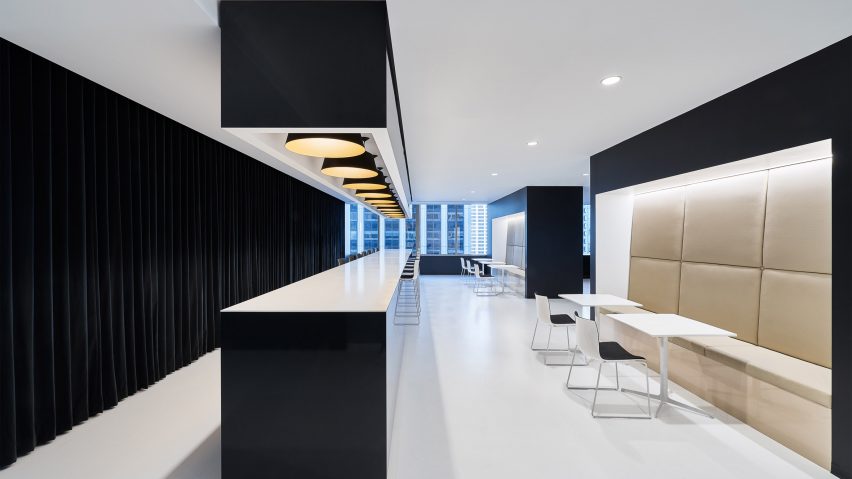
Garcia Tamjidi Architecture Design has created a black and white office space for beauty brand incubator Kendo, featuring glossy surfaces that reflect views of San Francisco's skyscrapers.
Kendo wanted to upgrade its office space, so enlisted Garcia Tamjidi Architecture Design – an architecture company known for its minimalist aesthetic – to better express the company's identity.
"[We] imported a retail look to energise the Kendo team, who'd been crammed into tiny offices that didn't suit either their needs or the company vibe," said the designers.
The offices occupy a full upper floor of high-rise building in Downtown San Francisco.
After exiting the elevators, the hall opens onto a reception and show area to one side.
This area is used as a showroom to display Kendo's core products, which are laid out along an elongated table with shiny black sides.
Enlarged models of the beauty products stand next to a cases containing items from their respective lines.
Marc Jacobs Beauty, Ole Henriksen, Kat Von D Beauty, and Bite Beauty are among those displayed.
Soft lighting from the table top and a ceiling fixture above help to draw attention to the display.
A boardroom to the left is located behind a glass wall, which reflects the views of skyscrapers from a window at the end of the table.
Kendo's reception desk sits opposite the showcase within the same room.
The polished booth encloses understated black furniture that contrasts with the exhibition of products.
On the opposite side of the elevators, the designers mirrored the lobby and showroom.
A table similar to the product display is lined with chairs to offer a space for serving and enjoying coffee, while a small kitchen and a few tables take up the adjacent space.
Offices take up the remainder of the floor area. Two types of conference rooms – rectangular and square – make up the corners.
Graphics cover entire walls of the meeting spaces and lounge area, while bright cushions also add bursts of colour to the otherwise monochrome interior.
The glass panes that wrap the building offer vistas of the dense urban surroundings.
"The striations of the neighbouring buildings becoming formal planes and angles that both add their own visual oomph and offer a modernist juxtaposition to the pops of colour introduced by the furnishings," said the designers.
Garcia Tamjidi Architecture Design has previously completed a residential project in San Francisco: an apartment that also features a minimal design.
Photography is by Joe Fletcher

