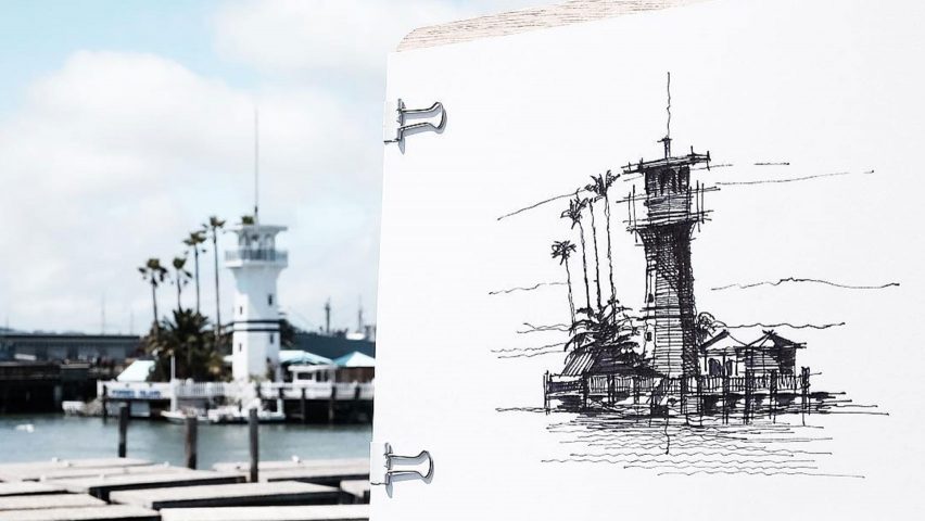
Architect, photographer and artist Dan Hogman has chosen 12 favourites from his collection of ink sketches depicting buildings and streetscapes.
San Francisco-based Hogman's drawings give Architectural Graphics author Francis Ching a run for his money.
Many of his illustrations are drawn from life, when he spends only 15-20 minutes on each to "capture the essence in few but evocative lines".
As well as a hobby in his spare time, Hogman also draws for commissions and to include in competition entries submitted by his practice.
"This is a simple ways to present ideas, and in many cases this presents a lasting impression on the jury," he said. "It's a valid alternative to often impersonal computer renderings, and offers a glimpse into the design process."
The architect shares his images with almost 100,000 Instagram followers, sometimes as sped-up videos that reveal his drawing process.
Hogman has selected a dozen of his favourite sketches for Dezeen, and briefly described each one:
A little design competition I did a while ago. This is a simple ways to present ideas, and in many cases this presents a lasting impression on the jury. In my mind, it's a valid alternative to often impersonal computer renderings, and offers a glimpse into the design process. This is actually the way I presented most of my work while in architecture graduate school.
I sketch while I travel. While a photo is a direct representation of a subject, a sketch looks deeper into the author's feeling and state of mind, at that time and place. This happens to be in Miami Beach, the Art Deco District. This buildings with simple and bold geometry make a perfect subject to practice light/shadow representation.
I usually sketch with just one pen from beginning to the end, whether fountain pen or fine-liner. But this round, I was commissioned to create a sketch to demo the six Micron pens that come as a package from Sakura – the sketch eventually became the cover for the package. This is available in art supply stores throughout Europe.
We all try to evolve and improve our techniques, no matter what we produce. While looking through my drawers, I came across two versions of the same subject, done about two years apart.
Live sketching offers the most honest means to represent a subject. The settings leave me with no help from the straight edge, photo inspiration or the comfort of my studio.
The process videos offer a glimpse into what it takes to do a sketch. I usually pencil out the main lines, followed by main lines in ink. Shadows and accent lines come last. I sometimes use fountain pens (Lamy in this case). I've always been fascinated by black ink, especially quality inks that offer a true black, for extreme contrast.
Street vignettes are challenging, due to the quickly changing context. In the deep canyons of high-rise Downtown San Francisco, light can be dramatically different minutes apart. This is why I try to limit my time to 15-20 minutes per sketch.
This shows a quick subject rendered during my lunch break. While some subjects would normally deserve hours or days to properly render, many of us simply can't dedicate more than a few minutes at a time. Power break!
I leave details vague on purpose. My attention span is limited, so wavy lines only contribute to the idea of a "sketch", in the true meaning of the term.
A quick vignette that could very well be accomplished on a napkin (with some related challenges...).
It's hard not to include a significant building on occasions. In this case, the Robie House by Frank Lloyd Wright – in probably too brutal and rough of a form. Ideally, the tone of the sketch would convey the "feel" of the subject, so I'd call this a fail for this reason.
What's a "doodle" and what's a "sketch"? The borders are vague. In any case, my inclination remains: capture the essence in few but evocative lines, in as little time as possible.

