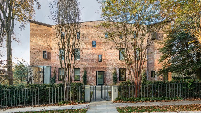
Boston architecture firm NADAAA has remodelled a 1920s Washington DC residence by extending the attic, adding large windows, and using plywood sheets to arrange the internal layout.
While renovating the detached Rock Creek House property, the architects removed ornamentation from the brick facades and extended the walls upward to create a larger attic space.
The north facade was kept in tact to provide a structural support, while large window were add to the south-facing wall to allow more daylight into the home.
"While the north wall is a traditional load bearing brick wall, the south face is now a curtain wall given the amount of glass," NADAAA founder Nader Tehrani told Dezeen. "The skin is a real hybrid."
Bricks removed to enlarge the openings were used for the attic extension, which features a slightly faceted roof.
The two wings of the home are recessed slightly from the central volume. These follow the design of the symmetrical original house, however new window placement has altered the once precise vertical mirroring.
Floor-to-ceiling glazing wraps around portions the building, while smaller window jut out seemingly randomly in other places.
The transparency of the building's south face makes the large garden a more important part of the home than in the old layout.
The yard begins as part of a terrace bordering a rectangular plot of grass and steps down towards a long pool at its south east corner.
A shaded portico at the east end of the terrace offers access to the lowest level of the home. Its roof becomes a porch extending out from the first floor.
The folded angular columns and perforated ceiling of the portico contrasts with the rest of the building.
"The clients were fascinated by some of our materials research and installation work," said Tehrani, who also serves as the dean of architecture at New York's Cooper Union. "For the porch, they asked for something more like a still life that stands as an object in the garden."
Interior elements like partition walls and staircase railings are made up of laminated plywood layers oriented in a north-south direction, which the architect described as a "grain".
This allows more light to permeate the spaces from the south without interruption.
Two staircases function as unifying volumes inside the home: one ascends from the lobby to the upper floors, while the other connects the western living space on the ground floor to the lower level.
An eye-shaped hole in the wall on the right side of the entrance opens a glimpse of the descending staircase through the vertical sheets of wood, visually connecting the two volumes.
"With these two interventions the once stratified realms of storage, bedrooms, work areas, and living areas become seamlessly intertwined," said NADAAA.
The studio further expanded the layout by turning the basement into a second living space with access to the garden.
The west staircase goes against the home's "grain", so cuts through the wood layers. This results in a stratified wood moulding that overhangs the steps, hiding services and creating a cavernous threshold to the lower floor.
"The garden level of the house used to be a storage space with no formal stair to it," Tehrani said. "With this renovation and transformation we designed the idea of a summer and winter living room, respectively in the garden and first levels."
The central staircase doglegs up from the lobby, providing access to workspaces, bedrooms, and a playroom in the converted attic.
The plywood railing takes on a different form each time the stairs change direction. It forms a continuous barrier north to south, then a slatted partition east-west – allowing light through from the south-facing windows.
Dezeen has featured several renovated homes that use glass to provide more light, including a town house in Rotterdam and a brick home in Brooklyn.
Photography is by John Horner.

