Trump may have won "not in spite of his terrible design work, but because of it" says Hillary Clinton's logo designer
American graphic designer Michael Bierut has expressed regret that the logo he created for Hillary Clinton's US presidential campaign wasn't enough to help her beat Donald Trump last November.
Bierut, a partner at design consultancy Pentagram, produced Clinton's campaign logo after meeting the Democratic candidate in January 2015.
Over two years later, he reflected that the design rustled up for the whirlwind campaign was eventually no match for Trump's decades of self-marketing through his real-estate projects and reality TV appearances.
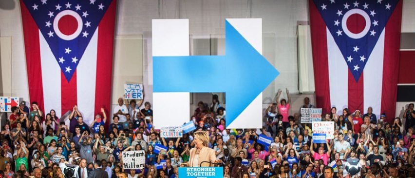
"We had spent months developing a logo; Trump had spent years building a brand," said Bierut in an essay for Design Observer.
"Had Trump won not in spite of his terrible design work, but because of it?"
The designer revealed the self-doubt he felt after losing to Trump's "bad typography; amateurish design; haphazard, inconsistent, downright ugly communications".
"And everything was topped off with nothing more than a red hat with a badly kerned, caps-locked slogan," Bierut said.
But he conceded that, as film producer Michael Moore pointed out, many people in the Midwestern states that swung the election care more about baseball hats than graphic design.
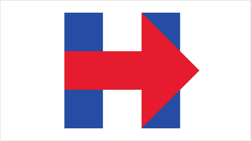
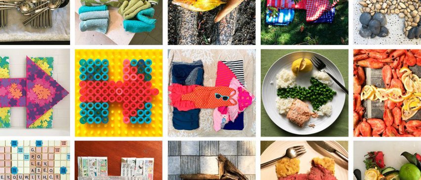
The logo that Bierut and his small team created for Clinton featured a square "H" with an arrow across its middle, coloured red, white and blue in its initial iteration.
The challenge, he said, was creating a symbol for someone most Americans had already heard of, compared to the task faced by those who designed for a relatively unknown Barack Obama in the run-up to the 2008 election.
Bierut's logo was revealed on 13 April 2015, during a video released by Clinton to officially announce her candidacy, and was quickly berated by both the media and the public.
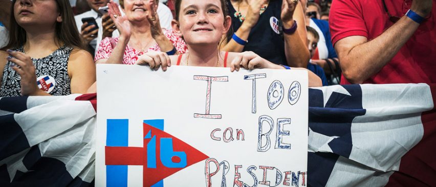
"It isn't pleasant to have talk-show hosts making fun of your work on national television," said the designer. "And there was something all so gleefully vicious about it."
"It was just some simple geometric shapes and a couple of primary colours, yet it seemed to drive so many people crazy," he added.
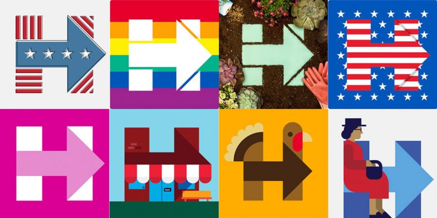
Despite this, Clinton's campaign team kept the logo, and opinions changed just weeks later when the symbol was altered with the rainbow hues of the LGBT movement, to coincide with the Supreme Court ruling on same-sex marriage.
Subsequent colour combinations were rolled out to coincide with prominent events, and the logo was eventually praised as dynamic and even "perfect".
"It could be customised not just by various interest groups, but by individual supporters," said Bierut. "It was the ultimate dynamic identity system."
Bierut also was confident that his design looked superior when seen beside the Republican candidate's imagery.
"Donald Trump's graphics were easy to dismiss," he said. "They combined the design sensibility of the Home Shopping Network with the tone of a Nigerian scam email."
On election night at the Javits Centre in New York, where Clinton planned her victory party, the H was everywhere that Bierut looked. However, events did not unfold as he or Clinton's team hoped or predicted.
"Going home," he remembered, "with my necktie with its pattern of H logos loosened around my neck, embarrassed by my hubris and worried about the future of our nation, I tried to figure out what had gone wrong."
"Talented pundits and strategists and pollsters, all masters of their craft, were wracked with self-doubt," Bierut added. "I too wondered if the very thing I was so good at had somehow betrayed me."
However his faith in design was restored while participating in the Women's Marches – which took place following Trump's inauguration – when the pink "pussy hats" first created by three Los Angeles knitters quickly and organically became a symbol of resistance.

Also ahead of the protests, designer Shepard Fairey adapted his award-winning graphics for Obama's 2008 campaign to represent some of the USA's minority populations.
"We are in uncharted territory now, and it is at once frightening and exhilarating," said Bierut. "Frightening because we face extraordinary challenges. Exhilarating because I believe, more than ever, in the power of design."
"It can provide comfort in the face of devastating change, and it can shake us out of our complacency when action is demanded," he added. "And now, more than ever, at the moment we need it most, it belongs to all of us."
Bierut, 60, has been a partner at Pentagram since 1990, where he was worked for clients including the Walt Disney Company, New York University, Motorola and The Atlantic.
He previously served as vice president of graphic design at Vignelli Associates in New York, and his designs feature in the collections of many prestigious museums worldwide.