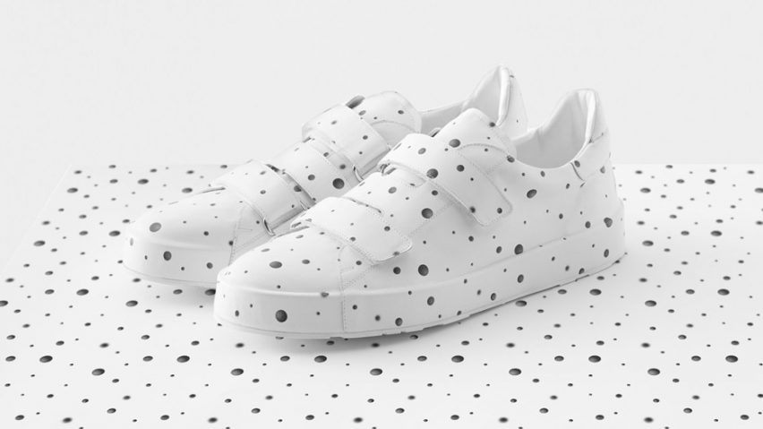
Nendo designs patterns for Jil Sander by photographing layered shapes
Nendo's Objectextile collection for German fashion label Jil Sander features patterns made by photographing layers of objects suspended inside cubes and has been unveiled at Milan design week.
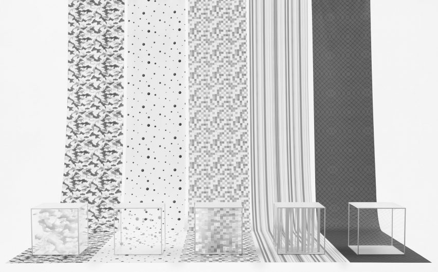
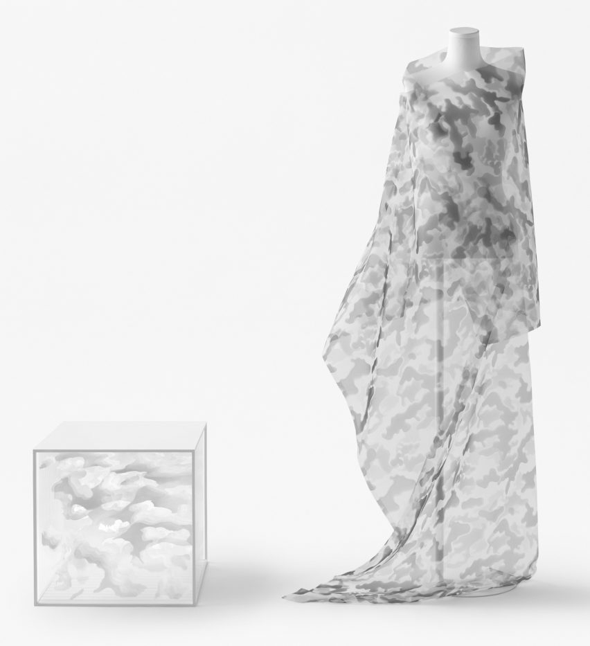
The designs include dotted, pixelated, camouflage, checked and striped prints, all of which are taken from photographs of all-white shapes. They were created for use in a Jil Sander capsule collection.
The German minimalist fashion designer founded her eponymous label in 1968 and launched its first collection in 1973. The brand is known for its monochromatic pieces, asymmetric cuts and use of colour-blocking.
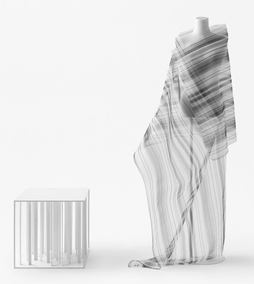
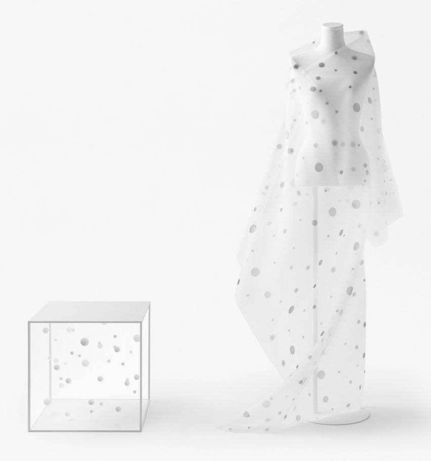
The Japanese studio made and shot a different box for each design, using lighting, shadows and different shooting methods and angles to create patterns that feature contrasting shades of grey.
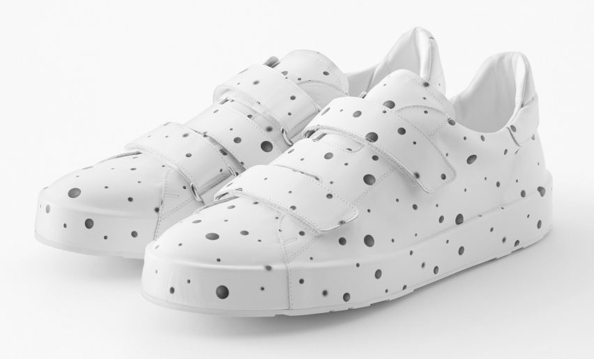
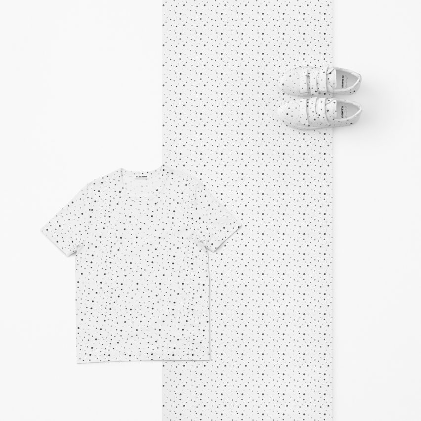
For the striped print, Nendo filled a cube with thin flat columns, arranged in a group, while the dot pattern was created by photographing 82 separate suspended balls.
A pixelated pattern was made using a box filled with irregularly arranged smaller cubes, and by tightly stretching thread and photographing it the studio created an intricate grid print.
For the camouflage design, Nendo layered sheets of transparent acrylic, and created effects by contrasting clear and frosted finishes
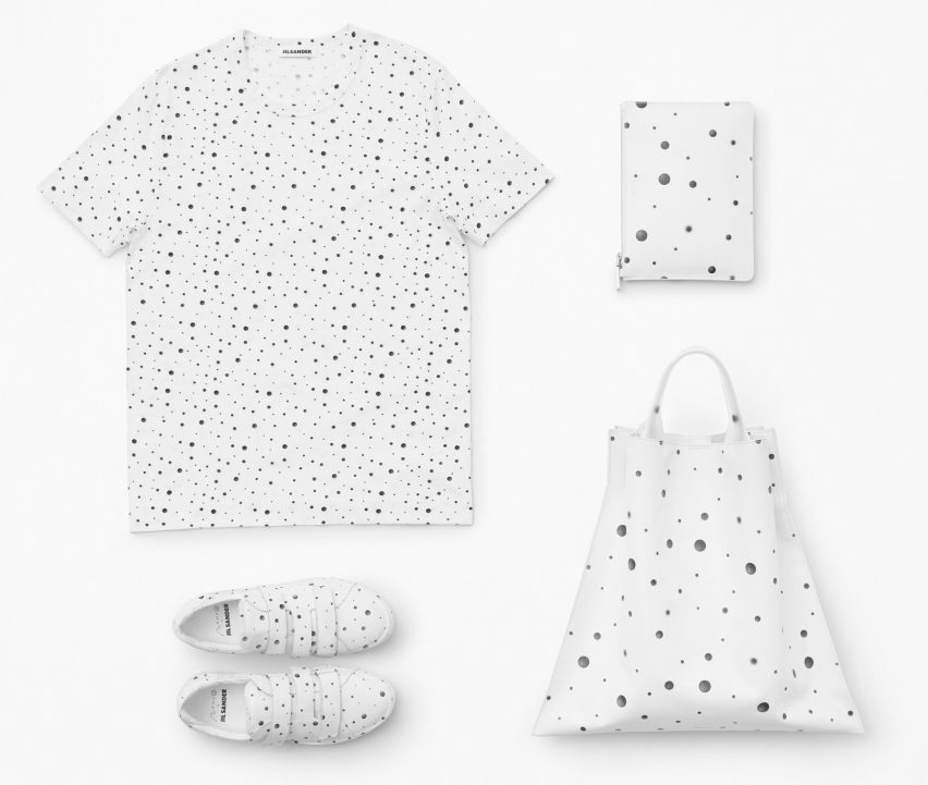
The designs have been used in a collection of garments including scarves, trainers, bags and teeshirts, which are on display at the studio's Nendo: Invisible Outlines Solo exhibition, at the Jil Sander showroom on Via Luca Beltrami 5.
It's not the only project Nendo is showing during Milan design week. The studio has also created a furniture collection that resembles tables melting into huge bowls and an aquarium of jellyfish-like silicone vases – both also being shown at the Jil Sander showroom.
Nendo – whose founder took 20th place in the Dezeen Hot List and was the highest ranked designer – is known for its prolific output. The studio has tackled a vast number of projects across the world of design, creating everything from furniture that twines together as if holding hands to minimal accessories for dogs.
Other exhibitions taking place during Milan design week include a Modernist merry-go-round, filled with products designed by Lee Broom over the last 12 years, and a collection of concrete and glass furniture made by Paul Cocksedge from the foundations of his London studio.
Photography is by Akihiro Yoshida.