"Ugly, expensive, useless"
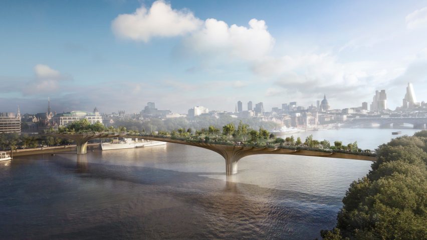
Thomas Heatherwick's Garden Bridge should be scrapped, according to a new financial inquiry, and some Dezeen readers have joined the clamour of voices calling the project a waste of money in this week's comments update.
Burning bridges: in the latest hurdle for London's controversial Garden Bridge, a new report has suggested pulling the plug on Thomas Heatherwick's design and angry readers are inclined to agree.
"Finally someone has the sense to cancel this project," wrote Apsco.
"With the hideous Pier in New York cancelled and Garden Bridge tumbling, let's hope Heatherwick will start to focus on good design again," said regular commenter Derek.
"Ugly, expensive, useless," said Mike simply.
But others felt the Garden Bridge could be worth the price tag if built. "As a New Yorker who enjoys the High Line immensely, I think this is a failure of vision by the government," wrote Joey.
"If people like this were in charge, the wonders of the world would not exist," agreed Kobi.
H-J felt the conclusions were too narrow-minded:
Should the Garden Bridge be scrapped? Have your say in our comment section ›

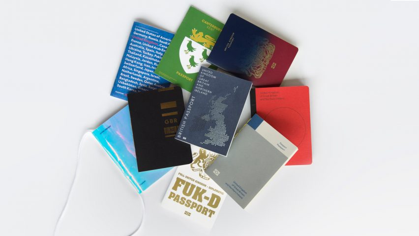
Passport to Brexit: we've revealed the winner of Dezeen's contest to redesign the UK passport, but readers have expressed their own opinions based on our shortlist of the nine best designs.
"These are all very well conceived and designed," conceded Aaron. "Obvious favourite being the vulgar passport. Too much greatness hidden in that crest."
"Why does everything have to be so aggressively political?" asked Narwhal. "I'm sat here with a British passport in front of me, and I see landforms of our coastline and animals. Is this patriotic? Are accurate depictions of Britain inside a British passport immoral?"
A passport dedicated to Britain's unpredictable weather proved popular, but one reader felt the two-toned winning entry summed up the post-Brexit climate best:
Read the comments on this story ›

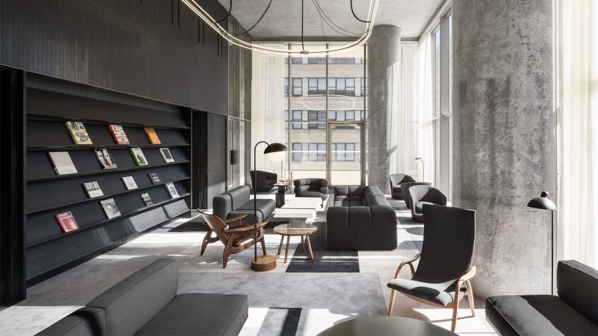
Pour it up: readers are admiring the concrete interiors of Herzog & de Meuron's 56 Leonard "Jenga" tower, which was recently completed in Tribeca, New York.
"Much more refined and elegant in their austerity than the gaudy-hip nouveau-riche frolic in Zaha's High Line condos," said Sorperdida.
"Dang, interiors win," agreed TFO.
But the austere look left some readers feeling cold. "WW2 bunker?" wrote Apsco, to which regular commenter H-J replied:
Read the comments on this story ›

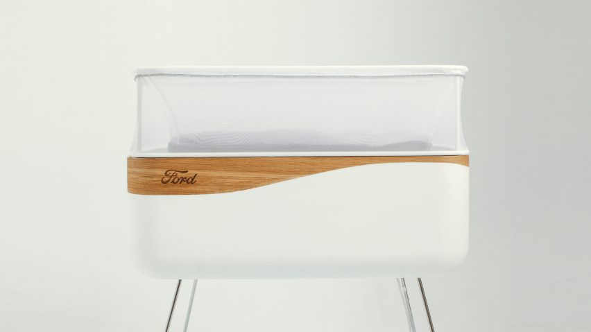
Rockabye: Ford's smart cot promises to recreate the feeling of being rocked to sleep in a car, but readers aren't sure if the proposal is serious.
"Is this a late April fool's joke?" asked Michael. "I really thought that design had evolved beyond this nonsense," added Hans Christian Asmussen.
However, some commenters saw how useful the design could be:
Read the comments on this story ›