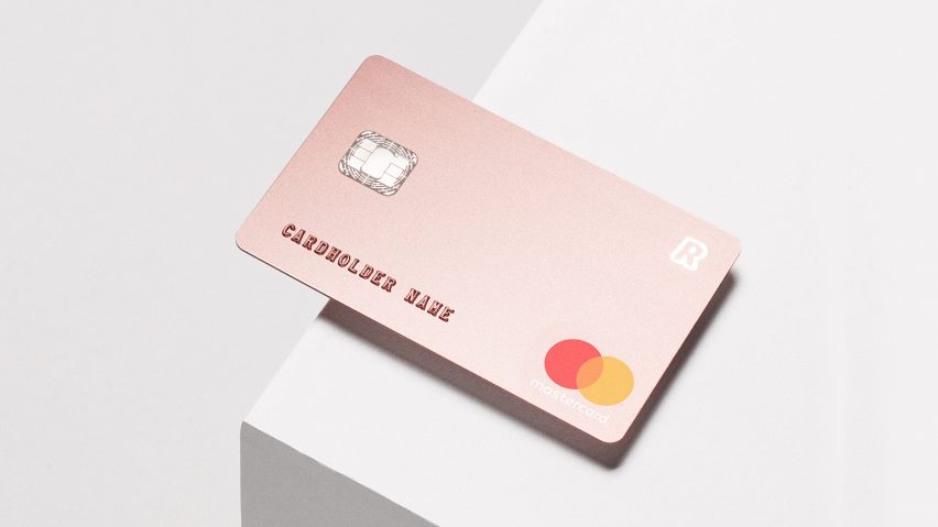
This bank card by Blond forgoes embellishment in favour of a minimal look to provide a "premium experience" for Revolut users.
The studio was briefed to create the bank cards and packaging for a new premium product by startup Revolut, which describes itself as a "21st-century banking alternative" that makes international transactions easier and less costly.
Blond, which previously designed a portable cylindrical speaker and wireless charging tray, was keen to set the brand apart from those offering a similar service.
While others often use additional details to differentiate between their standard and premium cards, Blond opted to strip the card of any embellishment. Instead of its usual embossed positioning on the front of the card, the 16-digit credit card number is subtly printed on the back.
"Other similar premium cards utilise detailing and embellishments in order to elevate the product above the standard option," said James Melia, Blond's creative director. "We wanted to avoid this dated approach and find a way to achieve a modern premium feel that suits the bold Revolut band."
To achieve this, the branding was reduced to a single "R" in the top right-hand corner and applied with a printing process known as foil blocking, which is normally used for the Mastercard hologram. The same technique is used for the numbering.
Pentagram's minimal Mastercard logo is located in the bottom corner, while the cardholder's name would be embossed in the usual place across the bottom.
The main surface of the card is created with subtle metallic inks and covered with a matt lamination, and the back of the card has also been stripped-back, so the signature and magnetic strips are reduced in size.
The studio also created packaging for the bank card, using black GF Smith papers and tone-on-tone foil blocking for the branding.
Revolut isn't the first brand to opt for minimal branding over a fussy identity. England's primary professional football competition kicked off its 2016/2017 season with a significantly more minimal lion's head logo, while design agency Pentagram gave Mastercard its first branding redesign in 20 years, creating a more minimal logo and visual identity for the credit card company.

