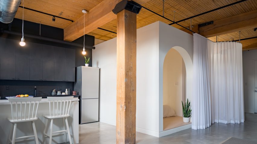
White box forms sleeping nook in Toronto loft by StudioAC
Toronto-based StudioAC has remodelled the interior of a local apartment for a young client, balancing a bright and open living space with a cosy bedroom tucked away inside a millwork box.
A young professional asked the designers to create an interior "that was equally fun, functional and unique" for the Broadview Loft project.

The designers partitioned off a bedroom and changing room from the rectangular floor plan. The resulting L-shaped living area wraps around the private spaces.
A rounded archway provides the entrance to the sleeping nook, where the bed rests on a slightly elevated platform. The pronounced entry and offset height help to signal a transition.
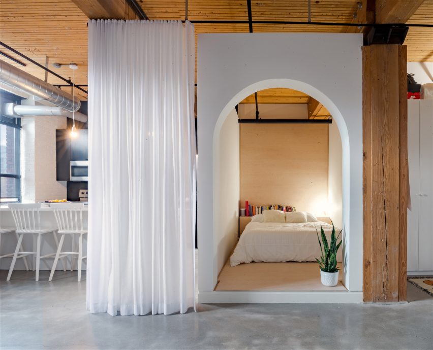
The box's interior alternates between white walls and plywood finishes. The balance creates a space that is at once clean and warm.
To the right of the nook's threshold, a thin opening leads into a walk-in-closet.
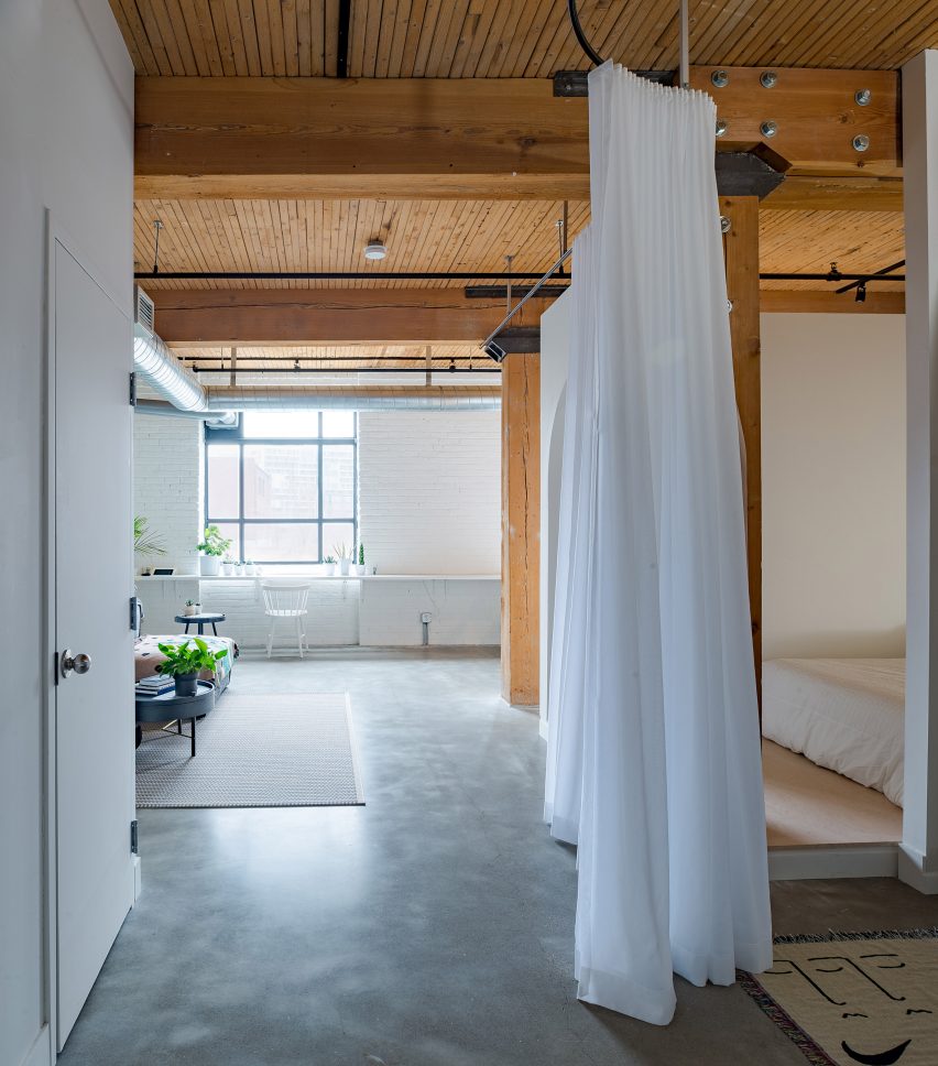
Drapery can be unfurled to cover the entrance to the millwork box and the walk-in closet. It also reaches to conceal a storage space to the right of the apartment door.
In front of the changing room, the fabric partition curves out into the hallway. The path it forms echoes the arch leading into the sleeping nook.
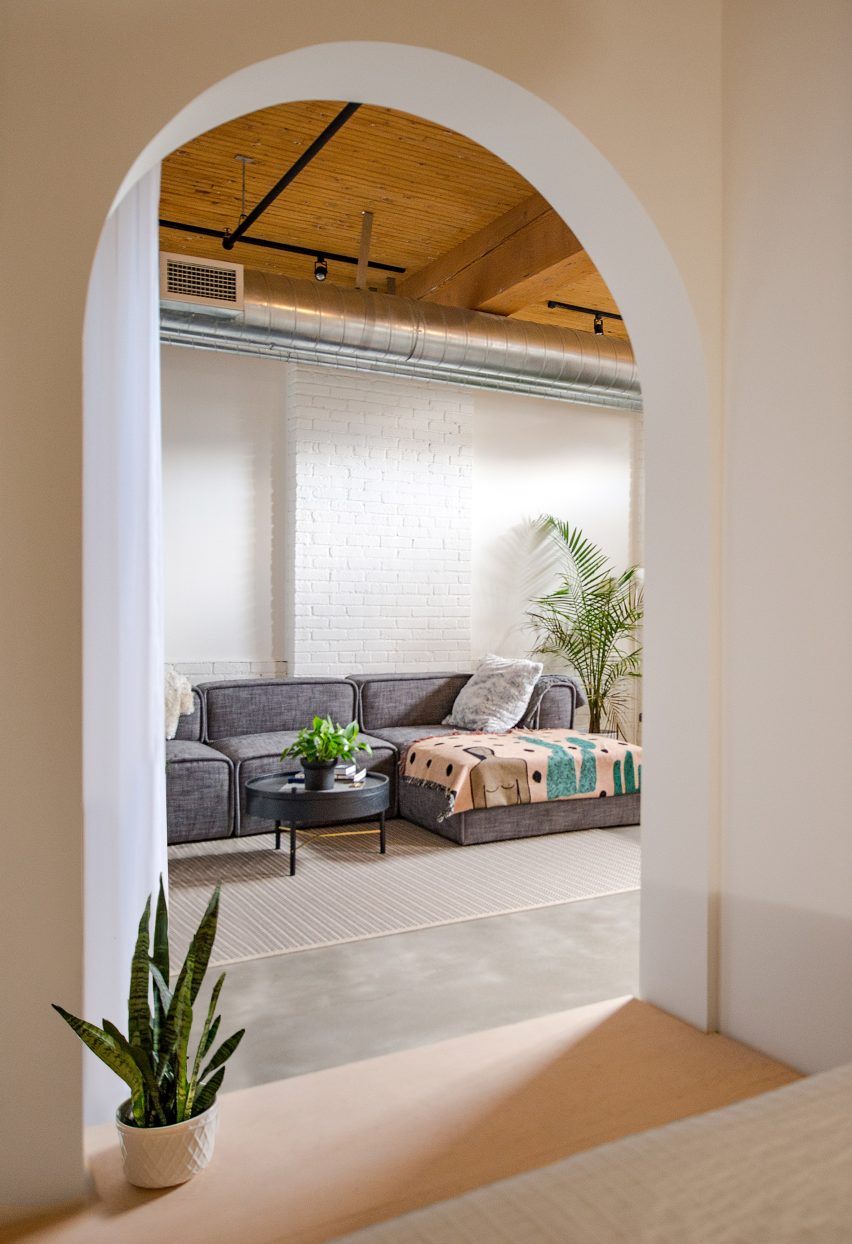
"The curtain track is the same arch in plan as the other [in the box] is in elevation," StudioAC partner Andrew Hill told Dezeen. "This subtle cuing ties the two elements together, one hard and stationary, the other light and dynamic."
The L-shaped living area begins in a hallway from the apartment entry. It leads past the partitioned sections on the right into a lounge that takes up the corner of the plan. Wrapping around the bed-box, the space extends back into a kitchen.
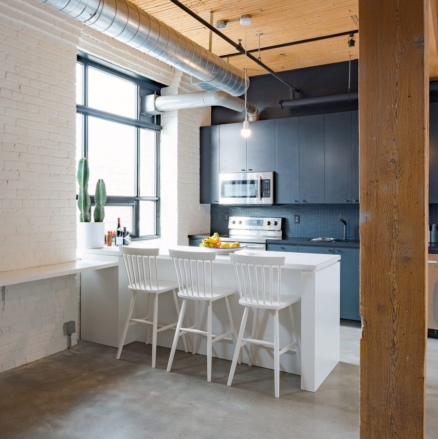
A bench at window-sill height lines the far wall opposite the entrance. It extends into the kitchen, where it angles into the room to form an island.
Aiming to underscore the depth of the dining space, the designers painted its back wall in black. The dark colour contrasts with the white-washed brick walls across the apartment and highlights the interior's interesting features.
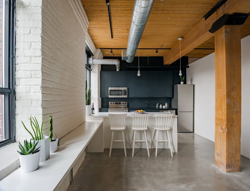
"The back wall of the kitchen was re-finished in black to have it receded from the objectified elements of the island and the bed box," said Andrew. "This simple contrast allows both pieces to pop visually and provide some relief within a predominantly 'white' design."
Other apartments where custom millwork is used to alter the layout include a live-work loft in Los Angeles Art District, and a remodelled Uptown Manhattan home with furniture that slides into partitions.
Photography is by Andrew Snow.
Project credits:
Architects: StudioAC
Builder: Whitaker Construction
Millwork: Zachary Tonge