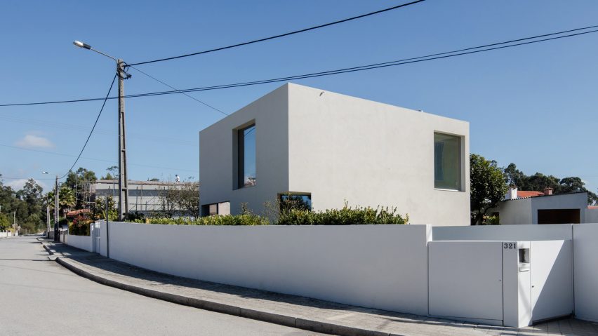
A 160-square-metre family home in Portugal completed on a shoestring budget is met with both high praise and doubt in this week's comments update.
Starting small: Portuguese architect José Carlos Nunes de Oliveira built Mami House for less than €100,000 (£84,000), impressing many Dezeen readers and inspiring some to follow suit.
"Finally, a great-looking affordable solution that many of us can aspire to achieve," stated James Beckett.
BeggarBoy agreed: "Just to look at it makes one feel inspired. Well done, I would be happy to call it home."
Unfortunately not everyone was won over by the design. Jjang_Sam said: "I'm not sure I understand the fuss this house is causing. Many Japanese homes deal with low budgets and small sites in equally, or, in many cases, a far more refined way."
"Given the labour intensive work of concrete, this sounds to me impossibly cheap." added an uncertain Tokyo Architect.
"That's a more than an impressive feat for that budget. You'd get cardboard and chewing gum in the US," countered JJME.
One reader in particular felt compelled to praise the project:
Is it possible to build a good family house for €100,000? Have your say in the comments section ›
Woman's touch: Gender balance in design became a hot topic among readers once again, following the news that female-only exhibitions have increased in New York following the election of Donald Trump.
"All-men would be terribly frowned upon but all-women is worth a fawning article?" pondered It is me again.
"Yes, unlike men, women are under-represented in many industries. We live in a patriarchal society and there is no such thing as reverse sexism," responded HeloRighetto.
"The amount of over-privileged, angry-at-nothing men in this comments section is ridiculous! If a minority wants to make their voices heard, why would the majority attack it?" added a frustrated Kayleigh.
This reader was keen to see more women designers in the media:
Read the comments on this story ›
MAD world: The nearly completed Chaoyang Park Plaza, designed by a mountain-referencing MAD, failed to capture the imagination of readers in the comments section.
"Looks cheap, somehow already outdated, and the envelope looks poorly constructed." said Danillo.
"Are we really at this point? Design a building to look like a mountain. It could have been done better by a (bad) first-year student." mused R2-D2.
However, this reader could picture a suitable use for the design:
Read the comments on this story ›
Car crash: Peter Zumthor's claim that his thermal baths in Vals have been ruined by an "egotistical developer" drew a fairly empathetic response.
"It is a pity that such a pearl has become the cornerstone of a new speculation by financial business. I really understand Peter Zumthor's displeasure" asserted Tommaso Corà
"The Morphosis tower is ridiculous, it's absolutely the wrong idea," chimed TFO, referencing the new building planned next door.
But not all were so sympathetic with Zumthor:
Read the comments on this story ›

