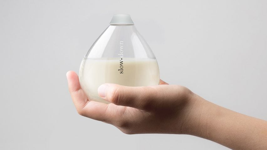
Polish studio Opus B has created a conceptual drink packaging designed to give consumers a chance to slow down.
The anti-energy drink comes in two glass bottles joined together in the middle to resemble an hourglass. The bottles are twisted apart to separate them into two portions.
The containers' narrow necks mean the drink – a "calming milkshake" made from natural ingredients – takes more time to serve.
"Our principal idea was to design a package which will provoke the creation of a new ritual of consumption," said Opus B's Aleksandra Wiśniewska. "The package creates a pretext to stop, think and catch a moment for yourself."
Opus B chose the hourglass shape not just as an obvious reference to time, but also as a way of making a double pack that it hopes would encourage people to share with someone else.
"We wanted to make associations with the passing of time, countdowns and some sort of transiency," Wiśniewska told Dezeen. "The watching of an hourglass is a certain ritual which may be soothing and relaxing thanks to its monotony."
The studio also used minimal typography for the bottle – which was a winner in blog The Dieline's 2017 packaging design awards – with white lettering that's revealed as the drink is poured out.
Opus B isn't the only studio using design to slow people down and alter behaviour. Dutch designer Marije Vogelzang recently created strangely shaped tableware to trick people into eating less.
Meanwhile, the Light Phone – a minimal handset created by Joe Hollier and Kaiwei Tang – intentionally lacks features, in the hope that owners will use it as little as possible.
"Design is about more than just formal solutions and aesthetically designed objects," added Wiśniewska. "The Slow brand concept is closer to critical design, which sees it as a medium for provoking thinking and sparking a discussion focused on important topics related to modern times."
Opus B works on product development, advertising and branding, and has designed packaging for several food and drink brands.

