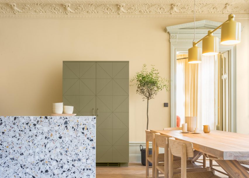
Instead of opting for the Scandinavian minimalism of many contemporary renovations, Note Design Studio chose to use shades of yellow, green and pink when transforming this old Stockholm office into a home.
Over a century old, the 200-square-metre property was previously the head office of a fashion brand. The clients asked local design collective Note Design Studio to transform it into a family home that maintained its "19th century splendour".
The designers' response was to create a colour palette based on some of the tones already there. They then applied these pastel hues to walls, mouldings, and door and window frames.
They call the project Hidden Tints.
"We noted the colours of the three tiled ovens: green, pink and a yellowish white," explained interior architect Sanna Wåhlin.
"We added tones to the original colour scale, which worked as a bridge between the powerful original hues, finally ending up with an eight-tone palette that originated from the hidden traces of the old apartment."
Some rooms are dominated by one colour, while others present an assortment of different tones. But they all build on the recent trend in Sweden for dark, cosy and colourful interiors, rather than the whites and greys of typical minimalist homes.
Note Design Studio has also applied similar thinking to some of its previous interiors projects, including a 1930s loft with a bright blue kitchen and a green-hued bistro elsewhere in Stockholm.
"Colour helps to emphasise the splendour in the detailing of the architecture," Wåhlin told Dezeen.
"In fact, the approach to colour in architecture in the old days was much braver than we see today. It deserves it's place again!"
The colours are complemented by the original but worn wooden floors, as well as newly added contemporary furniture pieces.
Pale yellow was chosen for the kitchen and dining room at the heart of the apartment. Here, a wooden table provides a dining space for six people, while a terrazzo island frame a kitchen in green and grey tones.
A similar palette features in the lounge space beyond, where the traditional ceiling mouldings are contrasted by a sculptural geometric lighting fixture.
In the bedrooms – one green and one peach – cabinets and wall panelling feature angular details that mimic the diagonal lines of the parquet flooring.
Many of Note Design Studio's own products also dot the interiors, from the Silo pendant lamps to the Mango chair, while other embellishments include plants, framed black and white photographs, and simple rugs.
"The result is a harmonious but rich colour experience," added Wåhlin.

