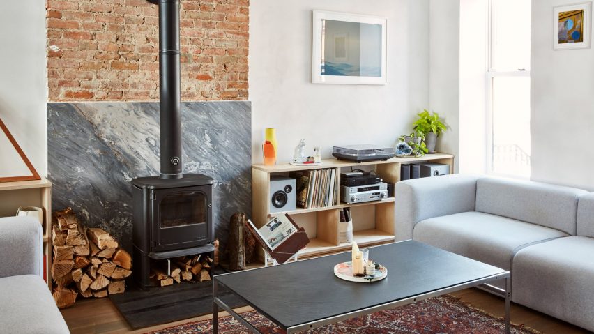
Lauren Snyder and Keith Burns create home inside overhauled brownstone in Brooklyn
Design store owner Lauren Snyder and architect Keith Burns renovated a brownstone townhouse in Brooklyn to create this light-filled home for themselves, where spaces are framed by objects rather than walls.
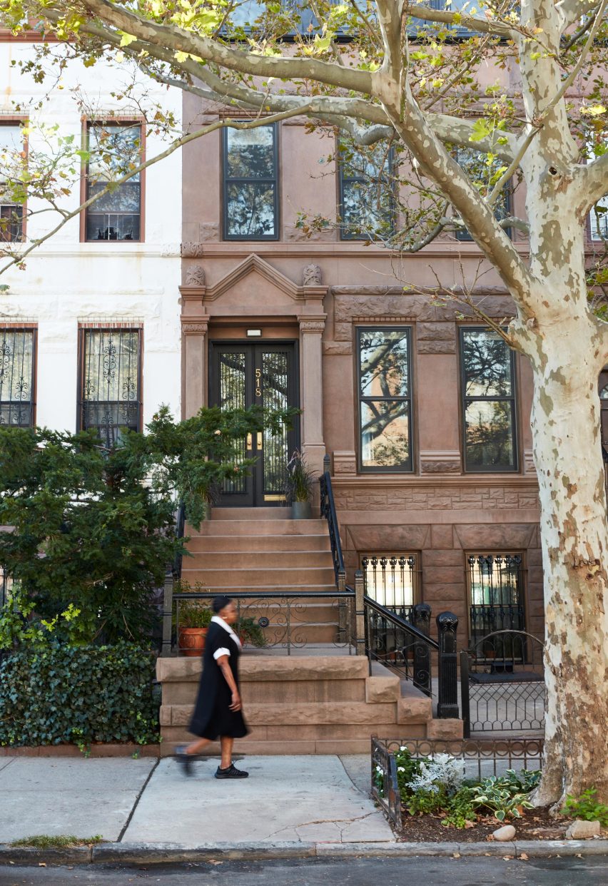
The narrow building in the Bedford-Stuyvesant area of Brooklyn was in a state of disrepair when Snyder – owner of The Primary Essentials – and Burns acquired it in the summer of 2014.
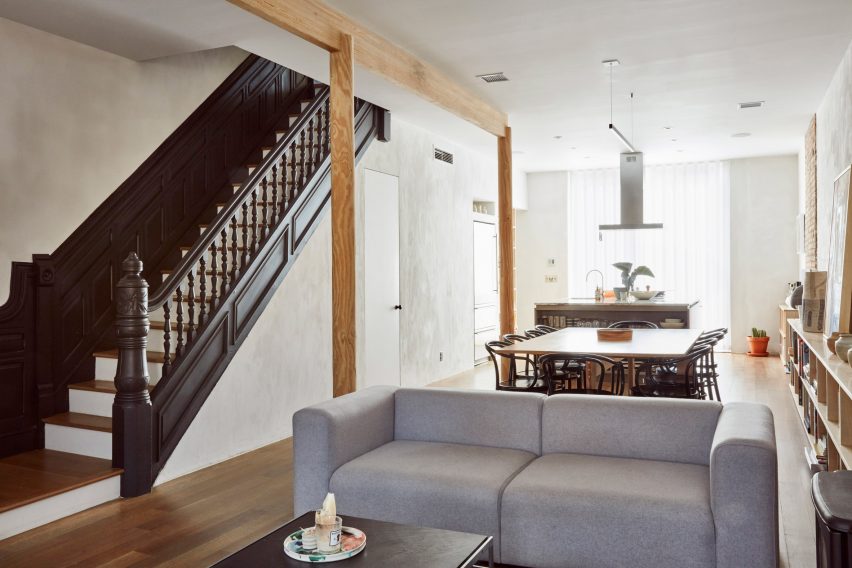
The pair decided to open up the cluttered interiors, to create sight lines to each of the home's exterior facades. This resulted in a more open-plan layout, making the living spaces feel airy despite the building's 18-foot (5.5 metres) width.
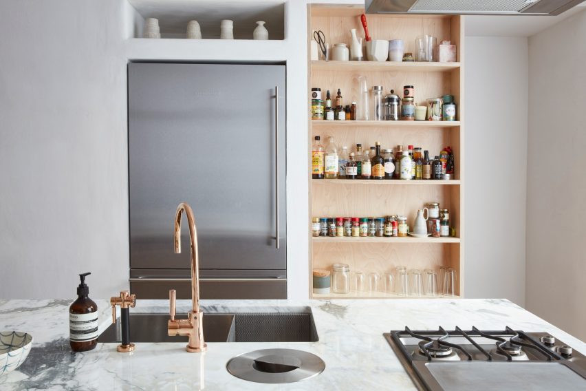
"The established envelope was challenging, because it contained a lot of deep space without natural light," explained Burns.
"Beyond the question of natural light, the challenge was how to fill the envelope in a way that was novel, without completely tearing it down."
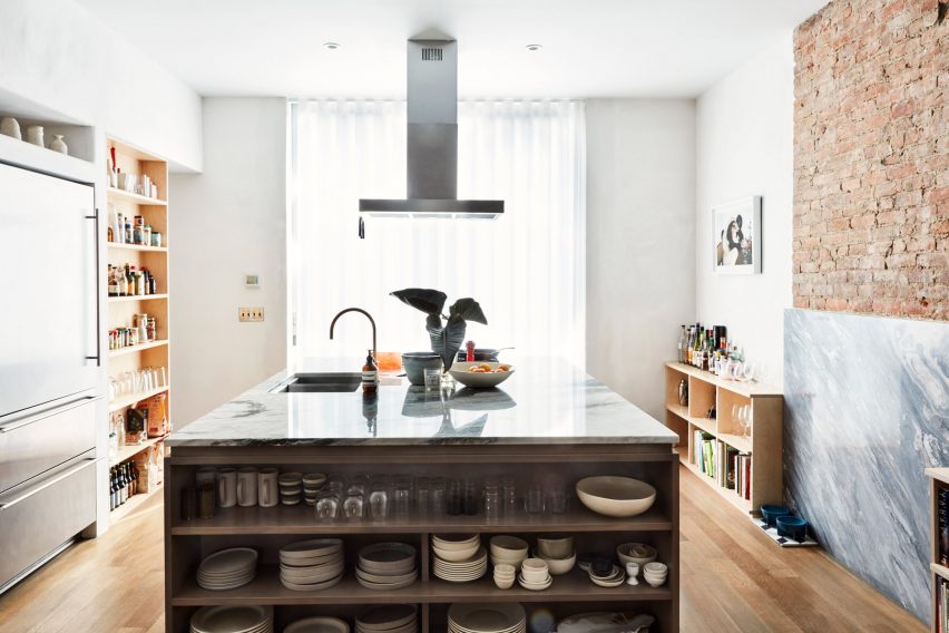
Without walls to define the various areas of the home, the duo opted to use furniture and other cues to organise the space.
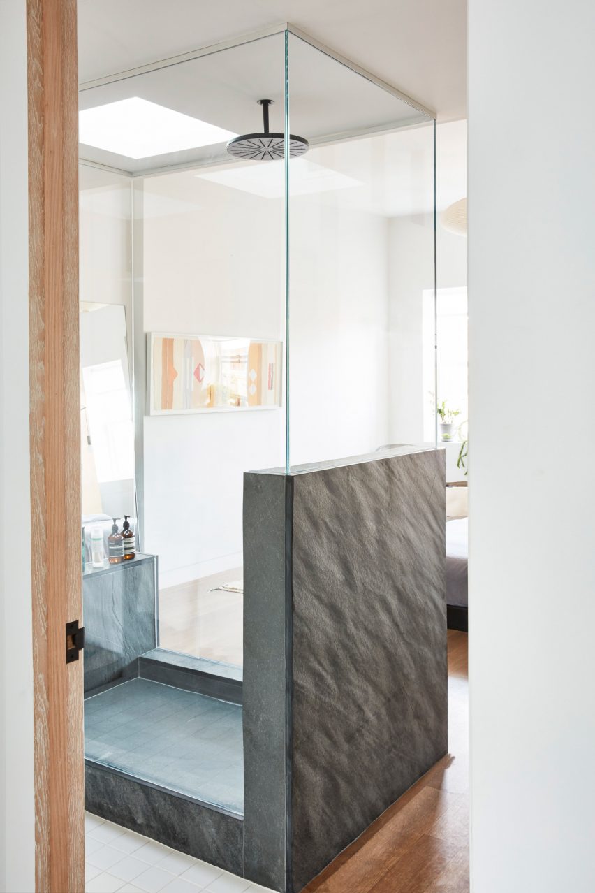
"We defined the space around objects, like the kitchen island, master shower, and closet, which has the nice effect of making the spaces all feel larger," the architect explained.
Brownstones are a common type of property in many New York neighbourhoods, and are popular with buyers. Other recent brownstone renovations in Brooklyn include one that was re-clad in aluminium and one with a lightwell carved out of it.
This 3,200-square-foot (297 square metres) building encompasses four storeys. Like most brownstone structures, the ground floor contains a standalone apartment, which the owners rent out. This is accessed separately.
Visitors climb up a short flight of outdoor steps to reach the main living area. Here, all walls are removed to create an open-concept kitchen, living and dining space. Only a few rough wooden columns were required for load-bearing purposes.
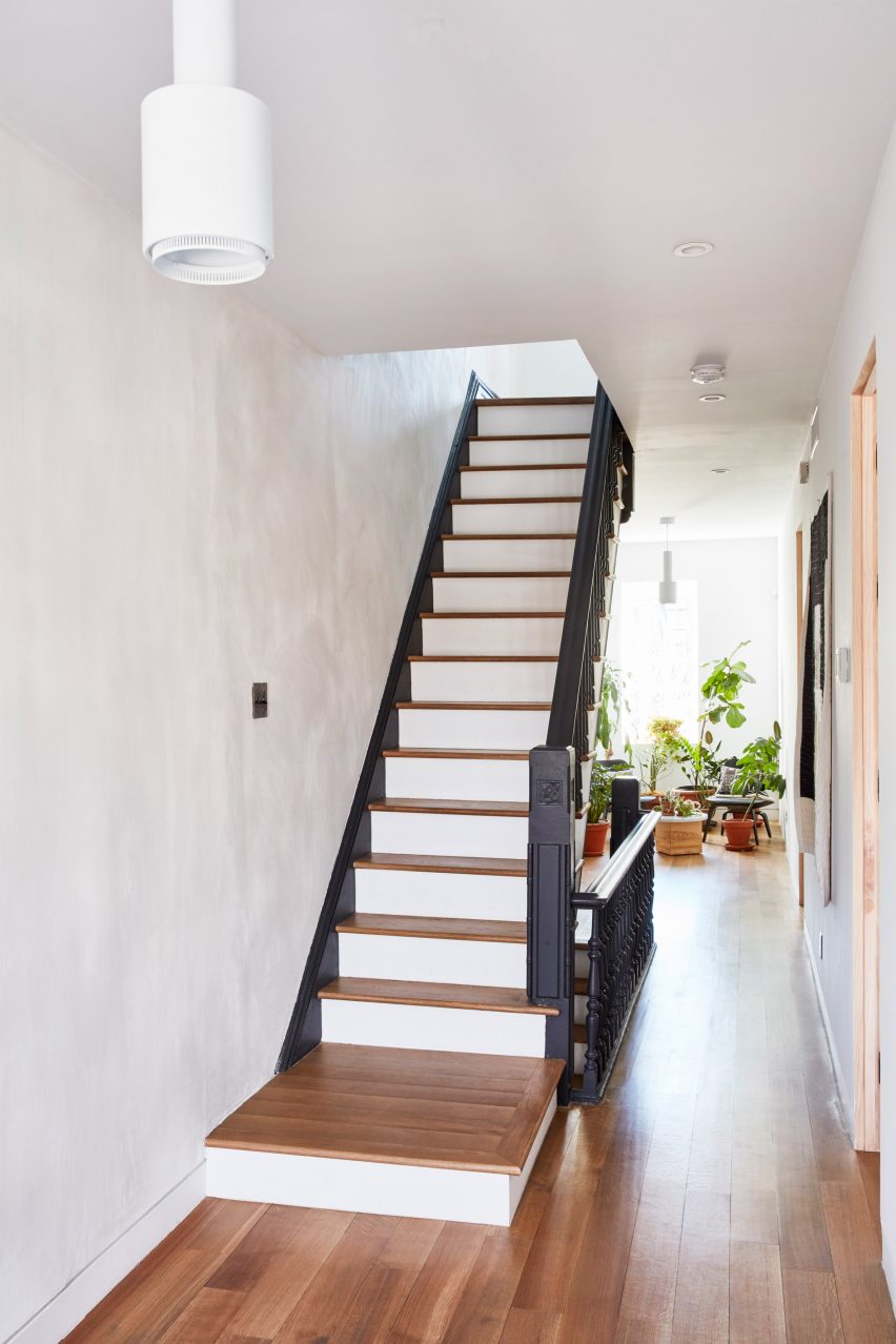
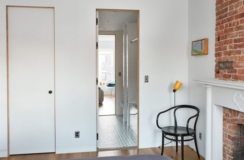
The home's existing staircase was preserved, and highlighted with a dark grey shade of paint. It leads up to a pair of guest bedrooms separated by a bathroom, which the couple share.
Rather than being cut off from the rest of the home, the stair's landing was designed to serve as two casual sitting areas. The south side receives more sunlight, and is full of potted plants. To the north, a reading nook overlooks the street.
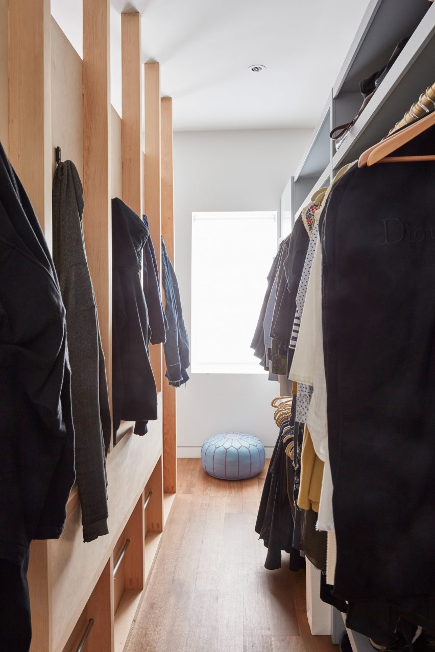
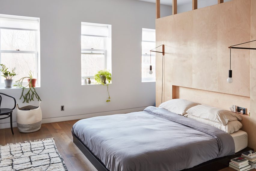
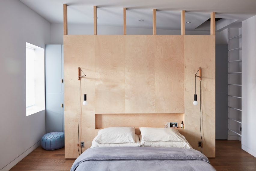
The home's top floor contains the master bedroom, as well as an office space. The bed occupies the centre of the room, and its expansive headboard conceals a walk-in closed located against the wall.
Although the building's exterior remained unchanged, the renovation entirely transformed the interiors. "There wasn't much to save," said Burns, who described the state of the property as "abandoned and unliveable" at the outset.
Minimalist finishes characterise the interiors. Marble accents contrast the neutral palette of white walls and wooden floors found throughout the home.
Photography is by Jonathan Hokklo.