Frank Lloyd Wright subverted typical art-gallery layouts with spiral Guggenheim museum
Our week of celebrating the 150th anniversary of American architect Frank Lloyd Wright's birth by examining his most important projects ends with the Solomon R Guggenheim Museum in New York, which he designed as a spiral ramp for viewing avant-garde artwork.
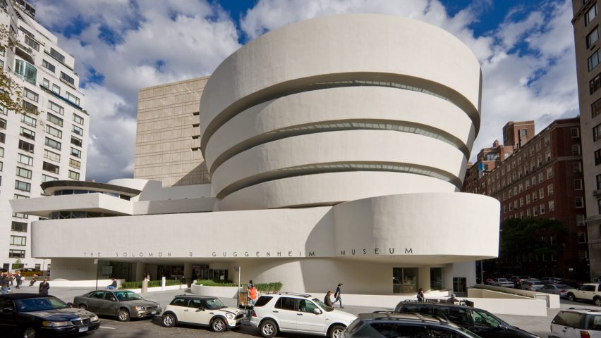
The Solomon R Guggenheim, commonly referred to as the Guggenheim, is one of Wright's most iconic projects and a key building of the 20th century. It was completed in 1959 and named an official New York City landmark in 1990, making it the youngest building to receive the accolade.
Wright was tasked in 1943 by Solomon R Guggenheim – a wealthy American businessman and philanthropist – to design an unusual museum to host his growing private art collection, which included pieces by Wassily Kandinsky, Paul Klee and Piet Mondrian.
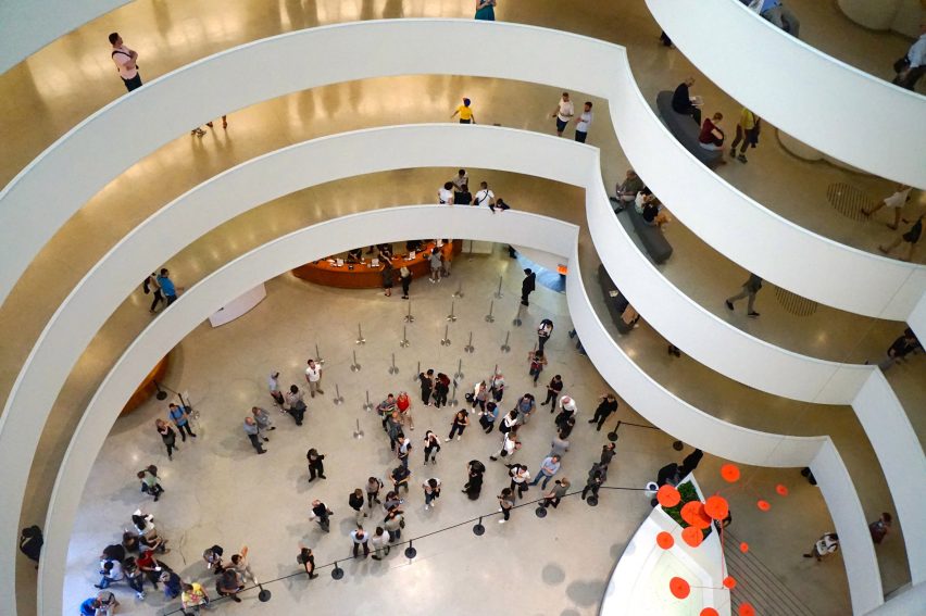
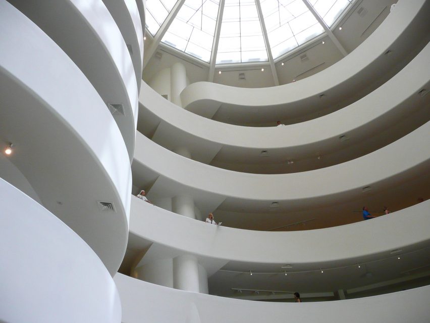
Aiming to break away from the traditional museum layout, which forced visitors to progress from space to space and then back through to exit, Wright designed the gallery as a continuous ramp.
Measuring a quarter of a mile, it loops around a central large atrium topped by a huge domed skylight. In Wright's design, a lift would take visitors to the top of the building and then the long ramp that allow them to saunter back down.
New York City provided a challenge for Wright. Unlike his past work, located in sprawling American Midwest or the desert, he felt that the city was over-populated, dense and lacking natural habitat.
Finding solace in the nearby Central Park, the architect settled for the site in the Upper East Side of Manhattan and used the project to experiment with his style of organic architecture in a built-up environment.
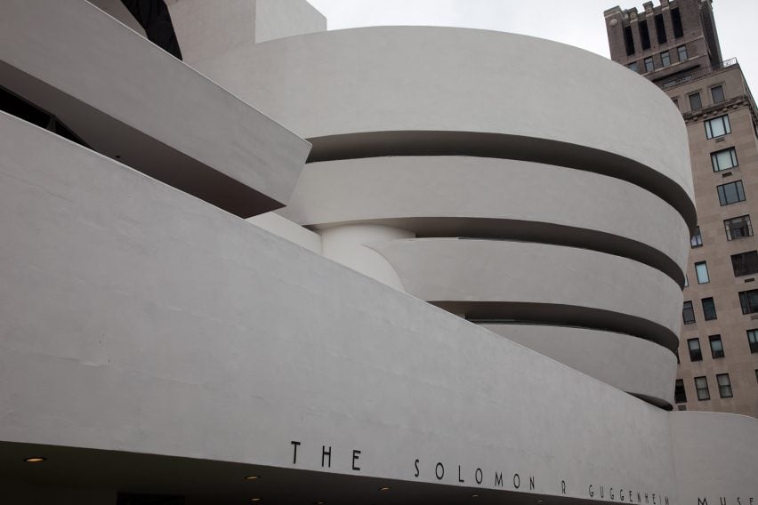
As prescribed by his philosophy, the Guggenheim bears an organic shape and its looping pathway has been likened to a nautilus shell.
On the exterior, it is expressed by white reinforced-concrete bands, which widen towards the top. In early drawings, Wright described the shape as an "inverted ziggurat" – a reference to the stepped pyramids of ancient Mesopotamia in the eastern Mediterranean.
A lower band wraps around both the main building and a smaller volume next to it, forms a canopy above the entrance. The second block was originally intended for apartments but is used as office space instead.
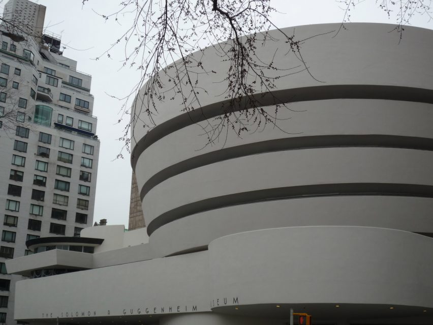
In one of the most well-known commentaries of the building, architecture critic Paul Goldberger said that was Wright's bold design has provided a lasting influence on others to come.
"Wright's building made it socially and culturally acceptable for an architect to design a highly expressive, intensely personal museum," said Goldberger.
"In this sense almost every museum of our time is a child of the Guggenheim."
The project was not entirely smooth sailing for Wright, who had imagined that paintings should be hung at a tilt, like the way they rest on an easel.
However, many artists disagreed and 21 protested about having their work showcased on the building's curved walls.
Over the 16-year-long project, Wright produced 700 sketches and six separate sets of working drawings for the building, some of which are currently on show in major retrospective exhibition at New York's MoMA along with a restored scale model of the project.
One of these early drawings shows that he had envisioned that exterior would be painted red – a far cry from the bright white that it is known for today. Wright had chosen the hue to reference natural colours, but also because of its importance Japanese culture, of which he was a great admirer.
Neither Wright nor Guggenheim lived to see the building open.
Guggenheim passed away in 1952, before the building broke ground in 1956. It was following his death that it was renamed from Museum of Non-Objective Painting to the Solomon R Guggenheim Museum.
The museum is part of the nonprofit Solomon R Guggenheim foundation, which includes the Guggenheim Museum Bilbao designed by Frank Gehry and the Peggy Guggenheim Collection in Venice.
Wright died in 1959, aged 91 – just six months before the museum opened in October the same year.
Following its completion, the building has undergone a series of extensions and renovations. In 1990 and 1992, the smaller rotunda was converted into a gallery called Thannhauser Building, which hosts a permanent collection of impressionist, post-impressionist, early modern, and contemporary art.
Special exhibitions are located in the main building and viewed in sequence from the bottom up, unlike Wright's original intentions.
Gwathmey Siegel and Associates also added a tower to the building to host four more exhibition spaces and office space. In 2002, the building was extended to include a 8,200-square-foot (762-square-metre) learning centre called the Sackler Center for Arts.
Estimates suggest that more that one million visitors attend the museum each year, making it one of the most visited sites in New York City.
Yesterday, 8 June 2017, marked the 150th anniversary of Frank Lloyd Wright's birth. On the same day, MoMA opened its exhibition presenting the architect's archive of drawings and models.
As one of Wright's most-loved projects, the Guggenheim has formed an integral part of the anniversary celebrations, with Lego launching an updated Guggenheim Museum kit to mark the occasion.
The museum also hosted a birthday party and curated tour of the building in Wright's honour – one of a series of events taking place across the US to mark the occasion.
Dezeen is also celebrating Wright's birthday, by looking back at his most famous projects, including Taliesin West, Fallingwater, Robie House and Hollyhock House.