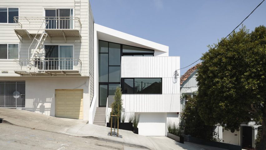
The founders of US firm Edmonds + Lee Architects designed this urban dwelling for themselves, including a bright white facade, a slanted roof and retractable glass walls.
Located in San Francisco's Noe Valley neighbourhood, the Switchback House sits on a steep road lined with low-scale dwellings. The site was formerly occupied by a modest, one-storey house.
Vivian Lee and Robert Edmonds, a married couple and founding partners of local firm Edmonds + Lee Architects, designed the home for themselves and their two young children.
Rather than occupying the full residence, they opted to divide the three-storey building into two discrete units. The upper floors are used by the family, while the bottom level is leased to a tenant.
"The lower floor can be – and currently is used as – an income-producing rental, but the house is designed flexibly enough that the owners can turn the structure back into a single-family home," the studio said.
The duplex is clad in white, pre-manufactured trim boards, with the street-facing elevation featuring a large expanse of dark glass. A rectilinear volume protrudes from the front of the residence, providing a contrast to the home's sharply slanted roof.
Inside, the architects placed on emphasis on quality over quantity. "Working as not only their own clients but also their own developers, they were able to avoid the typical market-driven pressure of maximising square feet and instead focus on qualitative issues," the studio said.
The overarching goal was to create a home that embraced its urban context while also feeling "light, airy, spacious and open to the sky".
In the upper-level unit, three bedrooms were placed on the first storey, while the public spaces were situated on the top floor in order to create a loft-style atmosphere.
Occupying the front portion of the top floor is the kitchen, which opens onto an outdoor deck. Wide, wooden stairs lead down to the living room, which also opens onto a terrace, providing sweeping views of the city.
The master suite and rental unit also feature outdoor terraces.
Throughout the residence, retractable glass walls enable interior spaces to be fully open to the outdoors. Gallery-style white walls and streamlined furnishings help create a feeling of clarity and serenity.
Cost-effective materials were used throughout the project, including basic drywall and painted steel. "Much of the house's detailing made creative use of everyday materials," the team said.
As with many economical projects, the team turned to Ikea for its storage needs.
"The architects undertook the ultimate Ikea hack: measuring the standard size of the big-box retailer's shelving, and building closet spaces to fit to the centimetre – creating a custom millwork-level aesthetic for a fraction of the price," the studio said.
Other homes in San Francisco include a residence by IwamotoScott that has an angular, wooden facade and a zinc-clad duplex by Stephen Phillips Architects that aims "to challenge the normative San Francisco housing typologies".
Photography is by Joe Fletcher Photography.

