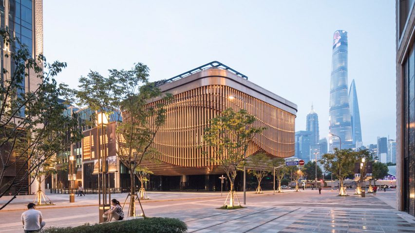
Readers' quizzical reactions to the moving facade of a new arts and culture centre in Shanghai by Foster + Partners and Heatherwick Studio leads this week's comments update.
All a facade: Foster and Heatherwick's new Shanghai theatre features "a moving veil which adapts to the changing use of the building", prompting a discussion about style versus substance.
Abhi was unconvinced. "Beautiful detailing and mechanism. But for what? Clearly overdesigned."
"Overdesigned? The idea covers the context just fine with no loose ends. It's calm and strong at the same time," responded Ercan Çelikkıran.
Bradley Schott wasn't ready to judge this book by its cover. "It sure is pretty, but if it's just a bunch of concrete columns and slabs underneath, then it is really a fundamentally ordinary building with a pretty facade."
One regular commenter felt the building is an improvement on Heatherwick's last collaboration – Google's London HQ. "Overall a much better collaboration than with BIG," wrote H-J.
"Looks like a pipe organ - perhaps it plays tunes." added Geofbob lightheartedly.
The design reminded one reader of the theories of architects Robert Venturi and Denise Scott Brown:
What do you make of Foster + Partners and Heatherwick Studio's collaboration? Have your say in the comments section ›
Red or blue: readers debated whether the optimistic reactions of UK designers and architects, in light of the country's surprising election result, were warranted.
"Some people, despite the clear results, still try to frame this Conservative victory as a win for Corbyn. How delusional one must be!" exclaimed H-J.
"Nothing to celebrate here, Corbyn did better than Milliband but still less electable than a weak Cameron and a disastrous May campaign," agreed Koby.
Geofbob was undeterred by the naysayers. "Think of it like the retreat from Dunkirk in 1940. Victory – certainly not! Cause for celebration – absolutely!"
William suggested it was about time UK politics caught up. "Since ditching the First Past the Post electoral system and bringing in MMP a number of years ago in New Zealand, hung parliaments are a fact of life. It's been a wholly good thing."
"Every cloud has a silver lining and it feels good reading the views above" pointed out a positive Cisela Wildes.
But not everyone was interested in the election:
Read the comments on this story ›
Rainy days: the Boundary's decision to replace typical blue-sky backdrops with foggy skies to create renderings of a wedge-shaped tower by Richard Keep Architects and Henry Goss left most readers unamused.
"Wow. These guys must be the first ever to do a fancy render without blue sky! Innovators," quipped Chris.
DWF felt he'd seen better. "The renderings don't have the same quality as those for their smaller projects, not up to their usual very high standards."
Some readers, like Danny Cass, were sold on the visualisations: "Impressive presentation of an impressive project."
One reader found a flaw in the details:
Read the comments on this story ›
Happy 150th: as Dezeen revisited the works Frank Lloyd Wright on his 150th birthday, readers added their thoughts on the iconic architect's work, particularly his Fallingwater house in Pennsylvania.
"This house is a masterpiece. If you haven't been there, it is a must see," declared The Liberty Disciple.
John Delaney added his reflections on the importance of Wright's legacy. "Wright and Aalto were able to 'humanise' buildings in a way that others could not. Who carries that mantle today? Kuma maybe?"
This reader thought it was important to look to the future as well as the past:
Read the comments on this story ›

