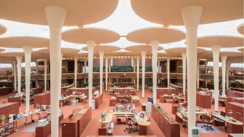
Mushroom-shaped columns, pyrex skylights and earthy coloured furnishings feature in Frank Lloyd Wright's Johnson Wax Headquarters, which is next in our series of the architect's most important projects, celebrating the 150th anniversary of his birth last week.
The Johnson Wax Headquarters – also known as the Johnson Wax Administration Building – was completed between 1936 and 1939 in Racine, Wisconsin. It provided the main office for SC Johnson & Son, an American manufacturer of household cleaning supplies.
Despite its location on an industrial park, Wright designed the building in his organic architecture style with references to natural forms. This is exemplified in the main open-plan office space, which is often described as forest-like.
Called the Great Room, the double-height space features tree-like columns that sprout from nine-inch (23 centimetres) diameter bases and widen to create lily-pad-shaped concrete tops.
Skylights made of pyrex tubing are set between the pads to offer a diffused lighting effect above the canopy. The pyrex extends down at the top of the walls to create clerestory windows.
Wright, who also illuminated his Larkin Administration Building from above, chose skylights rather facade glazing because he wanted to block views of the surroundings.
In the Bruce Brooks Pfeiffer and Gerald Nordland edition of the essay series called Frank Lloyd Wright: In the Realm of Ideas, Wright is quoted as discussing the office's light-filled open nature:
"There in the Johnson Building you catch no sense of enclosure whatever at any angle, top or sides," he said.
"Interior space comes free, you are not aware of any boxing in at all," he continued. "Restricted space simply is not there. Right there where you've always experienced this interior constriction you take a look at the sky!"
As well as providing a new model office spaces with the open-plan layout, Wright's design was built using advanced construction techniques.
The shape of the structural columns didn't fit building code at the time, and Wright was forced to show that they could support twelve tons of material. During the tests, the columns didn't falter until loaded five fold with sixty tons of materials.
A mezzanine level surrounding the office space was designated for the administrators with views to the floor below.
The American architect also used the pyrex glass tubing to create wall dividers inside the building. He also designed all the furnishings, selecting red tones that took cues from natural earthy hues.
One of his designs included a chair with three legs, but he was later tasked to redesign the seats as people fell off them.
Smaller versions of the dendriform columns also feature in the covered car park. Wright purposely made this space lower in order to offer contrast when entering the main room.
Curved "Cherokee red" brickwork walls make up the exterior of the building – a move away from the straight-edged shapes in his earlier Prairie style.
It is often cited as an example of the art modern style, a later version of art deco architecture that flourished in the 1930s, which was characterised by streamlined curving forms.
Wright later added a 15-storey research tower to the Johnson Wax complex – one of two of the architect's remaining high-rise buildings – featuring glazed bands set between layers of brickwork.
Inside, circular mezzanine floors are cantilevered from the central core and alternated with full size floors.
In addition to a central elevator, the tower featured a 29-inch-wide (73-centimetre) spiral staircase. As this does not follow current fire safety requirements, the building is no longer used, but is open for tours.
Both the administrative building and the high-rise were named National Historic Landmarks in 1976 as Administration Building and Research Tower, SC Johnson and Son.
Last week, on 8 June 2017, marked the 150th anniversary of the Wright's birth. A series of events took place to mark the occasion and MoMA opened its major retrospective exhibition presenting the architect's archive of drawings and models.

