"Frank Lloyd Wright remains America's greatest architect"
Rounding off our celebration of Frank Lloyd Wright's 150th birthday, Aaron Betsky dissects the American architect's array of buildings to prove why his body of work remains unmatched in the USA.
There are few experiences in architecture more rewarding than visiting a building designed by Frank Lloyd Wright. What exactly makes them so good? The details in every building are different, but over the seven decades that Wright practiced, he developed a repertory of devices – tricks of the trade, if you will – that you begin to recognise and appreciate. They form the core of the continued importance and relevance of his work today, 150 years after his birth.
First and foremost, there is the way the buildings sit in their sites. I did not say "on", but "in", because his best designs nestle into the land with a rightness that makes them appear as the human-made elaboration of that place.
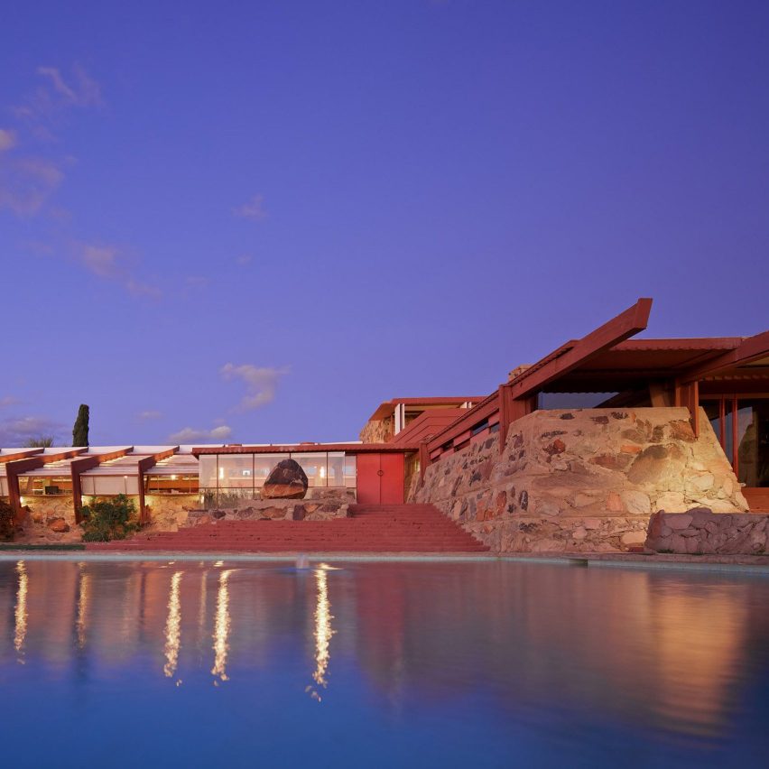
This is especially true in his rural buildings, such as Taliesin in Spring Green and Taliesin West in Scottsdale, where the horizontal lines are the contours lines of the land made visible and reiterated to emphasise human occupation, while the spreading roofs not only denote shelter, but are also geometric versions both of the immediate site and of the hills or mountains that rise around them.
When the landscape is flat, as in Oak Park or around some of the later Usonian houses, the architecture offers itself as an intensification and decomposition of the suburbs around them, clarifying the landscape humans made.
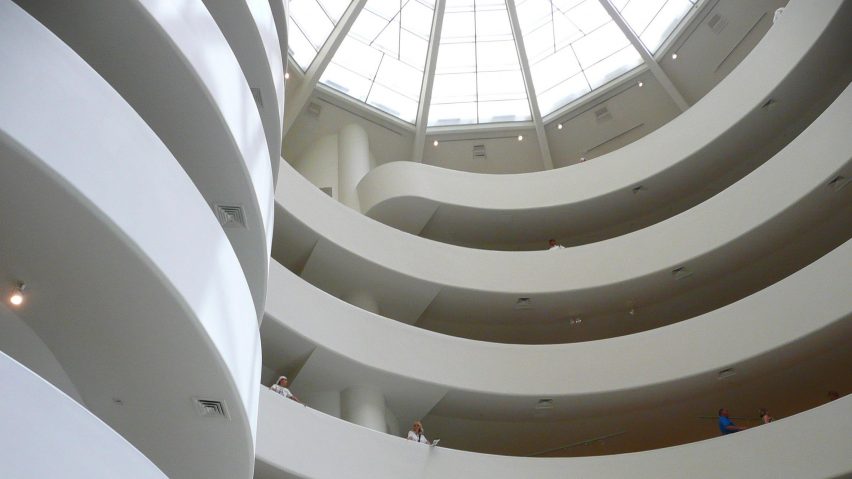
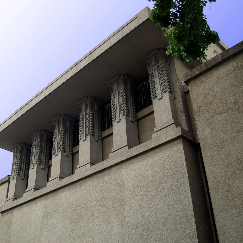
In urban settings, Wright tended to either isolate his structures as mute monuments to another world sheltered inside, as in Unity Temple or the Johnson Wax Headquarters, or spiral out of the site in the manner of the Guggenheim Museum in New York.
Entry into Wright's buildings is almost inevitably a journey that turns into a quest
Wright did not love downtown areas, and it shows in his architecture. They work hard to take you away from the noise, dirt, and "mobocracy" he thought dominated downtowns.
The entry into Wright's buildings is almost inevitably a journey that turns into a quest with many twists and turns, tights spots and moments of respite, before you reach the hearth at the centre of the home or the sanctuary in the church.
Wright frequently used what the architect Charles Moore called "that old death and resurrection trick", in which you find yourself brought into a small, low, and dark space, before you explode into a room, such as the sanctuary at Unity Temple or the living room at Taliesin West, that is large, tall, and filled with light.
Before you get there you have turn and see glimpses of spaces to come that then slide away with the next turn. To get from the main campus axis of Taliesin West into that living room takes six turns.
Those hearths, often lit by skylights or clerestories, form both the physical and symbolic cores of Wright's houses. There you are supposed to gather and create a community around the warmth and light at the heart of domesticity.
In his public buildings, Wright often erected small shrines with quotes from his favourite poets or philosophers to sanctify the place of business, worship, or entertainment. The cores root you to the land or the site, and create an anchor for the separate worlds Wright creates through his designs.
Almost every element in a Wright-designed structure is a delight to the eye and often the hand
Turn around once you have reached that centre, and you look back at the world you have left. Wright used ribbon and corner windows to draw your eye out to the world outside, while highlighting the horizontal line of repose that would make you feel both at home in and in control of the landscape.
The windows usually offer the best views when you are sitting down, emphasising that you should be rest within the realms he created. In urban structures, skylights draw your eye away from the confusion around you and towards the abstraction of the sky, a place even larger than the most expansive and thrusting metropolis.
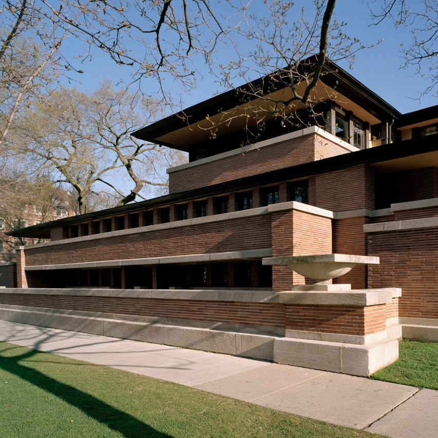
As much as Wright choreographed his interiors into stage sets for daily life, he also broke apart his structures. Early in his career he achieved this by "breaking the box" of the suburban home into planes such as those of the Robie House that extend out into the site and dissolve the building's solidity into openings, moments of intensity, and intersections of planes floating over and through the landscape.
Later he became more and more interested in spiralling you from outside in and then through the building, as he did at Taliesin West, until he designed the Guggenheim at the end of his life (it opened a few months after he passed away), implying a realm of art that would keep spiralling out of the city and to some unknown place of pure abstraction.
Beyond using these spatial moves, Wright also delighted in making beautiful compositions and developing intricate details and ornament. Almost every element in a Wright-designed structure is a delight to the eye and often the hand.
Wright's formal abilities and inventiveness do not fully explain the impact of his architecture
Planes slide by each other, horizontals and verticals balance, and lines build up to emphasise mass. Ornament flourishes at the edges of planes, drawing attention to their stretch and implying three-dimensional elaborations beyond what the actual structures can support, such as is the case in the "balloon" details he used on later structures such as the David and Gladys Wright House.
Finally, having prepared the way with all the care of which he was capable, Wright would sometimes leap into the great gesture; at first somewhat timidly, in the decomposition of the Winslow House's rear and the abstraction of the gable in his Home and Studio in Oak Park, then with more bravura in the cantilevered planes of the Robie House and the towers of the Larkin Building, as well as in that building's Great Room, and then more and more into the cantilevers, bridges, triangular or diamond-shaped interiors (such as that of the Beth Sholom Synagogue in Elkins Park, Pennsylvania) of his later work.
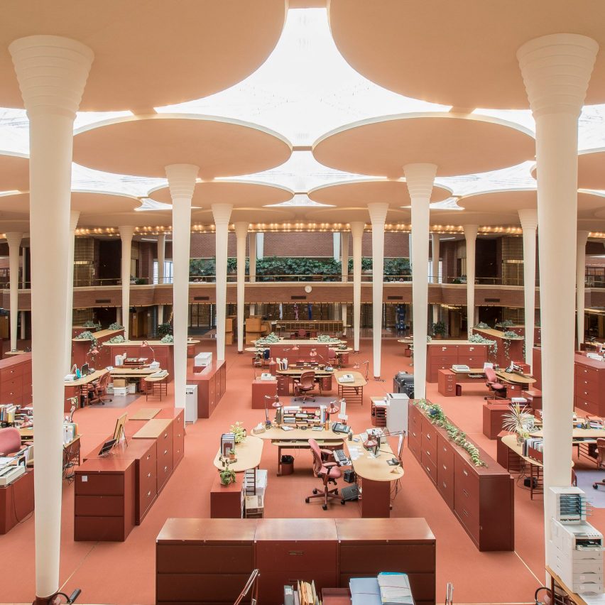
Wright's formal abilities and inventiveness do not fully explain the impact of his architecture, which is as much rooted in the culture out of which it rose and the architect's own talents as a salesman (his autobiography is by far the most read architecture book ever).
The same intensity of design, along with his preference for low and dark spaces, can also make his buildings depressing and confining, while all that complexity also means that his roofs often leak and his spaces do not always invite changes of use.
Being in a Wright building can be as much work as it might have been to design it. Look carefully, though, and you will see the solid, if also always dissolving, structures that are at the heart of why Frank Lloyd Wright remains America's greatest architect.