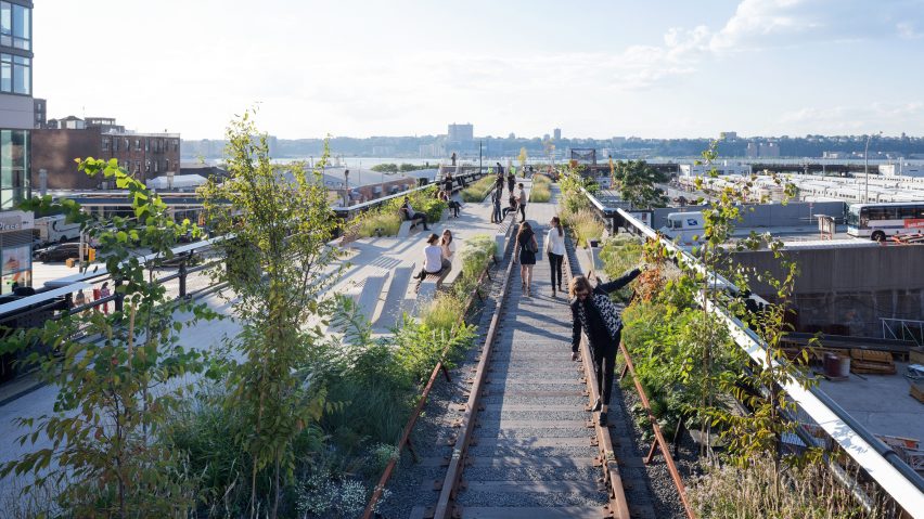
Gentrification is the hot topic in this week's comments update, after the creators behind New York's High Line launched a website advising on how to create similar projects without pushing out local communities.
High price: readers are debating whether adaptive reuse projects such as the High Line in Manhattan negatively or positively impact cities, after its creators set up The High Line Network to advise against creating inequality.
Some commenters felt the situation was inevitable. "Manhattan is breathing gentrification," wrote Karol. "It fuels the city."
"It is almost impossible to avoid, when a project like this is inserted in a 'low income' urban context," said Ji. "These kinds of places skyrocket the land prices and raise investment, which is good for the city."
"Gentrification is bad? How, exactly?" Duckusucker chimed in. "It increases property values; homeowners can sell for much more than they invested. If they're poor or low-income, they get a windfall and can move to better homes or have a nice nest egg."
"Most low-income folks are not property owners, but rather renters," replied Bobby. "Thus rents rise and they have to move because they're priced out... no windfall for them, just displacement."
One reader remarked that the High Line was specifically precisely because the community around it were engaged throughout its planning:
Is gentrification a force for good? Have your say in the comments section ›
Wrong, champ: this tiny modernist-inspired hut nestled into the mountainous Scottish landscape has proved surprisingly controversial with readers.
"Why is the building completely dismissive of the most important quality of this site?" lamented J.Tait. "You can't see the beautiful views!"
Regular commenter Guest was also unimpressed. "So it's a traditional wood cabin from any point in the last 300 years, but with little Ronchamp-style windows," they said.
"I don't understand. Is this just a room with a table in the middle of nowhere?" said a user called Mcmlxix.
But Dollis provided some important context for the doubters:
Read the comments on this story ›
Stage set: seven big-name architects have submitted competing proposals for a new events pavilion in Edinburgh, but which design is the readers' favourite?
"It must have been a wide brief to allow the entry of both Sou Fujimoto's Celtic knot-inspired walkway and wHY's series of smaller pavilions with wavy grassed roofs," said Geofbob. "I suspect BIG will win."
"I'm generally not a fan of Adjaye's work, but I quite like the forceful simplicity of this design," wrote Mattia. "Honestly, all are quite lovely."
"I found the whole outcome rather underwhelming considering the names at stake," disagreed Sorperdida.
But one reader had a clear favourite, and it wasn't from one of the most famous firms:
Read the comments on this story ›
Book smart: Sou Fujimoto has designed a hybrid bookshelf and chair that serves as both storage and seating, but readers are debating how innovative the idea is.
"Looks like that IKEA shelf that everybody has, but with a chair cut out. But yeah, innovation," said Lars.
"If you think that looks like the IKEA shelf, it says a lot about your attention to detail," hit back Gan.
"The design is nice and smart, but is it really useful?" asked Malgorzata.
One reader gave the ultimate put-down:
Read the comments on this story ›

