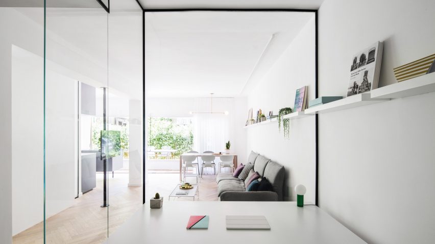
Light colours and glass walls create the illusion of extra space within this Bauhaus apartment in Tel Aviv, which has been refurbished by architect Amir Navon of Studio 6b Design School and interior designer Maayan Zusman.
Working alongside interior design graduates Dana Sagive and Naama Tison Vilotsky – also of Studio 6b Design School – Navon and Zusman were tasked with opening up the space while also fitting more rooms in.
The apartment, located in a Bauhaus building in one of the city's central boulevards, measures 70 square metres and has its own private garden – a rarity in Tel Aviv, according to the designers.
By removing walls and reconfiguring the original layout, the designers have transformed the one-bedroom, one-bathroom apartment into a two-bedroom, two-bathroom apartment with compact external and internal kitchens, and a home office located within a glass box in the living room.
During a previous renovation process, the apartment's ceilings were lowered and pillars thickened in order to provide building support.
To create a bright and airy appearance, a light-toned oak herringbone floor is teamed with pale colours, while dark accents are used in the kitchen and bathroom spaces.
"We wanted to provide darker contrasts without closing up the space," explained the designers. "This can be seen in the grey kitchen, the black en-suite bathroom – which is accented with golds – and the dark herringbone tile floor in the second bathroom."
A "safe room" that was also added during the building's earlier renovation was turned into the second bedroom. Two wooden plates with holes pierced in them support modular brass hooks and shelves that can be used for storage.
Brass accents were used throughout the apartment in the form of light fixtures and accessories including a Lambert and Fils pendant lamp above the dining table. Brass lamps were also installed on the apartment's thickened structural pillars in order to integrate them into the new design instead of hiding them.
To save on space, a wardrobe forms part of the wall between the bedroom and the living room, while translucent glass doors allow light to flow between the living spaces.
A glass work room, located in the entry of the house, overlooks the living area. A curtain that wraps the space can be used to create privacy.
A line of shelving units in varying lengths stretch across the entire living area from the dining area into the glass office room.
"As size was critical we chose to purchase few items and custom designed most to fit exactly, including cabinets, shelves, bedside units, mirrors and so on," the designers explained.
Outside, the garden's flooring was changed to decking to match the building's exterior windows, and living green walls were installed to provide plant life without taking up valuable floor space.
As city property prices continue to skyrocket, the trend for micro apartments is growing. Other recent space-saving designs include a compact concrete house in an old industrial area of Deventer, the Netherlands, that was designed for a young couple on a tight budget, and a living unit designed by Nils Holger Moormann for those setting up home in a micro apartment.
Photography is by Itay Benit.

