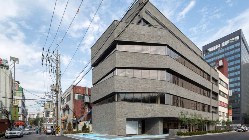
South Korean studio BUS Architecture has completed a mixed-use building in the Seoul, featuring bands of windows set into its brick facades that decrease in size as they wrap around to the rear.
The building in the Mapo district is positioned on an L-shaped corner site connected to a main road with well-established shops and businesses on one side and a quieter sub-street on the other.
The area reaching back from the main street is the narrowest portion of the site, but the architects wanted to find a way to activate this space and encourage more pedestrians to enter the building.
A lane was created that extends through the building to connect the two streets on either side. A short set of steps leads from the main road to the path, which is set between the neighbouring buildings and is flanked by a paved courtyard.
"The door to the road is always open, sometimes serving as a shortcut for pedestrians to cross the street, or sometimes as a small yard for pedestrians' brief rest," said BUS Architecture.
Where it meets the courtyard, the building's facade curls down to create an uninterrupted surface. A window ledge set into this wall provides a casual perch next to a bench built into the wall lining the paved area.
The arrangement of the building was determined by a desire to achieve the maximum possible floor area. Planning regulations determined that the office spaces on the top two levels needed to be set back from the main facade.
The client had requested glazed curtain walls on all sides of the building, but local restrictions dictated that less than 60 per cent of the exterior could be covered with windows.
In addition to these guidelines, the rear of the building looks onto the neighbouring buildings, so large glazed surfaces lining the main commercial floors were not appropriate.
The architects developed a proposal featuring bands of windows on the elevation facing the nearby Han River. The windows taper as they wrap around the angular corner to minimise views of the neighbouring structure.
"We modified the sizes of the windows according to the direction in which you see them from each of the building's corners, and accentuated the sense of speed of the panorama when you get to each of the floors through the vertical traffic line," said the architects.
The composition of slanted brick surfaces interspersed with the glazing lends the facades a sense of dynamism and distorted perspective that activates the frontage facing the adjacent road intersection.
From inside the commercial floors, the changing shapes of the windows creates a wrap-around panoramic effect that opens up towards the best views.
Photography is by Kyung Roh.

