"It's not a swastika it's a pinwheel"
Readers have been debating the shape of BIG's latest project, a subterranean second world war museum, in this week's comments update.
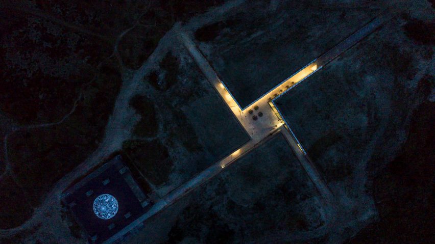
Symbolic: some readers think the new dug-out passages and central courtyard of the Tirpitz Museum in Denmark, which sits adjacent to a former Nazi bunker, resemble a Swastika emblem. But not everyone agrees.
"Umm....did BIG just incorporate a giant swastika for people to see from space?" asked a disbelieving Jenga Cat.
"I mean, technically it's not a swastika it's a pinwheel, which is, of course, a commonly accepted architectural parti. Really, this may be some of BIG's best work and it's getting hijacked by the swastika reference," said HeywoodFloyd, jumping to the firm's defence.
"Anywhere else this wouldn't look like a swastika but on a site like this? You have to be a little bit more careful," countered a sympathetic Jack Treber.
Ronaldo Belló was pulling no punches:"BIG lacked so much sensibility in this project it is offensive to humankind."
"But Dezeen readers are perceiving this as a broken swastika, thus symbolising the defeat of the Nazi movement, which of course is one of the subjects of the Tirpitz Museum," responded Geofbob.
This reader is more frustrated that a symbol could be banned forever:
What do you make of BIG's design for the Tirpitz Museum? Have your say in the comments section ›

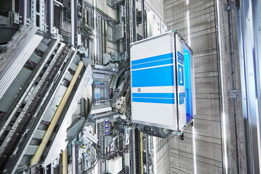
Pure imagination: the world's first rope-less, horizontal-vertical elevator by German manufacturer ThyssenKrupp failed to inspire the majority of commenters this week.
Concerned Citizen had seen it all before: "I believe Otis created the first such elevator for Disney World in Florida several years ago"
"Looks low maintenance..." sneered Peter Odegaard.
Arun Agagrwal was more positive: "This is great and fantastic. Well done team Thyssen."
Meanwhile, John Delaney was dreaming bigger: "Isn't really practical or even necessary here on earth, but would be great in space. One step away from the Turbolift!"
One reader had a health conscious response to the project:
Read the comments on this story ›

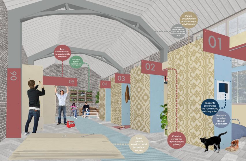
Time sensitive: A charity design competition-winning proposal to repurpose non-flammable cladding panels to house Romanian migrant workers by architecture studio Reed Watts was seen as thoughtless by most readers.
"Even if this was conceived prior to Grenfell; and even though these panels are being removed due to refurbishment; it's almost incredible that a reputable design studio and charity would let this proposal go forward at this time. Where's the sheer common sense and awareness of these people?" lamented Geofbob.
Joseph Strawbridge took issue with the lack of space allocated in the plan. "Migrant workers deserve homes – not prisons cells," he said.
"Looks like a great room to cry in," added Mary sarcastically.
This reader seemed fairly depressed by the project:
Read the comments on this story ›

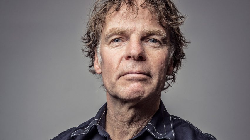
East is East: MVRDV architect Winy Maas' comment, that major Asian cities are overtaking Western counterparts in terms of urban quality, was met with a mixed response by readers.
Heywood Floyd believed that it was merely a case of imitation rather than bettering: "All of those perfect Asian cities have the benefit of infrastructure, zoning and other urban design concepts that were pioneered and incubated in cities like NY and London."
"Economics, taxes, regulatory challenges, individualist versus collectivist cultural structures. These are all things that Maas seemed to not acknowledge," added TFO, who felt the comparisons were too simplistic.
But this reader had the first-hand experience to support the claims:
Read the comments on this story ›