A studio for photographer Juergen Teller, a new wing at the British Museum and a revived seaside pier are among the projects shortlisted for this year's Stirling Prize.
The Royal Institute of British Architects has revealed six projects vying for the 2017 edition of the RIBA Stirling Prize, which is awarded annually to the building that is judged to have made the greatest contribution to British architecture in the past year.
These six are: Barrett's Grove by Groupwork and Amin Taha; British Museum World Conservation and Exhibitions Centre by Rogers Stirk Harbour + Partners; Command of the Oceans by Baynes and Mitchell Architects; City of Glasgow College City Campus by Reiach & Hall Architects and Michael Laird Architects, Hastings Pier by dRMM Architects; and Photography Studio for Juergen Teller by 6a Architects.
Half of the buildings on the shortlist are tourist attractions. The other three include a research facility, a housing block and a private workspace.
RIBA president Jane Duncan described them as "spaces and places of pure beauty, surprise and delight".
"This year's shortlisted schemes show exceptionally creative, beautifully considered and carefully detailed buildings that have made every single penny count," she said.
"Commissioned at the end of the recession, they are an accolade to a creative profession at the top of its game. Each of these outstanding projects has transformed their local area and delights those who are lucky enough to visit, live, study or work in them."
Rogers Stirk Harbour + Partners has already won the prize twice before, first for its Barajas Airport in 2006, then for its Maggie's Centre London in 2009. Reiach & Hall Architects, Michael Laird Architects and dRMM have all been shortlisted before, but never won.
The list was selected from the 49 winners of the RIBA's national awards, which were revealed last month.
A panel of judges will now visit all six projects before selecting a winner. This will be announced on Tuesday 31 October 2017, in a ceremony at the Roundhouse in Camden, London.
Last year the prize went to Caruso St John for the "highly accomplished and expertly detailed" London gallery it designed for British artist Damien Hirst.
Read on for judges' citations for all six shortlisted projects:
Barrett's Grove, Stoke Newington, London, by Groupwork and Amin Taha
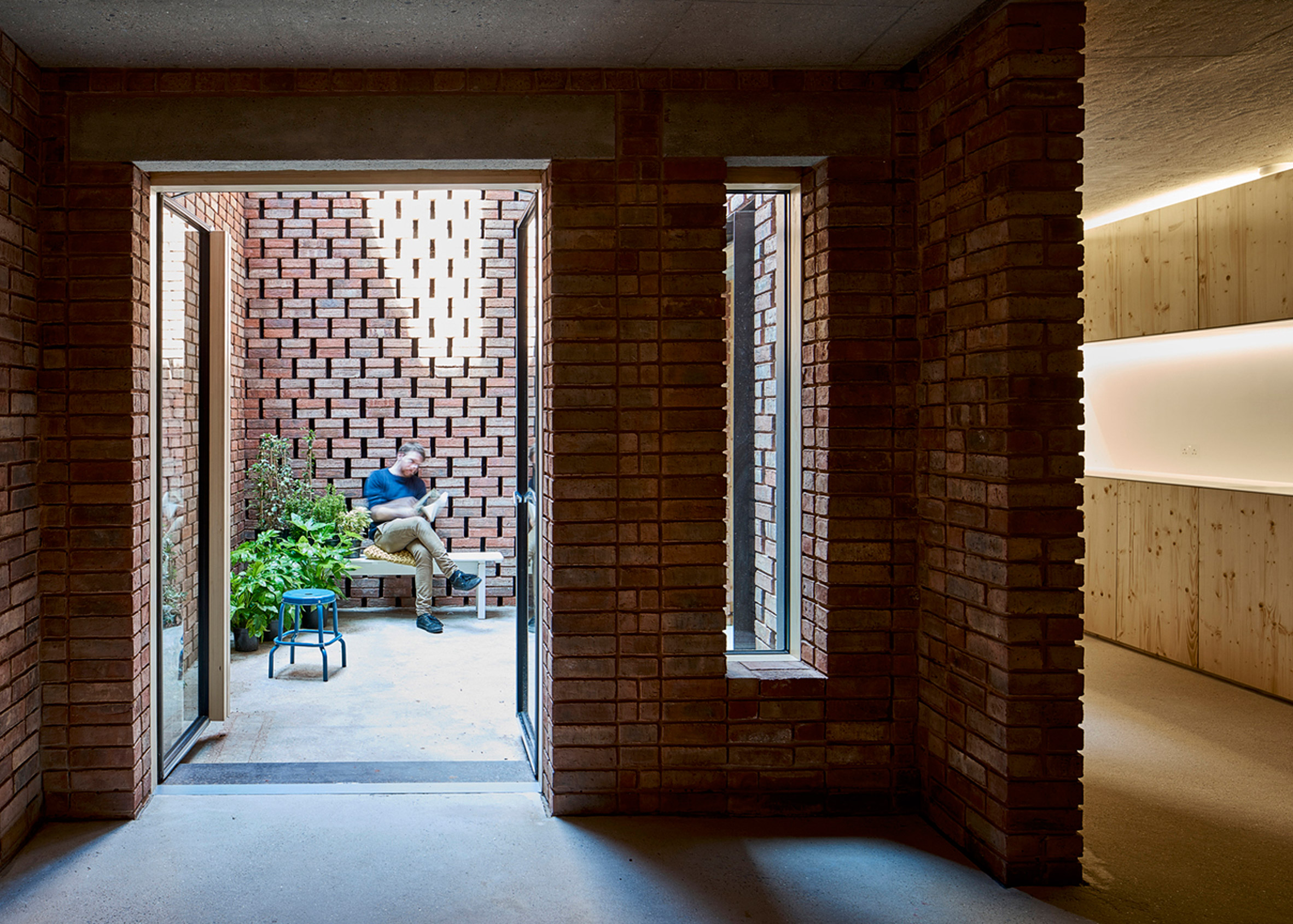
"Barrett's Grove is a characterful building in a disjointed urban street. Its adjacency to a primary school is a fitting location for a house built with the fairy-tale materials of brick, wood and straw. Inside, the building holds a series of generously proportioned, well-lit apartments; each with a wicker basket balcony that sticks out proud and far, like a salute to passers-by.
"The staggered hit-and-miss brick skin of the façade makes a larger-than-usual pattern, which fits the tallness of the overall building. Wrapping the skin up and over the roof, emphasizes the simplicity of the building's form.
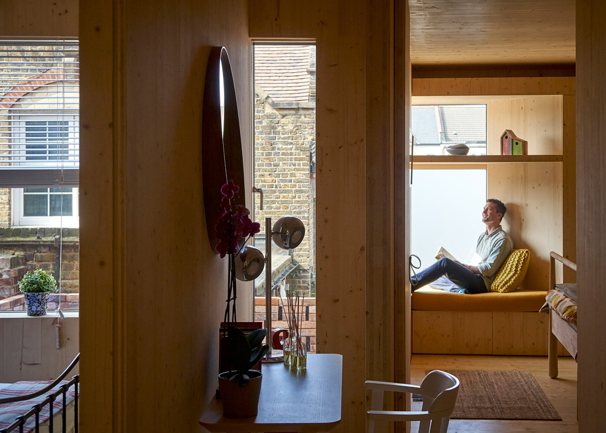
"Inside, the feeling is of a large house split into many homes; a refreshing change from the cheap finishes and convoluted corridors of many apartment blocks.
"The apartments are double aspect and each room is a good proportion. Space is used wisely and left over space is exploited, for example a strip of workspace overlooks the living room in the top maisonette making a small strip of space a delight to inhabit."
Find out more about Barrett's Grove ›
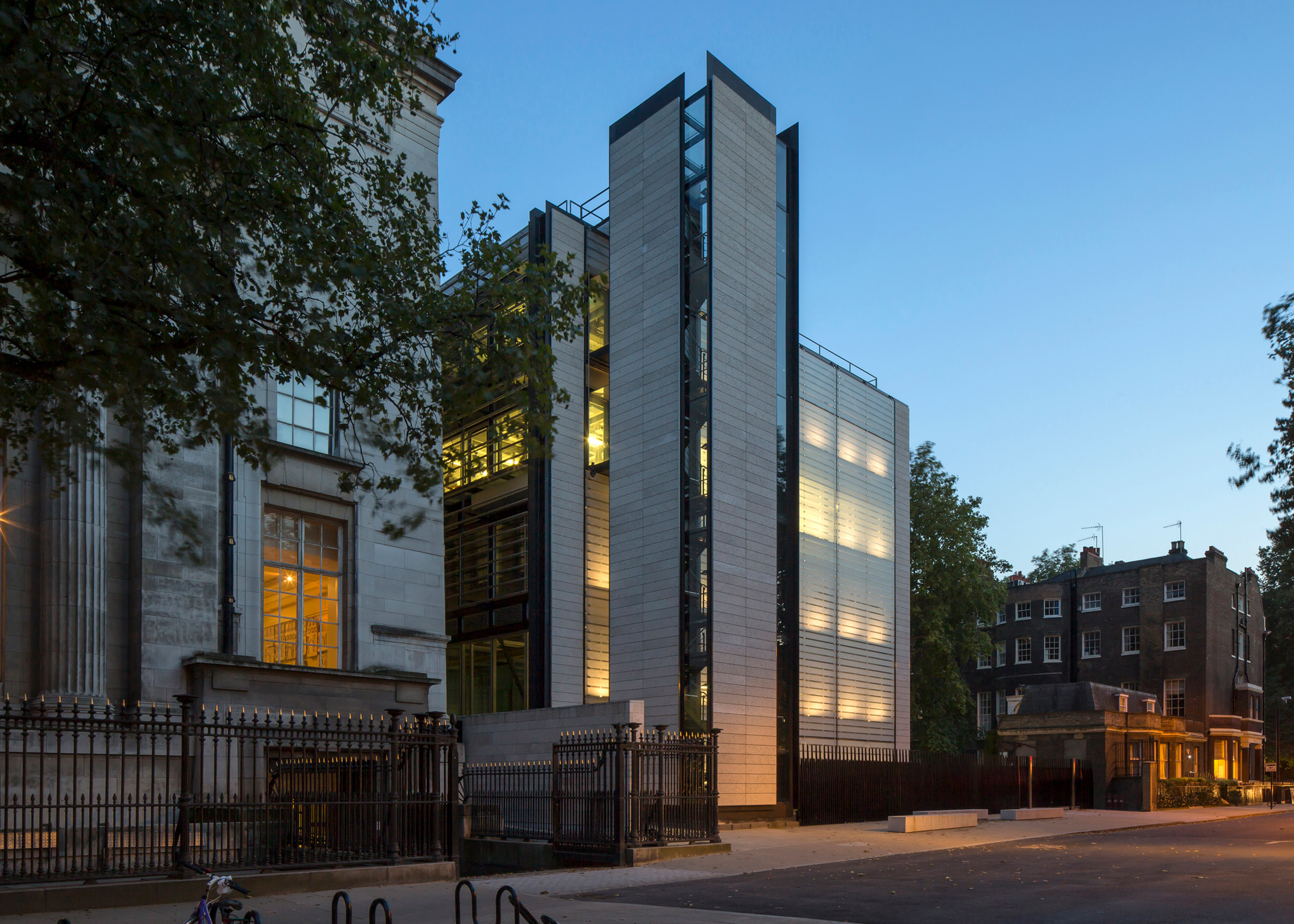
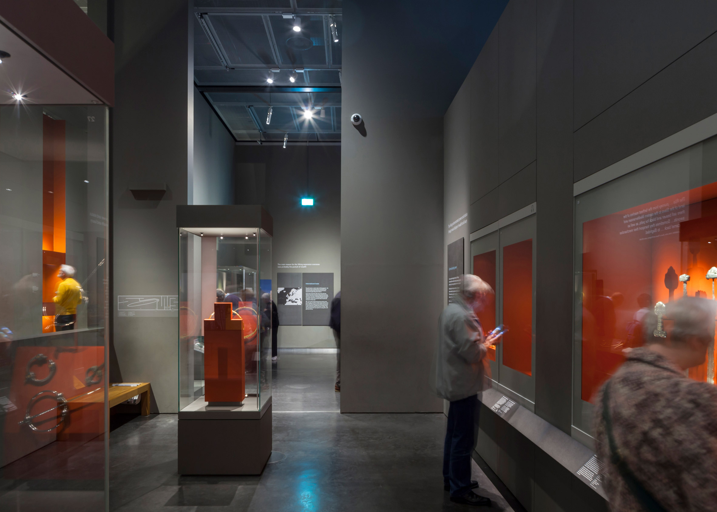
"The WCEC building is located on the north-west corner of the British Museum site in Bloomsbury. It consists of five vertically linked pavilions (one of which is located entirely underground), and houses a new exhibition gallery, laboratories and conservation studios, storage, and facilities to support the Museum' logistical requirements and loans programme.
"This building is the realisation of an extremely complicated brief in terms of spatial challenges, technical requirements, and engineering technologies. Its achievement derives from the elegant and simple way these challenges are met, while maintaining a clear and coherent diagram and a refined and rational building enclosure.
"The spaces provided for exhibition allow objects of a size and height which would not be possible to exhibit elsewhere in the museum. Objects can be delivered at street level in lorries which are then taken to lower floors by a platform lift that sinks into the ground without disturbing the landscape.
"The jury felt that the substantial accommodation for curation activities, with demanding constraints on direct light, thermal control and pest prevention, are seamlessly threaded into the overriding diagram and structure, with an admirable rigour and clarity.
"Grander public spaces are accommodated in the main museum, while the new extension provides simple circulation through glass lifts, bridges and glazed lobbies, making the journey through the building clean and enjoyable.
"A system of fritted glazed horizontal panels allow controlled light into the building while insuring protection for the exhibits either on display or within the workshops. This allows curation of precious artefacts to occur in an environment that maintains access to natural light.
"The jury appreciated the way the architects had overcome planning and heritage concerns in relation to the building for new offices which are sunk below ground but grouped around an attractive glass-roofed central space.
"Generally the jury admired the skill and control the architects had demonstrated in realising the client's enormously complicated and demanding brief while maintaining a rigorous and disciplined plan and an elegant external cladding system."
Find out more about World Conservation and Exhibitions Centre ›
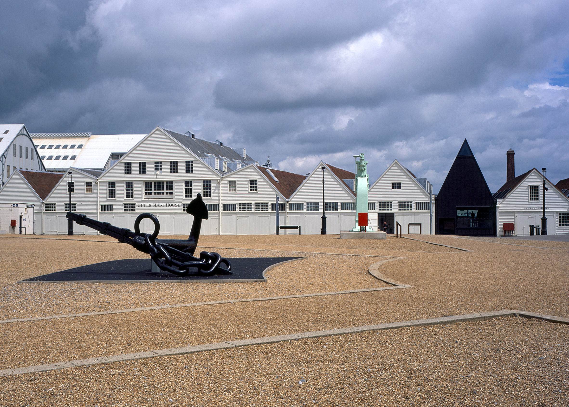
Command of the Oceans, Chatham, Kent, by Baynes and Mitchell Architects
"This project is a champion for progressive conservation, inventive re-use and adaptation of existing fabric. The importance of the historic fabric has been clearly understood, which has allowed freedom in other areas to change the circulation and the reading of the buildings to give the whole complex of buildings a new lease of life.
"The striking new visitor entrance, clad in black zinc, knits together the historic fabric to either side. The decision to use black cladding rather than a white structure which would match existing, and the decision not to mimic the pitch of the existing roofs, was a bold move in conservation terms and very successful. The modest entrance is immediately obvious to the visitor on arrival in the large car park, which sits above the old mast pond; and yet in certain lights it seems to disappear and becomes very much subservient to the adjacent listed structures. This inventive solution to create a raised entrance with associated ramp won Baynes and Mitchell the architectural competition, and unlocks the whole plan.
"The cathedral-like quality of the entrance hall, with its focus on the end view over the dockyard, is very successful. The museum element of the scheme which tells the history of the dockyard is designed around a route which ultimately leads to the hidden timbers of the unknown ship beneath the floorboards. This sense of discovery and the decision to leave the timbers in situ is a very powerful move.
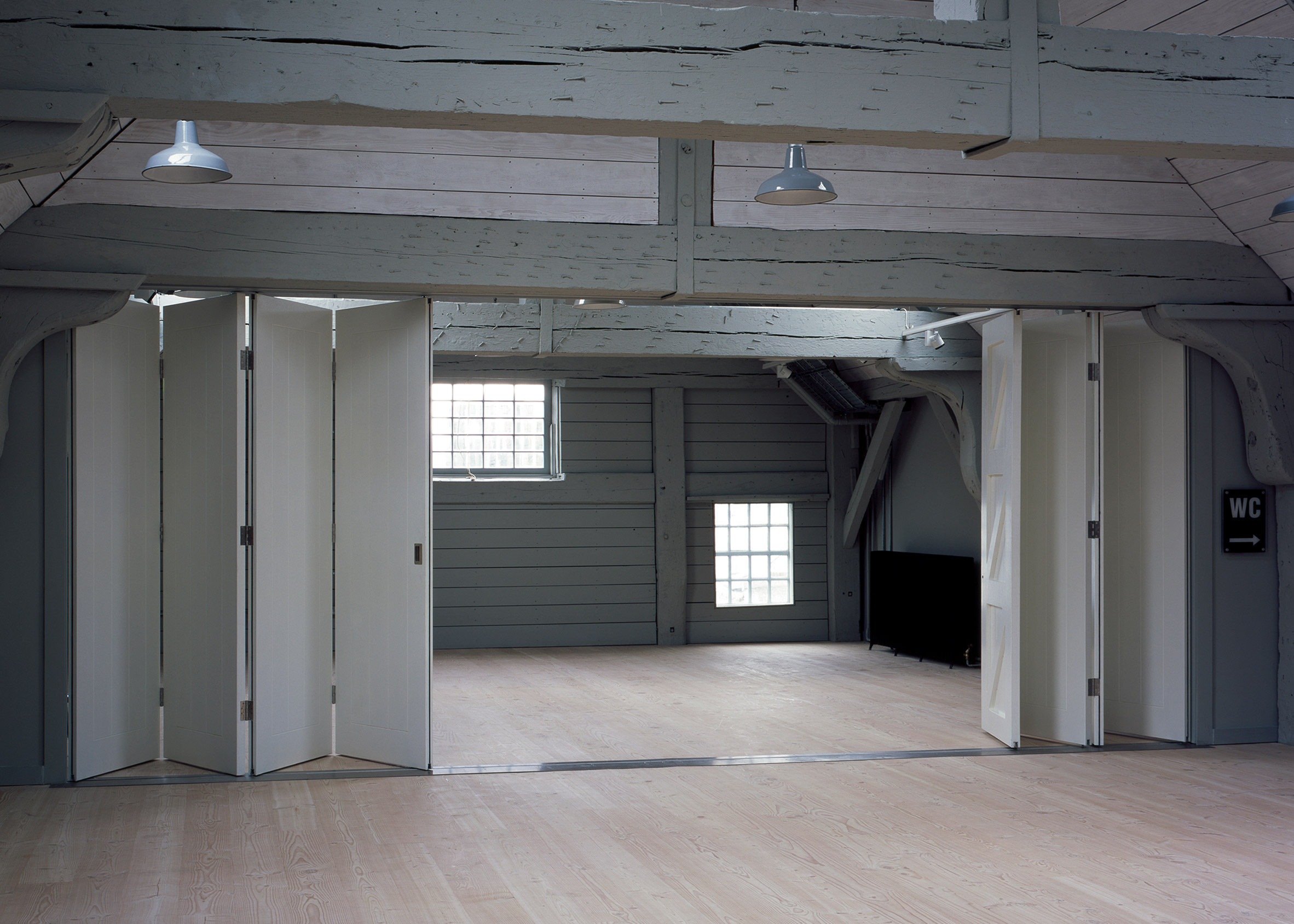
"The project is academically rigorous in terms of repairs, reversibility and selection of new materials and is a delightful new addition to the historic dockyard. The project exhibits careful and critical use of appropriate repairs. Successful engagement with specialist craftsmen and sensitive repairs, such as the scarfing of the main timbers in the mast house, adds to the beauty of the refurbished spaces.
"Internally, the existing buildings were assessed in terms of their significance and this informed the hierarchy and extent of the new interventions. Baynes and Mitchell have also fully engaged with the impact of the proposals in terms of the archaeology of the site and an appropriate means of responding to the concept of 'as found' presentation.
"The palette of black metal, blue limestone, board-marked concrete and composite timber has been carefully chosen in response to the strong, industrial language of the historic buildings and landscape.
"This project has benefited greatly from an enlightened client who is committed to making the story of the dockyard accessible to the visitor. This deep understanding of the historical significance of this group of buildings has been fully understood by the architect and interpreted in a way to reveal significant features of the historic landscape. This is a Heritage Lottery Funded project and Historic England was closely involved in a very collaborative way."
City of Glasgow College City Campus, Glasgow, by Reiach & Hall Architects and Michael Laird Architects
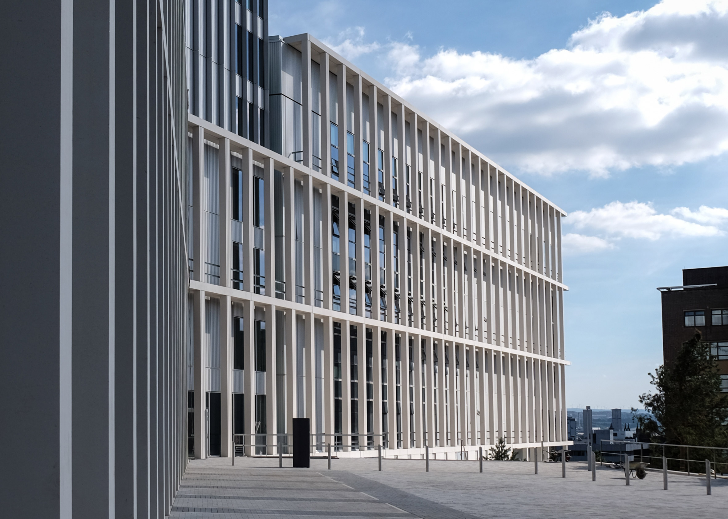
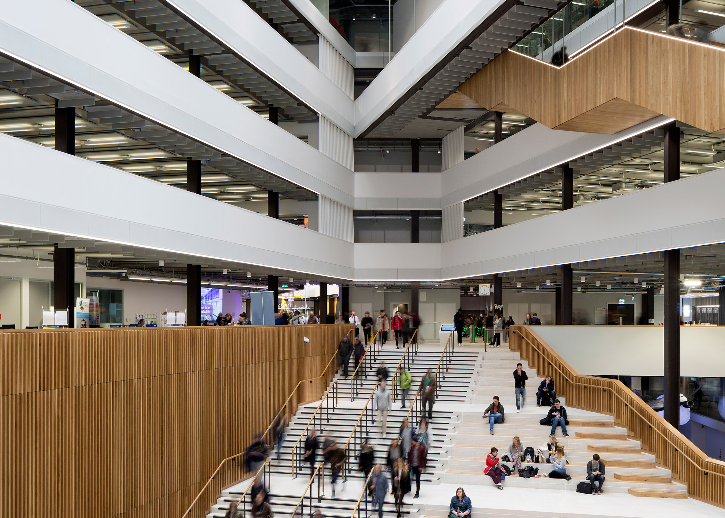
"The merger of Glasgow's central, metropolitan and nautical colleges created a super college bringing together facilities and teaching previously housed in 11 separate buildings across the city within two new central campuses. City Campus, more than 60,000m2 in size, is the second of these large new buildings. It brings together six major faculties in 300 high-tech classrooms, multi-purpose lecture theatres and specialist teaching facilities.
"While the initial impression of this building is as something of immense scale which also signals its presence as an important place of learning, its internal spaces are designed to encourage both the formal teaching processes which it contains and informal, more chance encounters. The materials palette and form of the building are deliberately restrained to generate something of skill, clarity and elegance, on the grandest scale.
"There is an astonishing scale and complexity to the brief for this project and considerable architectural skill is demonstrated in its realisation; not just in resolving the brief, but in the contribution to the city – in massing, composition and the generosity of the public route through the grand stepped atrium space. This architectural skill extends beyond the cityscape through to the detailed care taken in the organisation of student spaces, encouraging social interaction across disciplines, to the considered approach to materials and detailing."
Hastings Pier, East Sussex, by dRMM Architects
"It has taken a seven-year heroic collaboration to turn a smouldering pier in disrepair and decline into a vibrant public space with a palpable sense of ownership. This collaboration has been between the community, the Council, the engineers and the architect and it is the architect's vision which has been vital throughout to steer the process. After extensive stakeholder consultation, it was clear to dRMM that the pier would be expected to host many different populist scenarios.
"Predictably enough, it transpired that it had to be everything to everybody, with an absent owner not responding to the increasingly Dangerous Structure repair requirements, and no rebuild budget available in a run-down seaside town. Lateral thinking was required to make a structurally and socially sustainable project actually happen. The architects had to write the brief and help raise the budget before redesigning the pier.
"Their 'master-move' and response to this brief was to design a strong, community led/owned serviced platform which could accommodate a whole host of uses, from music concerts, to international markets. 'In homage to conceptualist Cedric Price, users bring their own architecture to plug in and play.' This concept is really working in practice and should be commended.
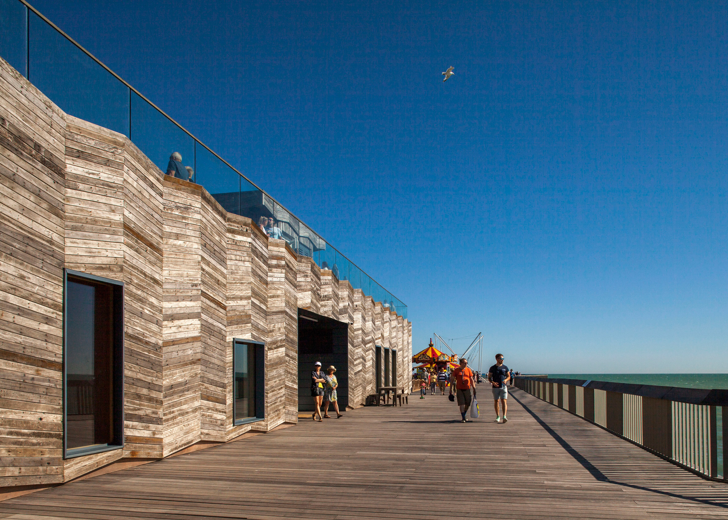
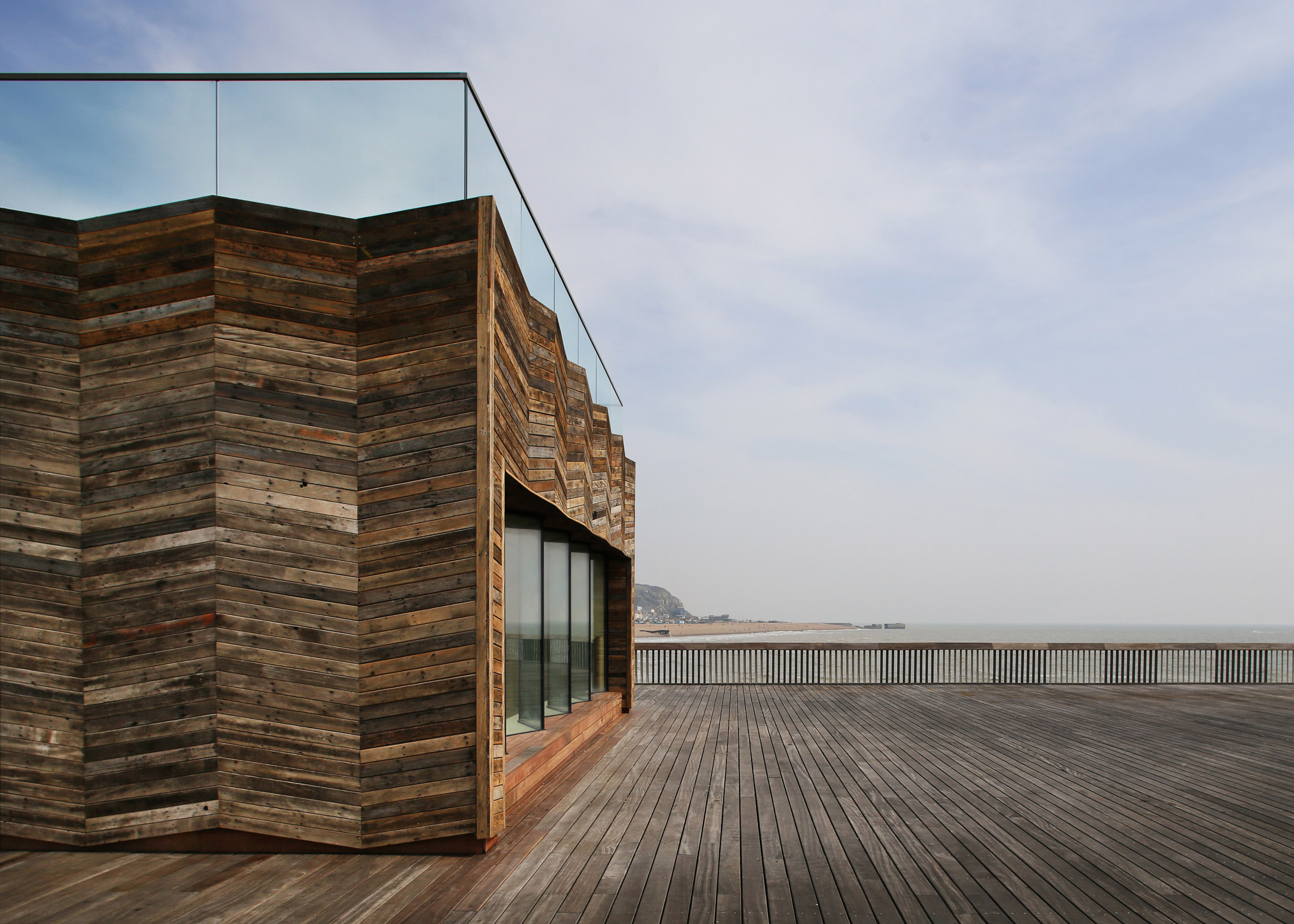
"The decision not to place any building at the end of the pier, which is possibly the obvious position to site a building, is an extremely powerful move. The large open space provides a sense of calmness and delight, with a strong connection to the sea and the seafront. The experience of free space and 'walking on water' is heightened by the optics of a very beautiful, louvred balustrade design and quality timber deck.
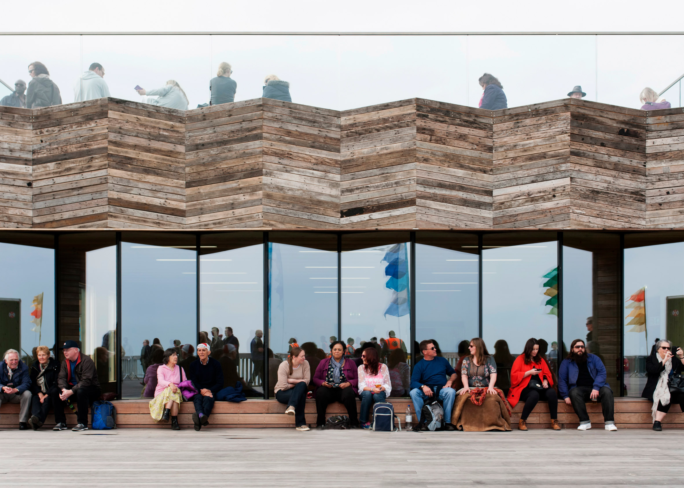
"The new visitor centre replacing the weakest section of the damaged pier is a relatively simple CLT structure clad in reclaimed timber which was salvaged from the original fire-damaged pier. This helps to create a strong feeling of place and belonging. It boosts an elevated, rooftop belvedere where locals go for a coffee or cup of soup. It offers adaptable space for events, exhibitions and education. Reclaimed timber deck furniture was designed by dRMM and Hastings & Bexhill Wood Recycling as part of a local employment initiative.
"The new pier is not a lonely pier: rather, it is extremely welcoming in its design, with free, open entry to the public. It offers flexibility, material and functional sustainability, and an uninterrupted vista of the natural and built surroundings. This is a Heritage Lottery Funded project and it has become a catalyst for urban regeneration.
"From a conservation perspective, this project has reinvigorated a fire-damaged historic structure and facilitated a contemporary and appropriate new 21st century use. The project has been mindful to integrate material from the original pier in the new design, and the process of restoration was used to help train a new generation of craft specialists."
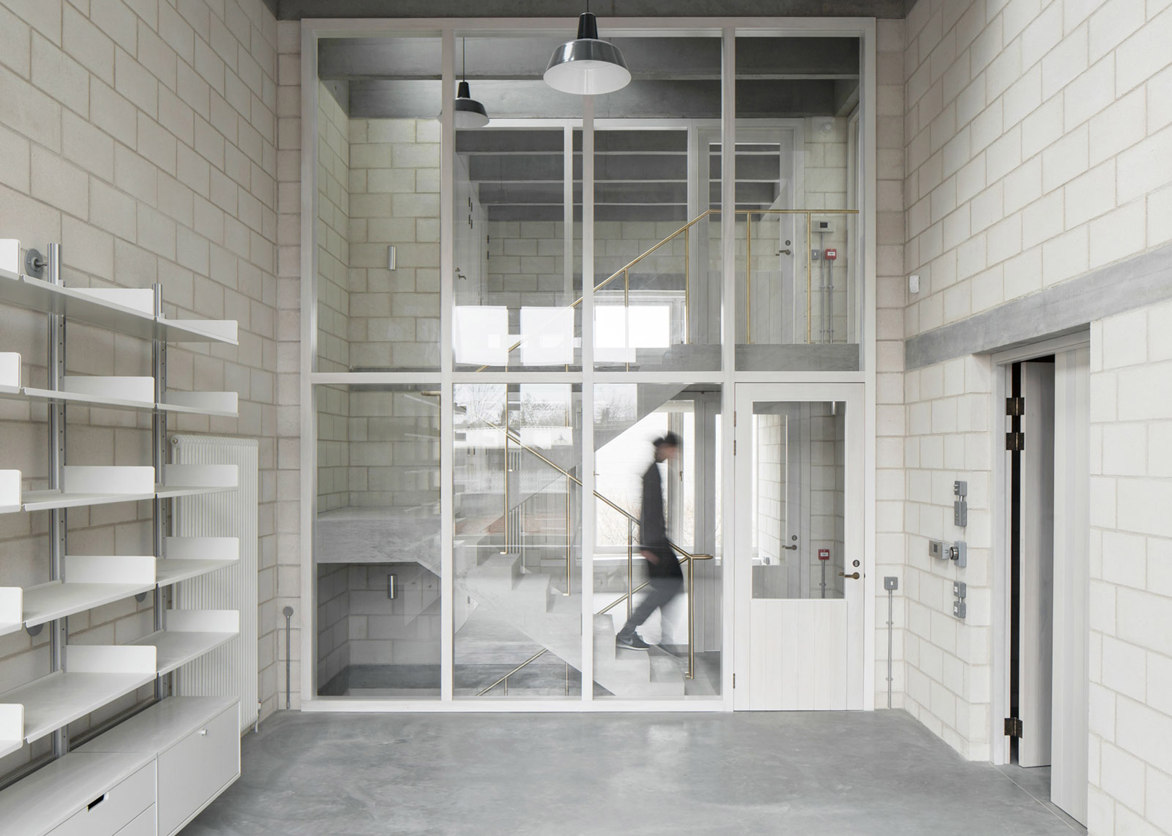
Photography Studio for Juergen Teller, London, by 6a Architects
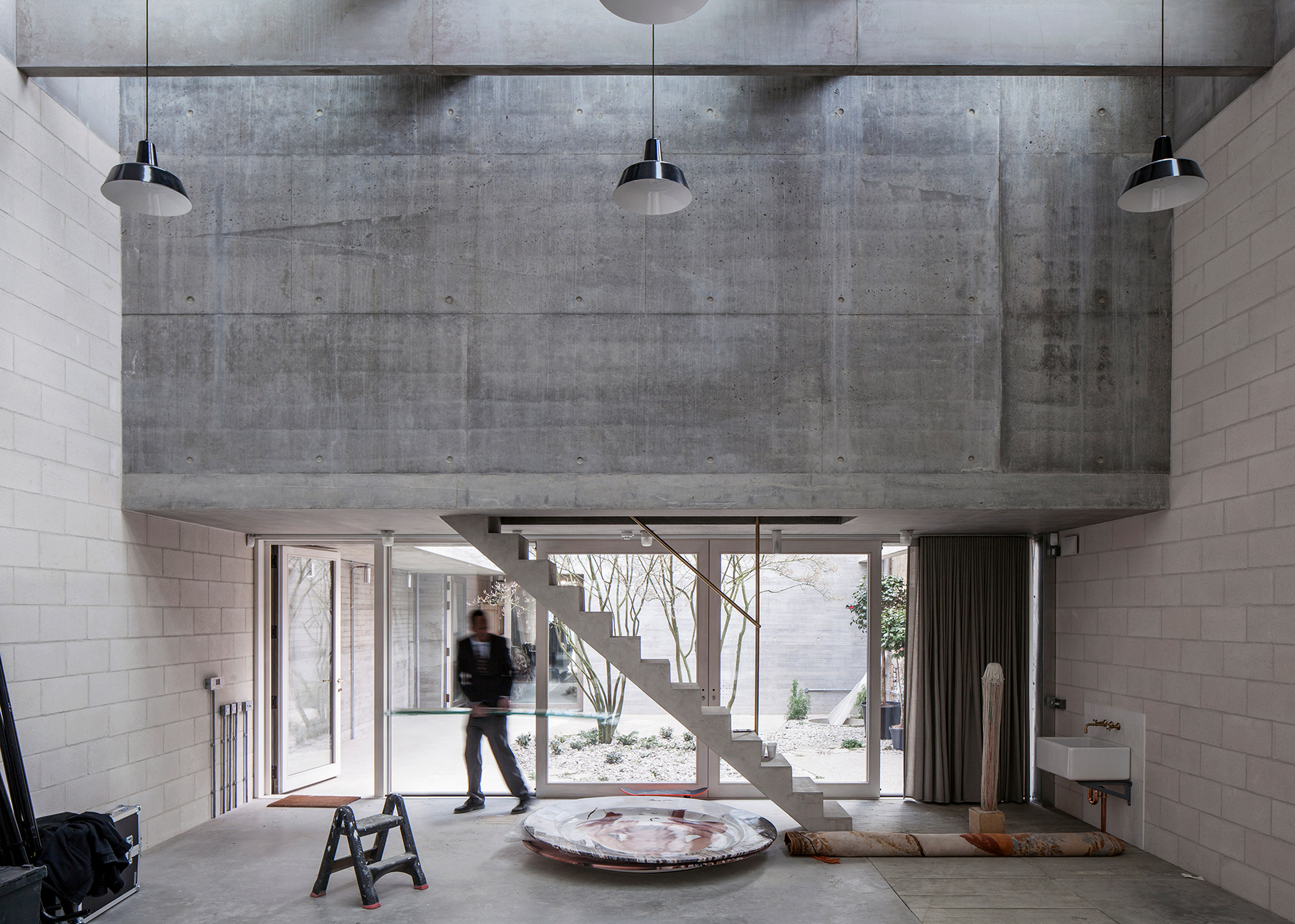
"The project comprises a series of three buildings and gardens to form a new studio, offices and archive for celebrated photographer Juergen Teller. The brief was for a light-filled, flexible, informal and welcoming set of spaces; with a natural flow and sociability.
"The project expertly exploits a typically London condition. Constrained by a long and narrow industrial plot at the rougher edge of Ladbroke Grove; its only face nestles between cheap developer housing, an industrial estate and the hinterland of the Westway.
"With few views possible out of the linear site, daylight is introduced through three courtyard gardens designed by Dan Pearson, and a grid of exquisitely thin concrete beams which march the length of the 60m site. These support north facing roof lights which fill the space with an extraordinary filtered light.
"Board-marked poured concrete registers the rhythm of the existing brick built party walls. Two raked concrete stairs brace the studio space, the only interruptions in an open landscape, which runs the length of the site.
"Detailing throughout is exquisite; from the in-situ concrete of the finely formed stairs, to the seamless brass balustrades. Large but delicately beaded timber window frames, add refinement to an otherwise minimal material palette. The building is an exemplar of fabric first and low energy design. The integration of services is expertly handled.
"The project is a mature and confident statement of orderliness and precision, whilst also being relaxed and playful. It forms a refined, yet flexible workplace, which is already beginning to act as a setting to prompt and influence on the work of its client.
"The building is sublime and the whole team should be highly commended."
Find out more about Photography Studio for Juergen Teller ›

