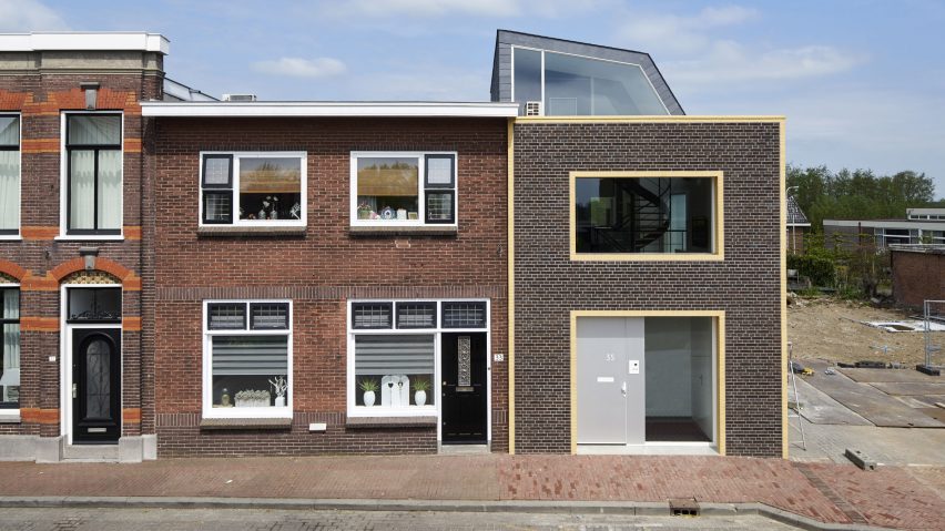
Ruud Visser Architects completes house in Holland that looks like a giant A
The house by Ruud Visser Architects features a brick facade that looks like a huge letter A, while its rear is a three-storey wall of windows.
The house is located in the village of Meerkerk, South Holland, on a historic street called the Tolstraat, which is lined with buildings from the early 1900s.
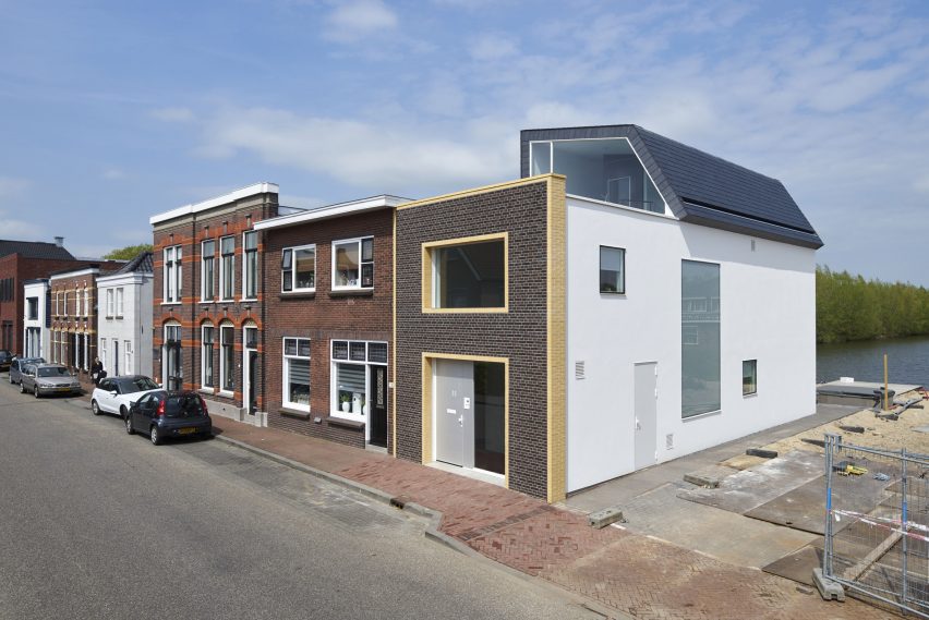
In response, Ruud Visser Architects designed the front of the building to match the masonry of its traditional neighbours. But a glazed rear facade was added to offer views of a nature reserve behind.
"The main challenge was to blend a new, contemporary, house into this complex historic setting. We decided to adapt the local 'messiness' into our design," explained the studio, which is based in nearby Lexmond.
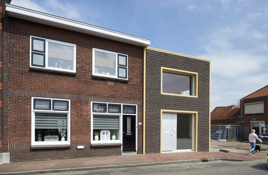
Called House in Meerkerk, the two-storey property provides a home for a retired couple, one of whom grew up in a house that stood on the site before.
Dark brickwork provides the building's frontage, while pale bricks highlight the A shape, by framing the outline of the wall, as well as the entranceway and a first-floor window.
This simplified articulation offers a contemporary contrast to the rest of the Tolstraat – a formal streetscape with a disorderly feel, thanks to a mishmash of building elements including annexes, sheds and varying types of roofs and fascias.
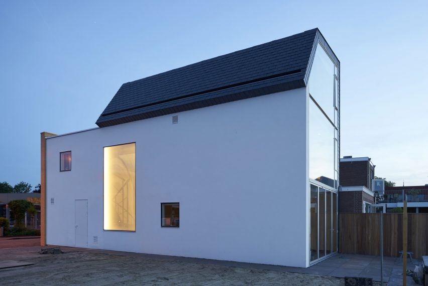
However other parts of the building were treated very differently, so that the building wouldn't stand out too much.
Behind the brickwork facade, a white plastered wall extends along the side of the building. This elevation incorporates minimally framed windows, including a translucent pane that allows daylight to filter through to a stairwell.
And at the rear, a three-storey-high window wall sits beneath a folded slate-covered roof, which extends up high enough to be seen from the front of the building.
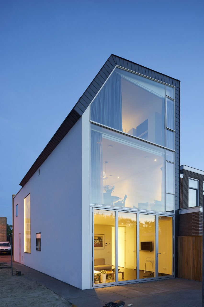
"We decided to work with the local village character of the street by not approaching the house as a single stand-alone object," aded the studio.
"We divided the body of the house into three distinct parts. Every part is made of a different material, each already to be found in the adjacent facades in the Tolstraat."
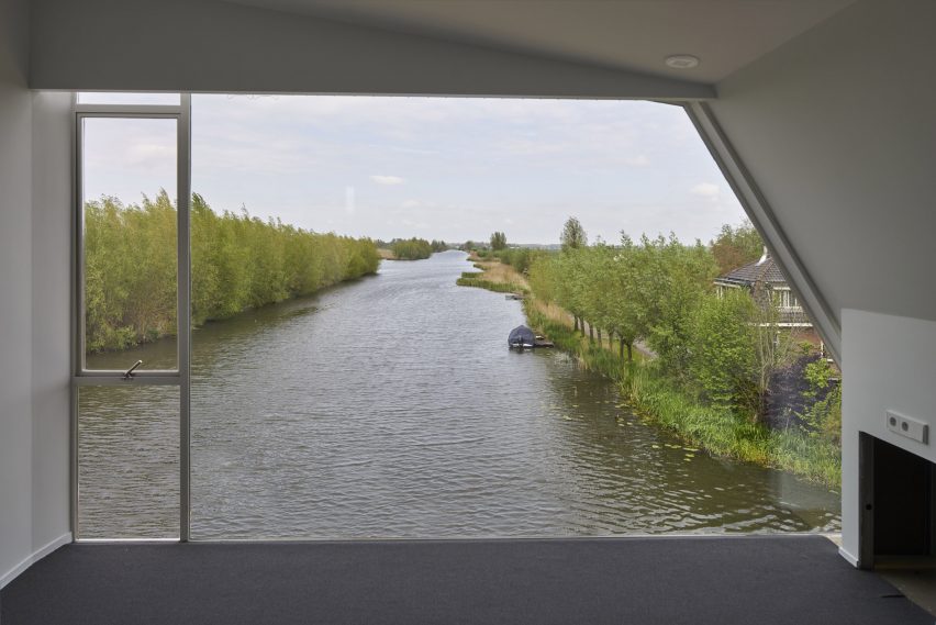
This expanse of glazing offers a view towards a 700-year-old excavated water reservoir that is now a nature reserve. This view holds happy memories for the client, so was important to emphasise in the design.
The building is entered from the street through a front door leading to an entrance hall that extends along the side of a storage area. This space can be used for storing bikes and opens directly onto a path connecting to the street.
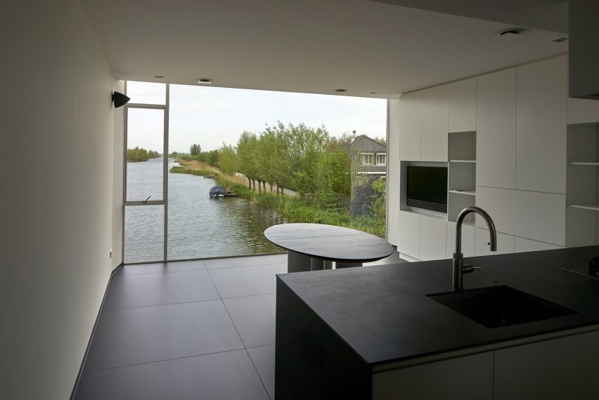
Inside the main house, the ground floor also accommodates a laundry area, toilet and a lounge at the rear that can be opened up to the paved patio.
A lift and a spiralling metal and wood staircase provide access to the upper storeys. The first floor contains a living area at the front of the house, with a kitchen and dining space at the rear.
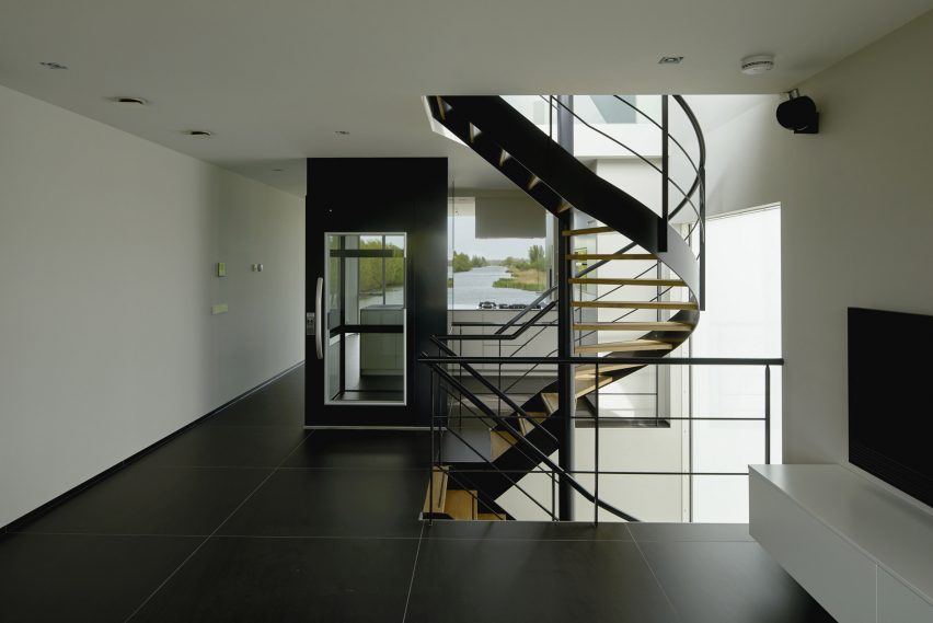
The bedroom on the top floor features a slanted wall and ceiling that follow the form of the folded roof.
Ruud Visser Architects has previously slotted a modern house inside the wood-panelled walls of a 1930s church in Rotterdam and extended a townhouse in The Hague, adding a large window with a cross-shaped wooden frame.
Photography is by René de Wit.