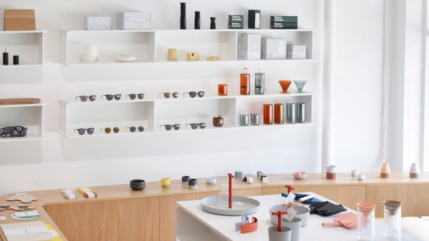
Tretow designs snaking interior for Commonplace design store in Milwaukee
Snaking shelves by local studio Tretow are designed to encourage customers to linger in Wisconsin's Commonplace design store.
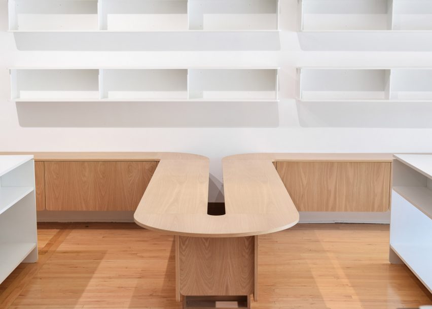
The shelving is part of a major overhaul of the retail space, which occupies a turn-of-the-century building in Bay View, Milwaukee. Commonplace approached Tretow to design interiors that wouldn't just set the store apart but encourage visitors to stay and browse.
The new interiors are intended to give individual products space to breathe, and be appreciated on their own. The studio decked the store out in a restrained palette of white oak, enamelled wood and enamelled corrugated steel.
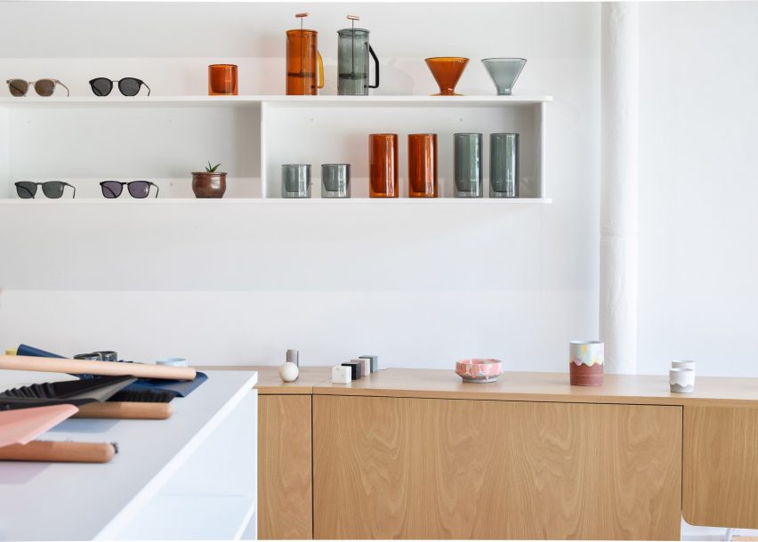
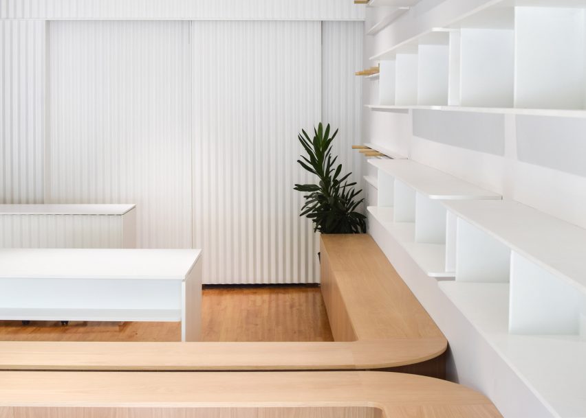
The centrepiece of the shop is a 50-foot-long piece of custom white oak display shelving, which curves snake-like along the walls of the store and into the middle of the space, to encourage visitors to follow its "expressive geometry". Cupboards underneath conceal further storage for the store's products.
Additional display room is offered by glossy white tables and minimal white shelving arranged in a grid-like pattern on the walls, to make the most of the store's limited space.
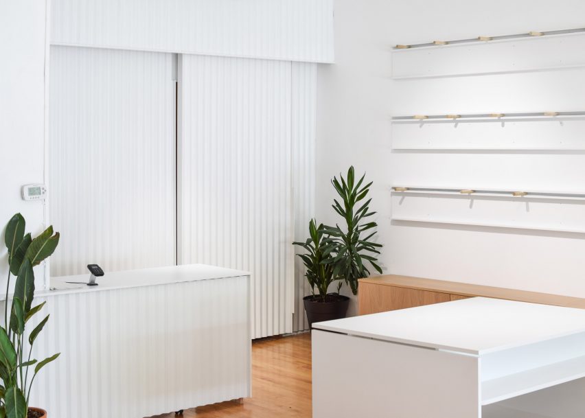
"The shelves also create a series of horizontal datums that mediate existing architecture at the front of the shop with the proportions of new architectural additions at the rear," said Tretow founder Ryan Tretow, who has completed several interiors in Milwaukee, and also designed furniture and lighting since setting the studio up in 2014.
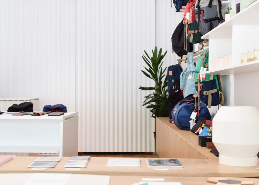
The storage space at the back of the shop is concealed behind a corrugated sliding door, designed to create a "visually interesting focal point out of what was previously an underutilised area". Corrugated metal also wraps around the glossy white counter.
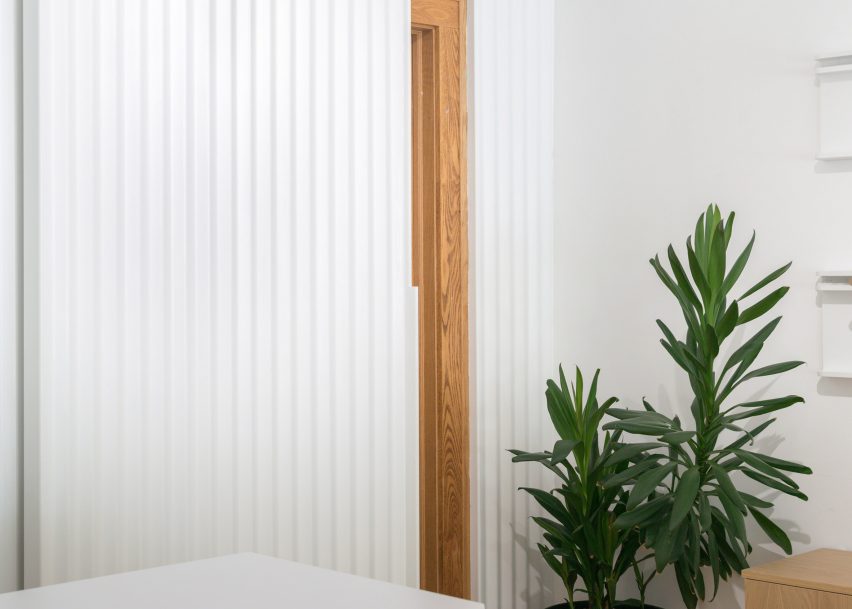
The interior is completed by white walls, a wooden floor that echoes the display shelves, and pot plants dotted about the space.
Commonplace stocks homeware, eyewear and accessories, all of which are displayed sparsely alongside one another, in line with the shop's philosophy to avoid the "clutter" of traditional retail spaces.
Toronto's MSDS Studio adopted a similarly neutral approach for the Flur flower store, which used minimal details to allow floral arrangements to shine.
British designer Jasper Morrison recently played with different ways of displaying products for the Good Design Store in Tokyo, which follows the layout of a typical house.