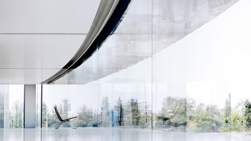
In this week's comments update, Dezeen commenters disagree with Apple chief designer Jony Ive's description of the company's new ring-shaped headquarters as "nice".
Ringing it: Foster + Partners' design for the giant Apple Park complex in Cupertino came under fire from some commenters, who were disappointed with the pared-back appearance of the building.
Karol Bloss felt the new HQ was symbolic of the brand's wavering status as pioneers. "The myth of Apple superior design ended some time ago. This building seems to be the prisoner of this minimalist pose from a previous decade."
"Cold and sterile, like an Apple store. No great chances have been taken here," said Carlos Ferreira. "This is where creativity goes to die," added Wolfganghammer bluntly.
Greg described the structure as totalitarian and imposing. "Exactly the kind of building Big Brother would have built. So fake. So unnatural," he said.
But some readers, like Chris, declared it Apple's latest triumph in innovation."This building is the epitome of Foster and Apple's approach to design and it's incredibly elegant and beautiful in my eyes."
One reader was impressed by Ive's dedication to minimalism:
Is Apple's new headquarters a positive or negative representation of their design principles? Have your say in the comments section ›
You shall not pass: readers debated whether locals were right to be offended by plans for a ring-shaped sculpture for Wales' Flint Castle, which have been halted following concerns over its "oppressive" symbolism.
"To abandon the Iron Ring because it's a symbol of oppression – while retaining the castle, which was the actual instrument of oppression – makes no sense," said a thoughtful Geofbob.
"Much oppression! Such subjugation!" was the sarcastic response from Derek_V.
"It's not like any of the world's governments are doing any better than Edward I when it comes to subjugating and oppressing the people," commented Paul.
Grant took a decidedly cynical view:
Read the comments on this story ›
Automatic: Bartlett graduate Grace Quah's feminist film depicting a residential scheme that fully automates the majority of household chores to reduce unpaid labour for women left some Dezeen readers concerned.
Stayathome called the idea dated. "The notion that somehow housework is a rallying cry for feminism and that housework needs to be abolished annoys me. I'm a stay-at-home dad, my wife works whilst I do the majority of the household chores."
Geofbob agreed that it unwittingly missed the mark: "Clearly, there are still many women burdened with more than their fair share of domestic chores, but this project seems unduly based on outdated stereotypes."
"Gadgets make a lot of chores easier and faster to do. The problem is that this hasn't decreased the overall burden of work that women do – it has raised 'standards' in the home and added a second shift to their day." countered Squidlet, who felt the debate is relevant to modern-day society.
One commenter waded in with a passionate plea to fight for mundane tasks:
Read the comments on this story ›
Seeing red: Ailsa Inglis' menstrual cup designed to fight the stigma around feminine hygiene sparked a heated discussion about how it compares to traditional period products.
Cat was not impressed with the glittery design. "So she infantilised an existing product?"
"Very impractical and unhygienic. It's downright irresponsible to be promoting such a product to young women who are at greater risk of all sorts of infections as a result," fumed Shar.
"They have a much greater reduced risk of Toxic Shock Syndrome than tampons," added Alana. "I had a girlfriend nearly die of TSS due to tampon use. There's no smell. No leaks. Affordable on the pocket. Less impact on the environment."
One reader was left with a pressing question for Dezeen's editorial staff:
Read the comments on this story ›

