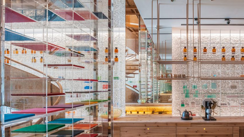
This drugstore by Taiwan studio Waterfrom includes greenery, glass shelves and copper details designed to combat the clinical reputation of pharmacies.
The 120-square-metre space in Taichung, Taiwan features a central lab table that is intended to banish traditional counter service and encourage more natural interaction between pharmacists and customers.
The table is made from solid wood that's supported by the trunk of a hundred-year-old tree, and includes a glass section housing growing moss and plants.
Copper lighting hangs overhead, alongside more green plants that have been suspended to create a "forest". A sense of openness recurs throughout the space, which includes several further lab-style benches and tables for visitors to sit and talk.
Traditional brown bottles are displayed on glass shelves that cover the walls of the drugstore – which has been owned by three generations of the same family – and test tubes are also held in copper racks. Lab equipment is contrasted with pot plants that occupy the same shelves.
"Just like Molecure is split and reorganised from the words 'molecule' and 'cure', while approaching the design we returned to the original purpose of the pharmacy – extracting molecules from nature to synthesise healing drugs," said Waterfrom.
"Thus we get the idea of building a space which we named 'green in the lab", combining the seemingly conflicting qualities of primitive with technology," added the studio.
To further contrast the usual pharmacy appearance, Waterfrom covered the store's walls in cobblestones, to create a rough texture, and installed a copper spiral staircase – included as a reference to the corkscrew shape of DNA's structure – at the centre of the space.
The upper floor features a laser-cut perforated pattern made from tessellating triangles, which cast "scattered shadows of leaves". Colour is introduced in the form of bright panels placed on glass shelves.
"Just as the owner designed, Molecure pharmacy gets rid of the fixed stereotype of pharmacies," said the studio.
"It also brings the three-generation traditional pharmacy a totally different look, improves the value of Taiwan's stagnant pharmacy industry, redefines the value of health and brings people who pay increasing attention to health a new space which integrates function, aesthetics and experimental spirit."
A pharmacy in Belgium similarly ditched the clinical white to embrace a warm-toned space designed to be more welcoming to customers. Japanese firm Hiroyuki Ogawa Architectus also designed a more calming environment for Tokyo's Fuji Pharmacy.
Waterfrom was set up in 2008 and has offices in both China and Taiwan. It works across interior design and architecture, and has been the recipient of several awards, including the Taiwan Interior Design and Golden Pin awards.
Photography is by Kuomin Lee.

