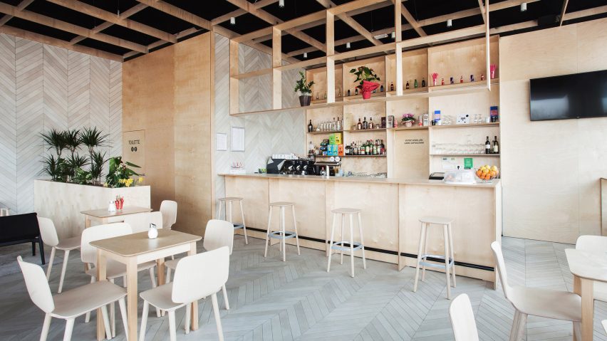
Slovenia-based architect Sanja Premrn paired simple plywood panels with pale, chevron-patterned tiling to create the angular geometries of this cafe bar.
Spin Bar is located within a new shopping centre in Kozina, Slovenia. Plywood panels cover the rear walls and were also used to build furniture elements, while ceramic tiles create a chevron pattern – a simplified version of herringbone – on the side walls and floors.
"Herringbone patterning is usually used with wood, so this seemed to me the best way to make ceramic tiles look warm and cosy," Premrn told Dezeen. "In such small spaces I like to see all walls covered in something, so the interior seems more sophisticated."
Plywood – a material that is the subject of a new exhibition at London's V&A museum – was chosen to make the space feel both warm and airy, and also because of its versatility. It was used to build the bar, as well as plant boxes and storage areas.
"I wanted to create a light and bright interior," said the architect. "This is a new building with a lot of natural light, but it is also pretty cold, so I had to warm it up somehow. What better way to do it than with wood."
"Plywood allows you to make slim furniture elements in ways hardwood never can," she added.
Premrn also worked with a local carpenter to design and build bespoke birch-plywood furniture for the space: a series of simple tables, chairs and stools. The only exceptions are the retro-style chairs in the lounge area, which were sourced from Italian furniture company Pedrali.
The layout of the 85-square-metre space is kept simple, with four seating zones arranged around the bar, and toilets and kitchen set behind.
"There was no brief – the client and I had worked together already so he trusted me and allowed me to make of it whatever I wanted," Premrn explained. "That was the hardest part! He only had a few requests with the layout – where the toilets and bar should be."
A rug defines the lounge area, while a planting box forms a partition between this space and the toilet entrance. Behind the greenery, the toilet door blends into the surrounding plywood wall, so that it is "as least disturbing as possible".
The chevron tiling continues inside the bathroom, and is accompanied by golden details.
"The gold faucet creates a special visual interest," said Premrn. "With a single-lever handle, this streamlined faucet evokes a sense of serenity, blending in perfectly with the calm appeal of a minimalist bathroom."
Photography is by Miha Bratina.

