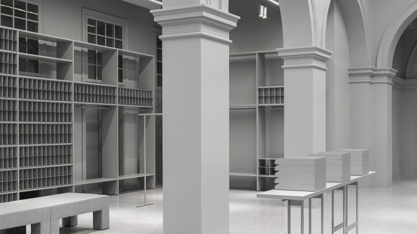
The H&M group is set to launch its latest brand, Arket, with a Copenhagen store featuring an all-grey palette and fixtures inspired by historical archives.
The store for the new lifestyle brand is set inside one of Copenhagen's historical townhouses, which was completed in 1733 and previously home to the headquarters of the Royal Danish Mail. It will open in October, after the London flagship launches later this month.
Interiors have been designed by the company's creative director Ulrika Bernhardtz, who was previously responsible for store design at other H&M group companies & Other Stories and COS.
Through her design, Bernhardtz wanted to express Arket's identity, while creating a "breathing space" for customers to shop at their leisure.
Arket means "sheet of paper" in Swedish, and the brand is built on three core concepts: archives, archetypes and the market.
The term archive became Bernhardtz's main point of inspiration, and the designer looked to the layout and organisation of historical record offices.
"When working on the store concept, it was in developing new solutions to practical challenges that we found most of our inspiration," Bernhardtz told Dezeen. "Two of these challenges were how to create breathing space in the store, and how to devise an uncomplicated and flexible way of presenting and editing our broad assortment."
"These and other challenges led us to the archive concept, our starting point for the physical store as well as the entire brand."
The store's archive system sees walls lined with shelves, nooks and cubbies. High tables, modelled on desks, allow customers a place to look at the items they are purchasing, with seating giving them a place to rest.
An entirely grey colour palette was used throughout the store to keep focus on the clothes, but different materials were used in order to create shades and textures.
Larch, birch, ash, stainless steel, aluminium, rubber and textile are paired with bespoke terrazzo stone that the brand developed with Italian manufacturer Marmi Scala.
"It is the repetition of this simple element and the monochrome palette that creates the concept," said Bernhardtz. "The neutral grey colour that we have used should serve as a solid backdrop to our collection and enhance it, rather than being the centre of attention."
"Our choice of materials is rooted in the practical needs of the construction, and their dimensions on industry standards, in order to waste as little raw material as possible," she continued.
No structural alterations were made to the space, which Bernhardtz said already had an archive system woven into its original features.
Fashion brands are increasingly favouring minimalist store designs. Design office Thisispaper Studio used clean white surfaces and simple birch plywood furniture to transform a Soviet-era dental clinic into a space for its first shop, while designer Reiichi Ikeda inserted boxy partitions that follow the pattern of existing ceiling trusses into the Nietzsche clothing boutique in Japan.

