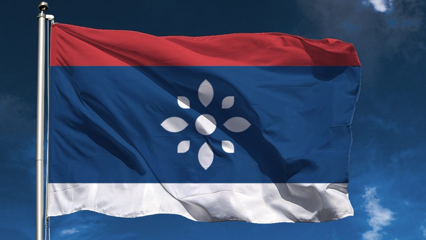
Graphic designer Vladan Pavlović has proposed a new visual identity for the Republic of Serbia that presents the Balkan country as one of "peace, democracy and tolerance".
The local designer's concept visual identity for Serbia includes a flag and crest that adopt the symbol of the rosette instead of the traditional coat of arms, which dates from 1882 and was last tweaked in 2010.
Pavlović wanted to explore how a new visual identity could change the perception people have of Serbia, both at home and abroad.
"Currently, with our visual identity, we are presenting ourselves to the world as a nation led by autocratic and orthodox leaders, because it is symbolised by our heraldry," he said.
"It is necessary to establish a new communication, based on the ideas of peace, democracy and tolerance, which the symbol of the Serbian rosette represents."
Serbia is still living through the after-effects of the 1990s Yugoslav Wars, which locked the constituent republics of the former Yugoslavia into conflict on ethnic lines and ended with a number of their leaders convicted of war crimes.
Serbia's stand-off with Kosovo over independence now regularly makes international headlines, while it is also currently negotiating to join the European Union.
To contrast some of the country's recent history, Pavlović chose to focus his visual identity on the rosette, which he describes as a symbol of unity, peace and stability – and one that has a long tradition in the region's architecture, painting, clothing and decoration.
This replaces the traditional coat of arms, which currently combines the Serbian cross, fleur-de-lis and symbols of the country's former monarchy, such as the double-headed eagle.
"In the new age, such a medieval heraldic does not represent a modern tolerant and multicultural society," said Pavlović. "The current state of the country markings is pretty bad, with too many elements and details, kitsch, missed and unsuitable symbols and images that are most often unconstitutional."
Pavlović includes the eight-petaled rosette in the centre of his flag design, which keeps Serbia's current tricolour – a pan-Slavic feature – but expands the middle band of blue.
"The blue surface on the flag is enlarged, because it is difficult to remember in which order the colours go on the current flag, because there are many similar flags," said the designer. "With this change, the flag becomes unique in the world. Due to the larger blue surface, the symbol is better emphasised."
Pavlović claims his proposed banner abides by the five principles of good flag design as outlined by the North American Vexillological Association, which advises that the pattern should be so simple that a child can draw it from memory.
Using the same rosette symbol and blue colour, Pavlović has also imagined the country a new coat of arms, emblem and stamp.
At the same time, the designer revised the coat of arms for the city of Belgrade to simplify the heraldry. The current version dates back to 1931.
Pavlović's design reduces the number of elements in the coat of arms, which centres on the city's Kalemegdan fortress, with lines beneath symbolising the intersecting Danube and Sava rivers.
He has also cut the number of colours to just blue and white – eliminating the red ground used to symbolise blood spilt in battle over the course of history. He believes it has "too negative associations".
Pavlović's concept visual identity for Serbia comes months after Stockholm studio Snask completed a similar undertaking for North Korea, giving it a heart motif designed to create a "common feeling of belonging".

