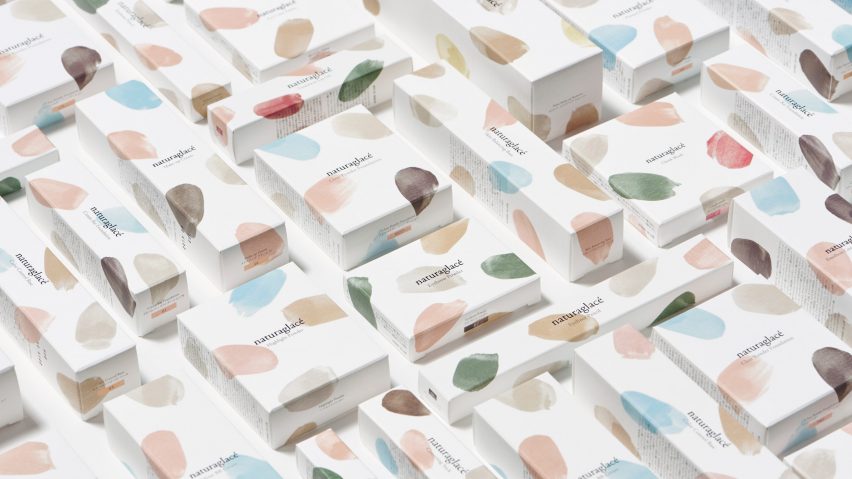
Nendo has used brush strokes in soft, pastel hues for a range of minimal packaging for an organic cosmetics company.
Oki Sato's studio was brought on board to "renew" the branding of Naturaglacé, a Japanese company that uses only natural ingredients to make its products.
The Nendo team was keen to reflect the brand's strong values – something they didn't feel the original packaging conveyed particularly well.
"The brand value lies in raw materials which are of 100 per cent natural origin. However, there was an issue that those strengths and characteristics were vague," said the studio.
They selected a colour palette of 11 shades inspired by raw materials, which were then applied to the white packaging in brush-stroke patterns.
Each of the 10 products are distinguished by a different pattern and colour combination. Inside, products are concealed within matt grey containers.
The compact cases for foundation and eyeshadows are designed to look a painter's palette, and feature a small indent on the edge to place the fingers.
"In this way, by borrowing nature's gifts and applying them on yourself as if a watercolour artist would paint a canvas, a design about the pleasure of applying makeup is accomplished."
The rebrand is in line with the current trend for minimal packaging, pioneered by companies like Apple. Other brands that favour the no-fuss style include chocolate manufacturer Mast Brothers and food and homeware company Brandless.
Nendo took a similar approach previously with its simple branding for TCM+, a line of skincare products based on the practices of Chinese medicine.
Sato founded Nendo in 2002, after graduating from Japan's Waseda University.
Last year, the studio was the highest-ranking design firm on 2016's Dezeen Hot List, a data-based power ranking of the industry's most influential names.
Other recent projects include a flat-packed light made from a single piece of paper and an all-white soy seasoning dispenser, designed to rival the iconic red-topped Kikkoman bottle.

